| Image |
Comment |
| 06/21/2006 01:13:22 PM |
|
 Photographer found comment helpful. Photographer found comment helpful. |
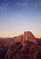
| 06/19/2006 11:22:03 AM |
Desolate Dome and Deep Spaceby bryanbrazilComment: that's a amazing capture. Very well done. I believe this is from the glacier point. I will ask you more questions once the voting is done and I know who you are :)
goes into my fav. |
| Photographer found comment helpful. |
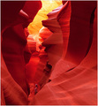
| 06/16/2006 04:35:53 PM |
Centuries Oldby Nikonian NinjaComment: It looks too dark, you seem to be missing the bright zones. It always helps to use the histogram to make sure you cover the range well. |
| Photographer found comment helpful. |
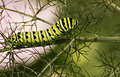
| 06/15/2006 05:36:13 PM |
Black Swallowtailby BakerBugComment: ** Critique Club **
When I first look at the image, I am confused as what is the 'green' you wanted to show? Is it the caterpillar or the green background ?
You have a great shot of caterpillar here, but the background doesn't go very well with it. I find the left top portion too distracting. If you could capture the subject from an angle to avoid the white background and may be able to keep the background all green, a green on green picture, that could have been great.
A few things that I think can improve the existing picture is sharpening after resizing. also you could tone down some of the red in the background.
Overall, a good subject choice, but background distracts the viewer.
If you have any questions, please feel free to pm me.
thanks,
Gaurawa |
| Photographer found comment helpful. |
| 06/14/2006 05:21:17 PM |
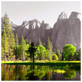
Nature's Majestyby RikkiComment: ** Critique Club **
What? You should be a member of the club and not requesting critiques :)
Very vibrant green colors, the selective saturation (?) makes me concentrate on the subject which is relevant to the theme here. You have also captured the reflection very well.
I would crop the top 20% or even 25% of the image and just stop at the rocks as the sky doesn't add to the picture, or rather distracts. I think the reason you still kept them was to avoid the line being in the center.
A second look and I still think I will go with removing top 20% and making the line go at about 40% of the frame.
-Gaurawa
|
| Photographer found comment helpful. |
| 06/14/2006 05:15:18 PM |
Jalapenoby fotomann_foreverComment: ** Critique Club **
Congratulations on a good finish with this simple, but yet effective photograph.
I like the use of negative space here. The subject is lighted quiet well with the background being pure white without any gradation. Also a good work on setting the white balance correctly to get the whites and true green color.
What I would have changed is the shadow and not let is extend on the right of jalapeno, which I believe would mean a brighter reflector.
In summary, a very well photographed image which deserves a high score
-Gaurawa |
| Photographer found comment helpful. |
| 06/13/2006 02:38:10 PM |
|
| Photographer found comment helpful. |
| 06/12/2006 09:14:54 AM |
|
| Photographer found comment helpful. |
| 06/12/2006 12:28:45 AM |
thinking of what lies aheadby RikkiComment: Yosemite! I could recognise this before reading the details. I was there this weekend for half dome hike. Made me realise I am not that fit. sore today :(
|
| Photographer found comment helpful. |
| 06/11/2006 11:02:29 PM |
|
| Photographer found comment helpful. |
Home -
Challenges -
Community -
League -
Photos -
Cameras -
Lenses -
Learn -
Help -
Terms of Use -
Privacy -
Top ^
DPChallenge, and website content and design, Copyright © 2001-2025 Challenging Technologies, LLC.
All digital photo copyrights belong to the photographers and may not be used without permission.
Current Server Time: 06/27/2025 07:39:43 PM EDT.