| Image |
Comment |
| 12/03/2008 09:04:00 AM |
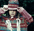
Hang In There by JudiComment: Fantastic shot. I think it'd do well commercially, but you might want to re-crop it to fit into a more standard aspect ratio. +fav. |
 Photographer found comment helpful. Photographer found comment helpful. |
| 11/22/2008 06:38:48 PM |
Cat.jpgby judojoeComment: Good, sharp, shot. Great colours. Needs more space on the left-hand side though. |
| Photographer found comment helpful. |
| 11/08/2008 12:43:39 PM |
by yankoComment: This is superb. Where have you been all my life? ;-)
|
| Photographer found comment helpful. |
| 10/22/2008 11:22:11 AM |
peekby stevieianComment: This was my '10' for the challenge. I thought it was a great shot, I love the colours you achieved in post-processing. Perhaps the 'inside-out' part was too subtle for the voters? |
| Photographer found comment helpful. |
| 10/16/2008 09:43:24 PM |
|
| Photographer found comment helpful. |
| 10/16/2008 09:37:55 PM |
|
| Photographer found comment helpful. |
| 08/28/2008 08:58:16 AM |
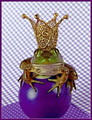
Purple Royaltyby LydiaComment: This is quite surreal. Some DPCers would just have shot the checkered purple background on its on as their entry.
But you added a pool ball... And then a frog... And as if that wasn't enough you topped it off with a crown! Did you run out of ideas for what to balance on top of the crown? :)
P.S. I think some people confused you with  timfythetoo timfythetoo as his wife is also on DPC. Message edited by author 2008-08-28 09:01:05. |
| Photographer found comment helpful. |
| 08/27/2008 05:48:27 AM |
Glorious Color by MaryOComment: Beautiful. I think the sharpening makes it look even more like a nebula. |
| Photographer found comment helpful. |
| 08/18/2008 07:13:17 AM |
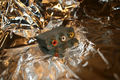
Computer games -- At work and play. by LiamD2005Comment: I don't think it was just the foil background that hurt the score. A few other observations;
- Centered composition. In most cases centering the subject looks boring. Try a rule-of-thirds composition
- Boring subject. To be honest, there's not much you could do to make this item look interesting. It looks like something you just found in a desk drawer 5 minutes before the submission time. It just doesn't hold my interest or tell any sort of story.
- Subject too small in frame. Try moving in closer to the subject, or at least cropping out all that empty space around it.
As far as backdrops go, try using a large sheet of white or coloured paper. For example;

That's a sheet of red card I bought in Easons. It doesn't detract from the subject, but creates a contrasting colour for the background. Just be careful with your lighting when using white backdrops, you want to avoid weird shadows appearing. |
| Photographer found comment helpful. |
| 07/28/2008 06:47:30 PM |
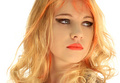
I Wishby JudiComment: I love the moody lighting here; looks like she's lit from below. And the pinks and oranges are great! However, I find the crop unsettling... too centered perhaps? I can't put my finger on it. |
| Photographer found comment helpful. |
Home -
Challenges -
Community -
League -
Photos -
Cameras -
Lenses -
Learn -
Help -
Terms of Use -
Privacy -
Top ^
DPChallenge, and website content and design, Copyright © 2001-2025 Challenging Technologies, LLC.
All digital photo copyrights belong to the photographers and may not be used without permission.
Current Server Time: 06/16/2025 05:59:46 AM EDT.