| Image |
Comment |
| 06/09/2006 06:30:09 PM |
... a man who sailed the seaby anotherdayComment: Hi from the Critique Club.
Please feel free to PM me with any comments or questions.
First impression: Nice environmental portrait. Love the character, and his expression, but missing his feet! :) He looks like the sea has tossed him around, shook him up, and dropped him in the middle of your picture. Perfect pose, dignified, but rough around the edges.
Technicals: Nice and sharp, maybe a little contrasty but it doens't hurt the pic in my opionion. My monitor shows his skin tones as a little bit on the red side, again, considering the style of the picture i dont think it hurts the pic(its just me being a little picky :))
Composition: Just the missing feet bother me. I like the inclusion of the smoke drifting through the frame. Makes the picture come alive and provides a dynamic element to the pic.
Nice score in this stiff competion! This would have also done very well in the enviromental portrait challenge i'm sure. I looked at your original and im not convinced you made the right choice. The light was pretty harsh but thats OK, he is a rugged/harsh looking character so it might not have hurt you. But, you scored very well so congrats.
Keep shooting,
mark
|
 Photographer found comment helpful. Photographer found comment helpful. |
| 06/09/2006 06:13:31 PM |
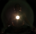
Enlighteningby DigiFotoBuddyComment: Hi from the Critique Club.
Please feel free to PM me with any comments or questions.
First impression: What is it? A second look reveals the outline of a person but still leaves me wondering about the bright light in the center of the frame.
Technicals: Hard for me to comment without your comments, but after reading them i would have to agree with karma regarding some letting some light spill back onto the models face. As a whole the picture is too dark for my taste but i certainly admire your creativity. A little more light to backlight the top of the models head would have been good to better define the model's shape.
Composition: The square crop with the centered light works well so i feel you made a good choice in that regard.
This is one of those entries where your creative thought process and implementation was lost on a majority of the voters. At least that is my suspicion. Out of the box thinking and you are to be commended. Knowing the details, it is easy to see how it met the challenge but most, myself included, would have probably suspected more than one light source.
I like your stuff and you have had some very nice pics. dont let the end result be discouraging(i'm sure you won't)
Keep shooting,
mark
|
| Photographer found comment helpful. |
| 06/07/2006 03:20:38 PM |
|
| Photographer found comment helpful. |
| 06/07/2006 03:08:19 PM |
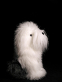
Did you say walkies?by joynimComment: Just a quick comment. Gave a 5 during the challenge...I don't like long haired dogs :)
For me the picture is so much in profile that it seems a little two dimensional. It would seem, based on the catchlight that the camera and the light were in the same position. Rather than the light sweeping accross the little guy and providing some shadows/definition to his shape it blasted him head on leaving a flatly lit image. Your exposure is right on, just needs a little different direction IMO.
You did a nice job on cropping, the empty space above his head is nice. His darker hair does disappear which gives the impression of a floating white head unless you look closely. This may have hurt your score as well if some voters did not have their monitor calibrated correctly.
I'm jumping aroudn here but the other thing that comes to mind is... next time try to get a little light raking across the background resulting in a lighting gradient. This would have helped separate your subject from its background.
Picture is sharp, subject is cute. Keep shooting,
mark
edit: didn't realize it was stuffed. Is it??? "slap myself upside the head and walk away muttering" Message edited by author 2006-06-07 15:10:30. |
| Photographer found comment helpful. |
| 06/07/2006 02:57:40 PM |
Return to Multnomahby DrAchooComment: surreal for sure. Great color contrast between the blues and greens. I would prefer the greens be somewhere between your original and the hyper-sat greens of this one. Like your tighter cropping choice and the lack of a border on this entry. |
| Photographer found comment helpful. |
| 06/07/2006 02:47:23 PM |
|
| Photographer found comment helpful. |
| 06/07/2006 12:14:46 AM |
|
| Photographer found comment helpful. |
| 06/07/2006 12:13:11 AM |
|
| Photographer found comment helpful. |
| 06/06/2006 02:14:51 PM |
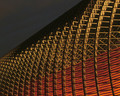
Kimmel at Night IIIby banmornComment: Hi from the Critique Club.
Wow, "kinda" hand held at 3.25 seconds. Pretty sharp i'd say considering.
Your pic is a wonderful abstract with a good balance between light and dark as well as some nice angular elements which contrast well with the curves.
I tend to agree with some of the commentators that either a darker sky or a bluer twilight sky would have been beneficial. but, as you said, sometimes conditions just dont work out as you hope. I really like the red and yellow colors and they provide a very nice balance.
As it relates to the challenge, i think it scored well, considering some of the other pictures which were entered. I believe the majority of DPC voters favor real vs. abstract when it comes to voting.
Good finish and one that you might want to try again when you have a better sky and a tripod(although you did fine w/o the tripod this time) :)
Keep up the good work with your pictures. I enjoy them.
PM me with any questions or comments.
Mark |
| Photographer found comment helpful. |
| 06/06/2006 02:00:41 PM |
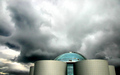
The Pearlby BrinComment: Hi from the critique club...
Brin,
First of all, i'm seeing this photo for the first time and even in a challenge that had many great entries, yours is outstanding. I love the minimalist approach and the processing to bring out the outstanding blue in contrast to the dark sky.
Technically speaking...Excellent. You know your stuff as evidenced by many of your entries including this one.
While the leaning verticals don't work well in some pictures i think they do justice to yours because the give the effect of holding or cradleing the round structure.
Some commentators suggested they would like to have seen more of the building, but i think your placement of the subject well down towards the bottom is what gives this photo its uniqueness and interest. Good choice on the landscape orientation.
Nice pic and congrats on your high finish. I always enjoy your work.
PM me with any questions or comments.
Mark
|
| Photographer found comment helpful. |
Home -
Challenges -
Community -
League -
Photos -
Cameras -
Lenses -
Learn -
Help -
Terms of Use -
Privacy -
Top ^
DPChallenge, and website content and design, Copyright © 2001-2025 Challenging Technologies, LLC.
All digital photo copyrights belong to the photographers and may not be used without permission.
Current Server Time: 06/22/2025 08:10:43 AM EDT.