|
|
|
Showing 791 - 800 of ~977 |
| Image |
Comment |
| 02/16/2003 10:00:15 PM | HURRY!! I can't hold this pose much longer.by margieComment: Critique Club
Your comments on this picture seem to have covered everything, so perhaps I can sum them up.
1)Focus is perfect on the bird, lovely detail.
2) Colour saturation is great, the birds colours look lovely and the green of the plant sets him off nicely.
3) The background is a bit distracting, I see two possibilities here, one of them would be to have a closer shot, with only the bird and plant, you could either crop or get closer. The other option, if your camera allows it, would be to use shallower depth of field, for example using an aperture of f2.8 or f4 might be better, this would render the background as a blur and then put more attention on the bird and get rid of the obvious curtain.
4) Lighting is beautiful, very soft and natural.
5) Perhaps cover the sofa with a white sheet, to get a more simple foreground and bring more attention to the bird.
I am quite impressed with this picture, perfect timing! I have a parakeet and it is impossible to get him to stay still long enough to take a picture. Good Luck in the next challenge. |  Photographer found comment helpful. Photographer found comment helpful. |
| 02/15/2003 10:38:20 AM | Beach, Sun, Sand and Silhouetteby PaigeComment: Critique Club
Composition-Content
I really loved this picture, it has such a warm and peaceful atmosphere.
I love the angle that you have used, with a cross section of both the darker part of the beach, the sunlit beach, ocean and sky. There is a lovely balance between these components. The solitary man walking into the picture perfects the composition.
Technical
Lovely lighting here, with a well controlled sunset, the highlights are not too bright. It looks like you boosted the yellow on this, which adds more warmth. Perhaps a tiny bit more contrast could have been used, especially on the sea. However, to be honest, I really like the soft colours.
My Opinion
I think that the only thing I would change about this picture would be the title. I think that "Solitude" would have been fitting and would have suited the very peaceful feeling attached with this. Maybe a nice simple border would have set it off. I really like this picture, great shot. One to be framed and put on the wall. | | Photographer found comment helpful. |
| 02/13/2003 09:40:02 AM | | | Photographer found comment helpful. |
| 02/11/2003 09:49:57 PM | Playtime is over after 6 monthsby Frank BeckmanComment: Critique Club
Composition-Content
This is a beautiful sunset, unfortunately it wasn't strong on the before and after theme, except for the title. I think that this would have done MUCH better in the cliche challenge. However, DPC isn't the be all and end all of photography (though I often forget that!) and you have taken a stunning picture, which would be fantastic blown up and put on the wall. Your composition is great, with the silhouetted playground in the front, contrasting well with the vibrant colours of the sky. Perhaps a tiny amount of rotation would have got the land perfectly straight. Also might have cropped off half a cm off the right to get rid of the tree/building.
Background
The sky is absolutely stunning, absolutely beautiful colours and textures.
Technical
You have exposed well for the sky, getting both the light and dark balanced perfectly. The use of silhoutte is great.
My Opinion
I can see your meaning of before and after here, but unfortunately maybe the link isn't obvious enough. This is a beautiful shot though and a very well captured sunset. Good Luck in the next challenge. | | Photographer found comment helpful. |
| 02/10/2003 09:12:39 AM | Cute as a Bugs Earby SonifoComment: I thought that this was a really fantastic picture, one of the best baby pictures I have ever seen, really think that this should have been in the top three! Congrats on 7th though! | | Photographer found comment helpful. |
| 02/09/2003 08:34:58 PM | The Unheardby AntithesisComment: Critique Club
Composition-Content
A very unique and original idea, great picture! I like the way that you have framed the person in the square and in that way you have met the challenge. Content is great, which absolutely makes the picture, quite an eerie shot, the whole person at the window thing is staight out of a horror movie! Don't worry, not too much like a pig! The image of the person at the window is pretty abstract, but there is enough detail to show the viewer what it is.
Technical
Lighting is good here, enough light to capture the detail of the face. Perhaps the lighting on the window frame could be a bit brighter, especially as the square should be emaphasised to fit the challenge. Along the same lines, the focus is a little soft on the window frame, perhaps this could be a bit sharper. However, overall I think that focusing is good, this must have been pretty hard to focus.
My Opinion
A very creative and unique approach to the challenge, it is a bit too nightmarish for my taste, but I can really appreciate the idea behind it. I wonder what this would be like in B/W. Hope that the creativity continues to be let out! Good Luck in the next challenge | | Photographer found comment helpful. |
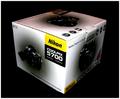
| 02/09/2003 08:11:05 PM | the cameras boxby shutterflyComment: Critique Club
Content-Composition
I have the same toy, great isn't it! Your composition is great here, you have created a good 3D effect and the use of negative space is excellent.The actual content of the picture probably isn't too inspiring for most of the voters, perhaps a more interesting subject would have done better. However, I think that you have done a great job of photographing THIS!
Background
I am a fan of black backgrounds, this really set of the subject and gave power to the overall shot. There is a tiny bit of dust right at the front of the shot, but it isn't too noticeable.
Technical
Basically, this shot is relying on the techniques used as opposed to the content. Your lighting is excellent, with the box lighter at the front and then fading into the background. Focus is good and I like the use of DOF, which fades into the background. You had a comment that it could be crisper, I can see Inspzil's point here, I have suffered with the same problem, not sure whether the lack of crispness has to do with the camera, the black background which exaggerates the lines of the box, or perhaps a slighter deeper DOF would have been better. The box does have jagged edges, bu I think that this is the texture of the box itself not the sharpening.
My Opinion
Even though I have this same camera, I am afraid that the subject doesn't excite me too much, however I think that you have done a great job of photographing it, the lighting is especially strong. Good Luck in the next challenge. | | Photographer found comment helpful. |
| 02/09/2003 07:46:06 PM | Cafe Iguanaby jenaromComment: Critique Club
Composition-Content
There is something that makes this picture stand out in the crowd, the simplicity, the colours? It is a lovely soft picture, which maybe makes us wish to slow down a bit and spend time strolling around these streets. I think that your composition is perfect, I like the angle that you took this from, which helps you focus on the door on the left and then also takes you into the picture to the door on the right. There is enough detail in the picture to hold the viewers eye, the plant pots, the yellow steps, the name, but overall I think that the simplicity of the composition captivates the viewer.
Background
Well, the background here is the picture, all I can say is that the colour is fantastic! I do like the idea of a cat sitting in the foreground, to add another dimension to the shot, but I don't think that the picture suffers without it.
Technical
Lighting is great here, lovely and soft with no shadows, which suits the building completely. Focusing, sharpness and DOF are all great.
My Opinion
Love it! I like the fact that you didn't try to change the natural beauty of this scene. Lovely picture. Good Luck in the next challenge | | Photographer found comment helpful. |
| 02/04/2003 09:11:28 PM | Busy Beeby HoogieComment: Great use of DOF here, lovely colours and detail, perhaps the post processing is a little heavy | | Photographer found comment helpful. |
| 02/03/2003 10:42:53 PM | | | Photographer found comment helpful. |
|
Showing 791 - 800 of ~977 |
Home -
Challenges -
Community -
League -
Photos -
Cameras -
Lenses -
Learn -
Help -
Terms of Use -
Privacy -
Top ^
DPChallenge, and website content and design, Copyright © 2001-2025 Challenging Technologies, LLC.
All digital photo copyrights belong to the photographers and may not be used without permission.
Current Server Time: 08/14/2025 02:57:20 PM EDT.
|