|
|
|
Showing 391 - 400 of ~4217 |
| Image |
Comment |
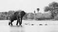
| 07/31/2009 05:44:44 PM | Water CrossingW.jpgby scooter88Comment: Beautiful image. The tones work very well to create a smoothness and subtleness in all the elements around the elephant, while still showcasing the textures in the elephant. I like the bird too. |  Photographer found comment helpful. Photographer found comment helpful. |
| 07/28/2009 05:05:42 PM | Zulu Wondererby mardakComment:  Critique Club Critique
First Impressions
Critique Club Critique
First Impressions
Interesting image, title makes me wonder if it was intentional or a typo. Yellow bag detracts because of the color/exposure control.
Photograph Information, Technicals & Composition Review
I like the dof on the man but wonder whether a little deeper would have allowed the bag to not have issues, if indeed you wanted to keep that element.
Composition wise, the angle makes this seem slightly awkward, especially with the crop. More space on the left, even if empty space, would have given the man more room, including his glance - if that makes sense. At first I wondered about a much tighter crop, especially for this Challenge, to allow his face to dominate the frame more. However on inspecting the image closer, there are other interesting elements, such as his clothing and that 'blown' yellow bag - which tells a small story. Looks like matches and cigarettes in the bag. Still, for the Challenge, if the quality was there, I think a much bolder crop would have allowed for more of a study of this young man.
Comments, Score & Placement Review
125/159 and a score of 5.02 gets you over the '5 line', but still a fair way down the bottom of the pack. I think 720 would have helped you create more impact for the voters who may have stopped and studied the image a little longer. My guess is that they were also distracted by the bag.
Your one comment received at least tells you what they saw and their interpretation of the capture/portrait. Yes, it is more of a candid than a portrait - although in my opinion, you can have one in the same, however to be a stronger contender for the image, the candid must be foremost a study of the person, or portrait - rather than looking like a candid foremost and a portrait by default - hopefully you understand what I'm trying to say there.
Summary
A variation in composition to get the face better placed in the frame to dominate - you may still be left with the issues in the bag which may not be recoverable from, cropping might not be an option. Perhaps a conversion to tones or b&w may have created something good, would be a matter of experimenting. Otherwise, an interesting portrait, that I wish I could have seen the face more dominant in a larger frame (720). | | Photographer found comment helpful. |
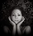
| 07/28/2009 07:55:05 AM | Flowers in her hair by PaulComment:
Critique Club Critique
First Impressions
Pretty. Tones are lovely and work well. Flowers are getting lost.
Photograph Information, Technicals & Composition Review
Just read your Photographer's Comments - for me, there is no over-softness, I think it works well. I at first wished there wasn't so much darkness (flowers aside for a moment), especially at the bottom of the frame - but it is growing on me the more I look at the image. Save for perhaps the bottom left, and only because it is not even with the right and for a centered image such as this my eyes want that visual balance. I think with those darker areas 'brighter' - either by pp or with the lighting 'in situ', would also be good, just 'another image'.
As I inspect the darker areas closer, I can discern some very slight 'issues' on the left in some of the darker areas. There is something that appears to be lace or fabric of some description just above her left shoulder, but that could be intentional.
I like the way her hands are posed and the expression on her face. The nose is maybe a fraction too soft, but it still works in my opinion. I like your composition.
I am sorry I cannot offer technical lighting critique. I would recommend seeking opinions from the knowledgeable ones at DPC in this area - and there are many, if you would like a little more insight into the technical lighting aspects of your image.
Comments, Score & Placement Review
3 out of 159 and a score of 7.13 - excellent of course. Sounds like you would/should be proud of yourself by not making something that is embarrassed by the work of other portrait photographers at DPC.
Several of your in-Challenge comments offer some good portrait observations, of course the resulting variations would change the image quite a bit, so as long as the final image is pleasing to your artistic vision - that's the main thing. Certainly some good pointers for future use though.
Summary
A stand out portrait that jumps up at you to look at. I do wish for the flowers to be seen more, both lighting wise and texture (that is if they are real - and looks like they are). | | Photographer found comment helpful. |
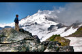
| 07/28/2009 05:57:08 AM | lighthouseby jdannelsComment: 9 - Wow, what a scene. Looks like an extremely difficult image to crop - really like the details and the long exposure creates a wonderful effect. Excellent quality. Up to 9 from 8 - but I do still wish I could see a little more, but just the size restrictions - make an excellent wall sized. Maybe a tweak in perspective correction, hard to tell, kind of like the way it is 'bent' with the (seemingly) fisheye lens. A very special place and scene, captured in an almost magical image. I also like the gray sky. Adding to my Favorites too. | | Photographer found comment helpful. |
| 07/28/2009 05:46:46 AM | | | Photographer found comment helpful. |
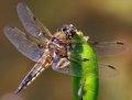
| 07/28/2009 05:45:58 AM | Dragonflyby KarenNfldComment: 8 - My favorite part of this image is the apparent 'liquid' in the body of the dragonfly. | | Photographer found comment helpful. |
| 07/28/2009 05:45:18 AM | | | Photographer found comment helpful. |
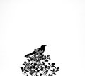
| 07/28/2009 05:44:43 AM | The Crowby vawendyComment: 8 - I like this. Stronger cropped on the left? - hmm, maybe - but it is not my image. Tones and processing work well. | | Photographer found comment helpful. |
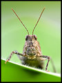
| 07/28/2009 05:43:41 AM | Hopperby DrAchooComment: 8 - Like the textures, color and composition. | | Photographer found comment helpful. |
| 07/28/2009 05:43:06 AM | | | Photographer found comment helpful. |
|
Showing 391 - 400 of ~4217 |
Home -
Challenges -
Community -
League -
Photos -
Cameras -
Lenses -
Learn -
Help -
Terms of Use -
Privacy -
Top ^
DPChallenge, and website content and design, Copyright © 2001-2025 Challenging Technologies, LLC.
All digital photo copyrights belong to the photographers and may not be used without permission.
Current Server Time: 06/19/2025 02:11:21 PM EDT.
|