|
|
|
Showing 3581 - 3590 of ~4217 |
| Image |
Comment |
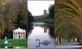
| 11/20/2005 06:17:30 AM | Fountains Abbey - A World Heritage Siteby p2jvrComment: 7 - Very nice. Criticism; the title is slightly forced and unnecessarily wordy. All nice shots, especially 2/3. 2 would like to have seen more definition 'somewhere', preferably in the swan. Colors and balance in 1/3 are nice, 2 choice/arrangement works, but not sure it 'flows' with 1/3 as well as it could. To really nit-pick, get every single pixel you can, especially for this style. Up to 7 from 6. |  Photographer found comment helpful. Photographer found comment helpful. |
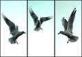
| 11/20/2005 06:11:51 AM | Aerial Balletby RiponladyComment: 7 - Good. Nice colors and tones, good 'balance'. Criticism; not much, and difficult with the size restrictions, perhaps a little more space 'below' each (depending what you had of course), may have given this a different edge, not sure. Good captures and seemingly good contrast control. Up to 7 from 6. | | Photographer found comment helpful. |
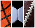
| 11/20/2005 06:08:03 AM | Let's Play Some Ballby Marc923Comment: 6 - Very good concept. Criticism; the 'artificial surfaces' are so well defined that they are the first thing I noticed in the texture detail, especially in #3. Texture is good, but doesn't have as much character/'feel' as different quality (leather) balls would have had. Color choice and arrangement is good. #2 is not perfectly centered, which would have been better in my opinion, but perhaps you were going for 'off center'. Like the diagonals on 1 & 3. The white frame works, but I wonder if perhaps even thin inner frames as well may have given more depth here. | | Photographer found comment helpful. |
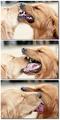
| 11/20/2005 06:04:50 AM | Devotionby sajinComment: 8 - Oh. Great. Criticism; not much, maybe slightly richer colors but difficult adjusting contrast I imagine on the cats. To really nit-pick, perhaps trying to get each shot more 'uniform' composition / colors, making a perfect 'set', if that makes sense, the green in the background, the rock the cub has it's head on (which you have just about identical in the last two frames). Perhaps (depending what you had to work with), the inclusion of the cub's paw to the left too, may also have made this an even better triptych. Be very good 'wall size'. Very nice and good balance, flow and 'story'. Too easy with a shot(s) like this/these. | | Photographer found comment helpful. |
| 11/20/2005 12:27:17 AM | Friends Not Foesby lynnesiteComment: 8 - Oh very good. Very good shots each. Criticism; colors on the white lab/retriever seem just slightly 'out', but difficult I am sure with these combinations. Very good use of triptych to display the three 'catches', and the 'story' for which your title is very good. Of course bigger - but you know that. I wonder if horizontally may have 'helped', but not sure. Also not sure on the 'shadow framing', or even on the choice of white as the background color, works, but I wonder if another color may have helped this be even better. Up to 8 from 7. | | Photographer found comment helpful. |
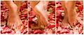
| 11/19/2005 10:26:59 PM | Piedi Nudiby rscorpComment: 6 - Like the concept, nice colors. Criticism; to really nit-pick, the marks (veins/creases) in the feet detract, especially from the seemingly 'soft' feel. Perhaps a little more space around, especially at the fore, of the feet, may also have made this better in my opinion. | | Photographer found comment helpful. |
| 11/19/2005 10:04:09 PM | Three strikes and you're a gonerby M.O.C.Comment: 6 - Like the concept. Criticism; like to see more 'context', but difficult depending how you did this. I am assuming car headlights, so good idea, just like to see perhaps a little sharper, especially in the fore sign, perhaps a slightly different 'composition' too, not sure. | | Photographer found comment helpful. |
| 11/19/2005 10:02:59 PM | Autumn Redby mexicoComment: 6 - Nice color capture. Criticism; stronger light, especially for the Challenge, as well as bringing out the texture and detail in the leaf, would have made this better in my opinion. | | Photographer found comment helpful. |
| 11/19/2005 10:02:17 PM | Leaf Lightby PoobaComment: 7 - Like it. Criticism; not much, maybe even stronger lighting, allowing the veins and detail to be brought out to their full potential more. | | Photographer found comment helpful. |
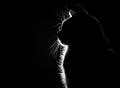
| 11/19/2005 09:57:00 PM | Purrrrfect Silhouette by dmmontyComment: 7 - Like this. Criticism; difficult, but I wonder about a different framing, perhaps vertical, but the horizontal works well here so who knows. I am sure you are aware of the 'specks' in front of the cat. Maybe, just the 'front' lit up, and the 'back' not visible at all may have given this an edge, but I do like the slight 'touch' on the back giving shape and context so who knows, just make them different, but still good, shots. edit:typos & congratulations Message edited by author 2005-11-23 00:59:34. | | Photographer found comment helpful. |
|
Showing 3581 - 3590 of ~4217 |
Home -
Challenges -
Community -
League -
Photos -
Cameras -
Lenses -
Learn -
Help -
Terms of Use -
Privacy -
Top ^
DPChallenge, and website content and design, Copyright © 2001-2025 Challenging Technologies, LLC.
All digital photo copyrights belong to the photographers and may not be used without permission.
Current Server Time: 06/22/2025 05:13:32 AM EDT.
|