|
|
|
Showing 3571 - 3580 of ~4217 |
| Image |
Comment |
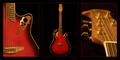
| 11/20/2005 04:56:27 PM | Standing Ovation™by FotoMunkiComment: 7 - Good, nice and 'clean'. Criticism; not much, mainly the red inner thin frame, not sure if perhaps a darker red, or different color may have made this better in my opinion. Maybe just a little more contrast/color. More definition in the detail in 1 & 3 too, but almost impossible I realize at this 'size'. Good 'showcase' via triptych. Up to 7 from 6. |  Photographer found comment helpful. Photographer found comment helpful. |
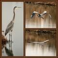
| 11/20/2005 04:49:44 PM | heron at homeby coolharComment: 7 - Very good, and good use of 'triptych'. Criticism; not much, really only the frame detracts in my opinion, especially the 'gold' thin frame. Very good shots all, nice coloring and good captures, especially 2 & 3. Up to 7 from 6. | | Photographer found comment helpful. |
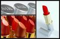
| 11/20/2005 04:48:53 PM | For Any Moodby karmatComment: 6 - Good use of triptych to 'showcase'. Criticism; not much, difficult with the size restrictions anyway, but perhaps 'sharper' on all, more 'fore focus' in the lower left shot and slight contrast/lighting(?) adjustment in 3/right shot, may have made this better in my opinion. Good 'commercial' aspect. | | Photographer found comment helpful. |
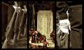
| 11/20/2005 04:45:23 PM | Courage, Honor, Integrityby dahkotaComment: 6 - Like the concept. Criticism; not sure on the toning/desaturation, especially at this size. I think color would have been better in my opinion, but that's your call. Again, difficult with the size restrictions, but perhaps a little more 'space' to the right in 1 and left in 3, and maybe centering of the Honor Roll, may have made this better in my opinion. | | Photographer found comment helpful. |
| 11/20/2005 04:34:35 PM | The Breakby JohnTFComment: 6 - Like the concept, and while I recall seeing similar shots 'elsewhere' in the past, not sure so if this is original, well done. Criticism; seems to be some gamma/contrast/reduction issues in the reds/oranges. Perhaps a sharper angle, creating a more 'dramatic effect' may have made this better in my opinion. Also, I think more 'movement' in the balls in 1/3 could also have enhanced the effect you have already achieved, but difficult to get this right I imagine. Possibly a different composition, especially in 1 & 3, allowing more balance and visual 'effect', may have also made this better. The light reflection on the balls is detracting/distracting, but could also have been used for added effect, with some 'diffusing', not sure how though. Like the potential here. Frame(s) work well. | | Photographer found comment helpful. |
| 11/20/2005 04:29:27 PM | Peak District Triptych by FalcComment: 7 - Very nice. Criticism; very difficult, mostly because of the size limitations, but I imagine this looks quite different 'wall size'. The 'inserts' are a good idea, but I am unsure on the 'gold' framing, especially since it has not been applied to the main 'frame', but unsure, as it does still work. The shot/scene itself is excellent and I like the perspective and composition and use of the wall. Slightly curious if the horizon is slanted, but not overly. Like to see even more detail (again difficult at this size) in the moss on the wall, but then - you have done so with the 'insert', as you have also done with the tree. Unless I am mistaken, both these 'inserts' are cropped out of this one picture, and to retain such good detail, clarity and color in them is very good. Perhaps a slightly different crop of the main frame, losing some of the sky/clouds, may have made this even better, but I realize your 'inserts' placing would change completely then. Maybe 'vertically framed' inserts would have 'balanced' better, not sure. Good, seemingly original, application of the triptych technique. review:unsure on 'classic triptych', but I like this nevertheless. | | Photographer found comment helpful. |
| 11/20/2005 06:35:37 AM | Caught in the Middleby DrAchooComment: 5 - Good, but a 'personal' type shot. Criticism; not much, you did well and I am sure this on your wall will be forever a classic. Again, it is a 'personal' shot though. Fun shots, reminds me of a shampoo/soap/family 'something' ad. Perhaps also in this case, slightly thicker framing may have also given this a little 'extra', not sure. Up to 5 from 4. | | Photographer found comment helpful. |
| 11/20/2005 06:27:43 AM | Pre-Gameby alanfreedComment: 7 - Good use of triptych to show a 'story' and 'feel'. Criticism; the green/yellow tint to the frame detracts in my opinion, perhaps a little darker would have looked better/enhanced the shots, especially the 3rd, more. Cropping half the flag in the first is 'not good', the perspectives and crops for 2/3 I think work well. Good coloring(s) in all, and all complement each other and there is good 'flow', not just with the color from frame to frame. Up to 7 from 6, I really like the concept and - well done if the idea is original. I just wish... that flag were not 'chopped'. | | Photographer found comment helpful. |
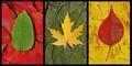
| 11/20/2005 06:22:57 AM | Autumnby ShaneBlakeComment: 6 - Nice. Good coloring. Criticism; not much, not sure on the 'base' choice of leaf for the middle shot/#2, doesn't seem to 'fit in' with the others, color yes but the shape/type no, in my opinion. More definition in the 'top' leaves especially, would also have made this better in my opinion. Up to 6 from 5. | | Photographer found comment helpful. |
| 11/20/2005 06:20:41 AM | Crossing The Lawby JudiComment: 6 - Good idea and potential. Criticism; not much, just more attention to minor details such as; straightening of the hat in 1, imbalance via over brightness of shirt in 3, perhaps the cuffs with a different and sharper angle (such as you have with the hat) in 3, may have made this a better 'series' in my opinion. If the 'officer' is holding open a cell door, to be able to better identify that, somehow, would also make this better in my opinion, although I do like the 'silhouette' type of effect in that shot. Up to 6 from 5.edit:typo Message edited by author 2005-11-21 00:46:07. | | Photographer found comment helpful. |
|
Showing 3571 - 3580 of ~4217 |
Home -
Challenges -
Community -
League -
Photos -
Cameras -
Lenses -
Learn -
Help -
Terms of Use -
Privacy -
Top ^
DPChallenge, and website content and design, Copyright © 2001-2025 Challenging Technologies, LLC.
All digital photo copyrights belong to the photographers and may not be used without permission.
Current Server Time: 06/22/2025 05:13:22 AM EDT.
|