| Image |
Comment |
| 11/30/2005 06:42:05 AM |
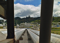
Industrial Powerby rayz1Comment: 2 - oops - wrong Challenge? I give you 2 because there is a 'collection of pipes'. |
 Photographer found comment helpful. Photographer found comment helpful. |
| 11/30/2005 06:41:08 AM |
Stonescapeby BrielleComment: 5 - Nice colors. Criticism; slightly more 'fore focus' would have made this better in my opinion, and a little sharper on whatever you choose to be in focus too. Seems a blue light reflection on the green/khaki stone, but that may be in it so not sure. The frame is too thick and detracts from this, especially at this size, in my opinion. A different crop too, especially to incorporate or cut out that 'crystal'(?) on the right. edit:typo Message edited by author 2005-12-07 07:53:30. |
| Photographer found comment helpful. |
| 11/30/2005 06:38:24 AM |
Stamp Collectionby LedZeppelin588Comment: 4 - Good potential. Criticism; assuming these are all stamps and very small frames, makes this shot likely even more difficult to capture, but I think that more attention paid to focal points, composition and background detail, would have made this better in my opinion. |
| Photographer found comment helpful. |
| 11/30/2005 06:36:26 AM |
Line of Shells by AlbireoComment: 8 - Very nice. Criticism; not much, perhaps slightly sharper on some of the foremost shells, but may be difficult to get such good focus on all then so not sure. Like the composition, symmetry, lines and shadows. Maybe just a touch more color/contrast, if possible, but not sure on that. |
| Photographer found comment helpful. |
| 11/30/2005 06:32:15 AM |
Spoils Of Warby CaitlynComment: 3 - Like the potential. Criticism; more attention to the composition/placements and also cropping, if possible would have made this better in my opinion. Too much seems either out of focus or blurry. Not sure on the toning, works, but perhaps needs some tweaking. |
| Photographer found comment helpful. |
| 11/30/2005 06:29:51 AM |
Highwaysby gotrondComment: 5 - Good colors. Criticism; in my opinion this is more about the child than the cars/collection. If the focus were on them, and the child out of focus, would have made this better for the Challenge in my opinion. Like the angle, even sharper would possibly also make this better. edit:typos Message edited by author 2005-12-07 08:00:08. |
| Photographer found comment helpful. |
| 11/30/2005 06:19:29 AM |
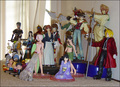
Multi-Fandom Figurinesby chetComment: 3 - Criticism; there was/is the potential to be much more creative here in my opinion. The lighting, focal points, angle, background, etc - even 'staging' the characters here, could have made this much more 'interesting' and added a bit of 'depth'. |
| Photographer found comment helpful. |
| 11/30/2005 06:16:00 AM |
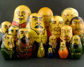
Part of the Gangby banmornComment: 5 - Can't see Putin. Like the potential here. Criticism; perhaps a tighter crop, especially at the fore/bottom and a light reflection 'adjustment' may have made this better in my opinion. Possibly also some 'unusual' lighting to try to give a more 'dramatic' effect, or some 'depth' to this. |
| Photographer found comment helpful. |
| 11/30/2005 06:12:58 AM |
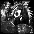
Eclectic Crystalby BriangellerComment: 7 - Nice effect and toning. Criticism; not sure on the cars at the fore, they don't flow/fit in with the feel (especially the fore one), in my opinion. Perhaps a different placement of them, not sure, also maybe a little more space on one of the sides, may have also made this better. Can't discern what that is on the horse's 'cheek', reflection perhaps, either way, unusual effect. |
| Photographer found comment helpful. |
| 11/30/2005 05:59:26 AM |
Bone collectorby alithenakeComment: 6 - Like the potential. Criticism; that shadow on the skull in the second row is too distracting and detracts too much from this image. A different crop, perhaps even a sharper angle (side on), and possibly more symmetry, would have made this a much better shot in my opinion. Not sure on the toning, works, but either needs some 'tweaking' or else maybe color, or another 'toning' would have been better, not sure. |
| Photographer found comment helpful. |
Home -
Challenges -
Community -
League -
Photos -
Cameras -
Lenses -
Learn -
Help -
Terms of Use -
Privacy -
Top ^
DPChallenge, and website content and design, Copyright © 2001-2025 Challenging Technologies, LLC.
All digital photo copyrights belong to the photographers and may not be used without permission.
Current Server Time: 06/22/2025 04:22:47 PM EDT.