|
|
|
Showing 3461 - 3470 of ~4217 |
| Image |
Comment |
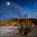
| 12/01/2005 06:20:35 AM | Desert Tendrilsby crabappl3Comment: 8 - Very nice. Criticism; difficult, but perhaps that 'grass' in the fore in better focus/detail, or even just the color 'contrasted' more if possible, may have made this even better in my opinion, although I realize perhaps you'd lose the overall focus that you have obtained, which is very good. This also seems like it may need a slight nudge rotation up on the right, but difficult to tell and makes zero difference to my score anyway. Nice coloring and simple scene. The star effect works, but if it were perhaps a little more subtle, may have worked better in my opinion, not sure. |  Photographer found comment helpful. Photographer found comment helpful. |
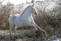
| 12/01/2005 06:12:06 AM | Color of Snowby loriprophotoComment: 7 - Like this, but think it has more potential. Criticism; apologies in advance if wrong, but seems it needs a slight nudge rotation up on the left, but very difficult to tell. This is an obvious opportune shot and you've captured it quite well, I just 'wish' the perspective/angle were even sharper, creating more of an 'impact' or 'movement' feel (hard to explain). You seem to have gained a good control of the contrast with all the whites, so suggesting anything there is again difficult. Perhaps just 'somehow' a different crop, not sure, just something to try to 'lift' this horse up and 'out' of the shot - if that makes sense. | | Photographer found comment helpful. |
| 12/01/2005 06:04:29 AM | Sunshine and Prideby CarmelynnComment: 6 - Nice, fairly good color control, especially with the white on white. Criticism; would like to have seen a uniform colored background, or else a more 'dappled'/'even' one; seems it goes from pink-white to blue-white from left to right. I think if the background was perhaps darker, a little sharper focus, especially on the eyes (but you may have been going for a 'soft look'), would have made this better in my opinion. The cat on the left seems like he is being 'edged' out a little by the fluffier one, so perhaps a different angle or even a rotation, not sure. edit:typo Message edited by author 2005-12-08 18:38:56. | | Photographer found comment helpful. |
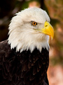
| 12/01/2005 06:00:48 AM | Eagle in Autumnby L1Comment: 6 - Like it, but, Criticism; seems to be either gamma issues or jpeg loss in the dark feathers (and partly the beak too), difficult to discern, might be post processing, not sure. The head and beak are nice and 'sharp', but not sure on the choice of 'composition' or crop, but obviously depends what you had to work with. edit:wording Message edited by author 2005-12-08 18:48:26. | | Photographer found comment helpful. |
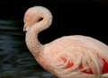
| 12/01/2005 05:56:38 AM | Waterside danceby snidowComment: 7 - Like the 'fluff factor' on the neck, very nice. Good coloring. Criticism; difficult, like the water movement effect in the background, the detail in the feathers, including color fore right is excellent, I already mentioned the neck, the eye is good, but the beak - just 'wish' that were in front, but you only get so many opportunities and I think you've done well with this composition/crop choice wise. Also, obviously, the tip of the beak being black, is 'lost' even more so against this dark background. | | Photographer found comment helpful. |
| 12/01/2005 05:53:10 AM | Am I in focus ?by airdanceComment: 6 - Yes you are, mostly. Criticism; even more detail would make this better in my opinion. A little 'blown', but that pale pink coloring against such a dark background likely makes contrast control difficult. In my opinion, if there was only one bird, the centered composition would have worked better, but with the two in the background, maybe more space, probably on the left (given the lighter variation of water(?) on the right), may have also made this better. Of course the beak 'cut' is obvious, on that I think that either an even tighter cropping on the head, or else incorporating the entire beak, dependent of course what you had to work with. | | Photographer found comment helpful. |
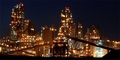
| 12/01/2005 05:44:34 AM | no place likeby yoavbComment: 7 - Very nice, looks futuristic. I'm sure the size restrictions don't do this justice. Criticism; difficult to tell, but the 'level' seems a fraction out, apologies if wrong (makes 0 difference to my score). I want to suggest perhaps more space on the right, but this works well, especially with the 'belts' or roads, whatever they are, in symmetry like this, so who knows. Seems to be 'something' top right too, no idea what. Perhaps if you'd gone for more height incorporation here might have helped this in this medium, but you'd lose the 'wide aspect' you've obviously gone for so, difficult. 2nd look, I think this is 'level', just the ground variations 'deceive the eye', especially at this size. | | Photographer found comment helpful. |
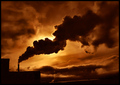
| 12/01/2005 05:39:30 AM | Beauty of the Beastby ibkcComment: 6 - Like this. Criticism; in my opinion, a tighter zoom/crop (if possible), aiming for the 'smoke/steam clouds' to really dominate this shot, would have made it even better in my opinion. The colors are also nice, but would like to see them a bit more vivid, perhaps it is the lights that are competing with them too much, not sure. | | Photographer found comment helpful. |
| 12/01/2005 05:34:42 AM | chocolate by ursulaComment: 7 - Good effect and lighting. Criticism; apologies if I am wrong, but this seems like it needs rotation/straightening. Toning is good, but it just seems 'tilted'. 2nd look - looks like it might have a pier/jetty/causeway(?) going out into water, but it is barely discernable, still, looks slightly 'tilted'. | | Photographer found comment helpful. |
| 11/30/2005 09:08:39 PM | Pulleyby TallblokeComment: 7 - Like this. Good colors and good background. Criticism; difficult, especially seeing as this was likely quite some distance from you, but like to see those colors even more vivid. Perhaps an attempt at desaturation, not sure, as the sky is a nice 'contrasting color' too. More detail also, especially in the pulley and chains (again difficult from this distance), and a greater depth of field (also difficult I imagine), would have made this even better in my opinion. Maybe a slightly different crop, especially to 'minimize' that 'rod'/whatever it is on the right there may also have helped. | | Photographer found comment helpful. |
|
Showing 3461 - 3470 of ~4217 |
Home -
Challenges -
Community -
League -
Photos -
Cameras -
Lenses -
Learn -
Help -
Terms of Use -
Privacy -
Top ^
DPChallenge, and website content and design, Copyright © 2001-2025 Challenging Technologies, LLC.
All digital photo copyrights belong to the photographers and may not be used without permission.
Current Server Time: 06/23/2025 07:21:35 AM EDT.
|