|
|
|
Showing 3441 - 3450 of ~4217 |
| Image |
Comment |
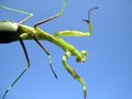
| 12/01/2005 05:15:59 PM | mantisby rachelellenComment: 5 - Good perspective. Criticism; depending of course what you had to work with, the feet (especially front four) all showing/not 'cut', and trying to get the head in just a little more focus (wouldn't even have to be sharp to make this still a good shot in my opinion) would have made this better. Given 'advanced editing', those 2 or 3 'spots' upper right and middle bottom, could/should have been cloned out. Difficult with contrast issues (and maybe cropping out more of the dark 'end body', who knows), but the green a little more vivid too, would also have made this even better in my opinion. edit:typos Message edited by author 2005-12-08 17:15:37. |  Photographer found comment helpful. Photographer found comment helpful. |
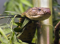
| 12/01/2005 05:11:42 PM | king cobraby BeetleComment: 6 - Good sharpness. Criticism; seems reflection/lighting issues on the head and assuming this is an exhibition/tank set-up, not sure how you could have avoided this - perhaps trying to adjust it in pp after, who knows. I like the sharpness on the eye, if that could follow through to the tip of the 'nose'/mouth, make this even better in my opinion. Quality dependent, a tighter and different crop too. Also seems to be a purple 'tinge' here and there, but that may again be a result of the artificial lighting. edit:typo Message edited by author 2005-12-08 17:25:34. | | Photographer found comment helpful. |
| 12/01/2005 05:06:24 PM | Curious Coonby dpdaveComment: 7 - Good. Criticism; like the composition but, with this background (including the subtle grain in it), the detail in the 'coon''s head/snout is diminished in my opinion, so (depending what you had to work with), perhaps a tighter crop on the right, and inclusion of more body on the left, or else just a tighter overall crop (quality dependent) may have made this better. I imagine trying to 'tweak' the colors/contrast would have been very difficult given the colors of the 'coon'. Sharper on the eyes, especially given your title, of course would be better but this is an 'opportune' type shot and, greater detail is of course camera/lens dependent. | | Photographer found comment helpful. |
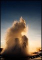
| 12/01/2005 05:02:37 PM | Explodingby garlicComment: 7 - Good capture and colors. Criticism; better without the people in my opinion. If possible, a slightly sharper, ground up, angle/perspective, while still retaining the top of the 'explosion', may have made this even better, not sure. I do like this angle, but think either a tighter crop on the left (if this is all you had to work with), or else centering the 'geyser' better, and possibly some more foreground for added 'context' (again depending what you had originally), may also have made this even better. edit:spelling Message edited by author 2005-12-08 18:17:02. | | Photographer found comment helpful. |
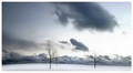
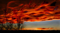
| 12/01/2005 04:58:46 PM | Loneliness...by QartComment: 7 - Very nice scene. Criticism; of course the size restrictions wouldn't do this justice, but especially given this image, in my opinion, had you sacrificed the frame (which again at this size doesn't help it - too 'thick'), to gain a little more 'space' to show the scene, would have likely helped this here. The largest cloud (again perhaps emphasized/highlighted at this size) detracts from the 'feel' and purity of this shot - mainly because it is so dominant. I like the centering, and while trying to judge if the horizon is 'level', I have no idea. The gentle sloping of the land is nice and the distant clouds - which look almost like a 'cloud forest', are very unique and again, I am sure are not able to be 'appreciated' at this size. Perhaps the trees placed/cropped (depending what you had to work with of course) more into the center, may have also made this even better (ie; more balance) but not sure. Also, perhaps a little more 'foreground snow', may have also made this even better, but again depends what you had to work with. | | Photographer found comment helpful. |
| 12/01/2005 04:32:02 PM | Before the Stormby rwaudioComment: 5 - Nice. Criticism; apologies if wrong but, looks like harsh pp burning/dodging here - not subtle enough if you 'had to' do it, in my opinion. The tree silhouettes are nice. Perhaps an even sharper, ground up, angle may have made this even better, not sure. | | Photographer found comment helpful. |
| 12/01/2005 04:28:44 PM | Wave Goodbyeby shutterflyComment: 4 - Good idea. Criticism; seems over processed (although perhaps you were going for this) and crooked, but might just be the angle. If that house were not visible in the background, ie; this taken from a different perspective, may have made this better in my opinion. Also out of all 'in' this shot, that house gable is the 'clearest', despite the processing. The grain works in this shot in my opinion, but again, with a few adjustments I think there is/was the potential for a much better shot here. | | Photographer found comment helpful. |
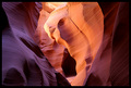
| 12/01/2005 04:25:23 PM | Study in: Light, Form, Textureby tfaustComment: 7 - Very nice. Criticism; colors are nice but look like they have been 'tweaked' a fraction too much (apologies if wrong). Good capture of what appears to be a type of cavern/cave, at least that is what it looks like from this angle. Like to see more detail in the texture of the very fore wall/rock, but that might be difficult to still be able to retain the focus where you have it as is, so who knows. This at wall size, the frame might suit, but in my opinion, at this size, it detracts, especially being so thick. | | Photographer found comment helpful. |
| 12/01/2005 04:21:35 PM | Not frost free...by idemaerschalkComment: 4 - Good potential. Criticism; don't think you have captured the full potential of this opportunity, maybe because it is a camera/lens dependent issue - but a workaround may have produced something that gave this a little extra. Perhaps perspective/angle slightly different, a different crop, composition, tweaking of colors/contrast, not sure. Can't recall ever seeing a shot of an orb web with frost like this on it, which just makes me 'want' to be able to see more detail in the frost particles even more. Perhaps a macro from a 'right under' or 'close to center and straight down' (really sharp angle) may have made this extra special. edit:typos Message edited by author 2005-12-08 17:53:00. | | Photographer found comment helpful. |
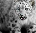
| 12/01/2005 07:28:33 AM | Deliriously Dangerousby CutterComment: 8/7/8..7 - Ahh - odd and 'unique factor/capture' mainly. Criticism; seems a few 'blue/green' issues on the nose and around the cat's right eye. Like the depth of field creating its own background effect. Perhaps a slightly different crop losing the bottom left leg(?), of course the ears not cropped, but presume that/this is all you had to work with. edit:typos Message edited by author 2005-12-08 17:57:03. | | Photographer found comment helpful. |
|
Showing 3441 - 3450 of ~4217 |
Home -
Challenges -
Community -
League -
Photos -
Cameras -
Lenses -
Learn -
Help -
Terms of Use -
Privacy -
Top ^
DPChallenge, and website content and design, Copyright © 2001-2025 Challenging Technologies, LLC.
All digital photo copyrights belong to the photographers and may not be used without permission.
Current Server Time: 06/23/2025 07:20:01 AM EDT.
|