|
|
|
Showing 3431 - 3440 of ~4217 |
| Image |
Comment |
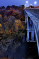
| 12/01/2005 06:15:56 PM | n i g h t f a l lby tateComment: 7 - Good perspective, good colors. Criticism; apologies if wrong, but seems it needs 'straightening', even just slightly, it may just be the unusual perspective, but the 'line' of the bridge (and the road on it) seems 'out'. Perhaps either a tighter crop out of the tips of those brown fore trees bottom left, or them incorporated more, may also have made this better in my opinion. |  Photographer found comment helpful. Photographer found comment helpful. |
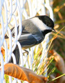
| 12/01/2005 06:09:46 PM | Howdy Neighbour!by RonRobertsonComment: 7 - Good catch and perspective/angle. Criticism; a little grainy especially on the right/background, which slightly detracts from the 'delicacy' of the bird, but then the chain-link fence balances that out in an unusual way. That fence is slightly dominant (and seems some 'blown' issues in it too), so perhaps a different cropping, not sure, may have helped this be an even better shot in my opinion. Maybe even the leaf at the fore completely out too, even though it means you would get "why did you crop the tail", but I think it would help make the bird 'pop' even more if you did. edit:typo Message edited by author 2005-12-08 17:00:06. | | Photographer found comment helpful. |
| 12/01/2005 06:06:37 PM | Catch meby boyetvComment: 7 - Nice. Good 'catch'/perspective/angle. Criticism; 'if only' that body, legs, etc were in sharp focus - but likely camera/lens dependent - but with that fine bokeh I wonder. The 'softness' is nice, but the focus on the 'fly' as is on the flowers, and again, 'sharper', would have made this much better in my opinion. Perhaps also a little more space (depending what you had to work with) above, and perhaps a slight rotation/adjustment and different crop, not sure, may have also made this even better. edit:typos Message edited by author 2005-12-08 17:02:31. | | Photographer found comment helpful. |
| 12/01/2005 06:00:46 PM | Right in the actionby BradComment: 7 - Good shot, good color. Criticism; slightly tighter crop on the left (still retaining enough face though) may have made this even better in my opinion. Perhaps more 'depth of field'/background 'play' on the right too, not sure. Also not sure on the frame. | | Photographer found comment helpful. |
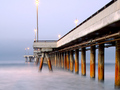
| 12/01/2005 05:54:11 PM | Dawn's Early Lightby qmdiComment: 8 - Very nice. Criticism; 'if only' that main light were not 'cut off' at the top. Colors are very good, very nice overall 'feel', like the perspective, just that 'crop' really, perhaps eliminating it altogether (but then you'd have the 'empty pole' trouble), so who knows. Like the good retention of depth at the end of the dock/causeway/jetty/pier/boardwalk/'line'. | | Photographer found comment helpful. |
| 12/01/2005 05:50:40 PM | Upby NordlysComment: 6 - Like the concept. Criticism; obviously the size restrictions don't do this justice but even still, it seems too 'high key'/contrasted to the point where too much detail, especially in the 'sail' has been lost. Be nice to be able to 'discern' the horizon a little better (I can barely now), and have some more 'color' in the emptiness in between, somehow, while still retaining the concept you've gone for - if that makes sense. Wall size this might look much better, but again, my opinion, if you had have 'adjusted' this to try to suit it to this medium, especially for this Challenge, would have helped you a lot but who knows. The frame detracts in my opinion, especially at this size. Again, perhaps it would work 'wall size', but even then I can't see it actually 'enhancing' this shot/concept. | | Photographer found comment helpful. |
| 12/01/2005 05:43:07 PM | FisherMen Sleepby holdingtimeComment: 6 - Good concept. Criticism; there is more potential here in my opinion, not sure 'how', and perhaps camera dependent, but this 'feels' a bit harsh and 'rigid', whether it is the lighting (especially the green on the left) or the seemingly lack of 'depth' on the boats, not sure. Perhaps (depending what you had to work with) a little more space to the right and 'above' the boats would have made this better in my opinion. Not sure what that 'something' (reddish color) is in the middle background, but that either enhanced or removed too would also improve this. | | Photographer found comment helpful. |
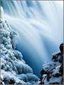
| 12/01/2005 05:39:41 PM | Winter bluesby LalliSigComment: 8 - Beautiful. Criticism; not much, maybe some even sharper detail on the snow/ice/texture right at the very fore of the shot, but likely difficult to retain the focus in the other areas, so who knows. Tempted to say I'd like to see less movement in the water, to see more detail, but this effect is very nice as is so who knows. Not sure on the frame, especially the black, perhaps brown (or whatever color is in those rocks) would have enhanced it/complemented it better, not sure. | | Photographer found comment helpful. |
| 12/01/2005 05:36:17 PM | Avian Reflectionsby maxjComment: 6 - Good catch. Criticism; I have to assume you didn't have that full reflection to work with or else you would have included it - that's the way it goes with opportunity shots. Of course 'if only' that fore wing were in better focus, but that is also camera/lens dependent. Like the colors, and while it seems a bit dark at this size, I am sure that larger yields a lot more detail and 'contrast'/effect. Even without that full reflection, perhaps just a bit more 'space' above the bird (again depending what you had), may have made this better in my opinion. | | Photographer found comment helpful. |
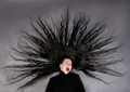
| 12/01/2005 05:23:57 PM | Electric Ladyby NazgulComment: 7 - Good idea, well done if it is original. Criticism; difficult, but in my opinion if she were either; a - her body/shoulders straight and the head then tilted or, b - the body/shoulders tilted more and the head 'brought back around' to be 'straight' (if that makes sense) may have given this an even greater impact/effect. The hair, while fairly well 'placed', just slightly 'rotated' to the right to get it more 'symmetricial' - but that would come by default with a change in head/body position. To really nit-pick, maybe the earrings/tongue ring(?) gone, for added 'neutrality', may also have given this a more simple and dramatic shot. The hair looks good, just think that in a shot like this, those minor other details would just enhance it even more - 'in my opinion'. I also want to suggest b/w or some type of toning, but I do like the skin color 'contrasting' against the black, and also the nice black sheen in the hair, which you'd likely lose with any adjustment. | | Photographer found comment helpful. |
|
Showing 3431 - 3440 of ~4217 |
Home -
Challenges -
Community -
League -
Photos -
Cameras -
Lenses -
Learn -
Help -
Terms of Use -
Privacy -
Top ^
DPChallenge, and website content and design, Copyright © 2001-2025 Challenging Technologies, LLC.
All digital photo copyrights belong to the photographers and may not be used without permission.
Current Server Time: 06/23/2025 07:19:01 AM EDT.
|