| Author | Thread |
|
|
12/08/2005 04:42:53 PM |
|
You probably found the most compelling crop in this shot. Good work. |
|
 Photographer found comment helpful. Photographer found comment helpful. |
|
|
12/08/2005 11:32:20 AM |
|
I was surprised you didn't get a better placing with this. I am sure the fact it was cropped differently and so small may have hurt it. I felt it was very unique and deserve higher than it got. |
|
| Photographer found comment helpful. |
Comments Made During the Challenge  |
|
|
12/07/2005 06:37:34 PM |
|
Just FABULOUS. I am so glad you went with such a bold crop too - it adds so much to this photo. 10 |
|
| Photographer found comment helpful. |
|
|
12/06/2005 08:51:13 PM |
|
I'm betting this is pretty cool full size, assuming you have the necissary resolution, but with only 640 pixels to work with I think it looses a lot of it's impact. For a shot like this (that's already pushing the limits the pixel allowance), I wouldn't have wasted space on a border. It's actually rather distracting since it takes up so much of the frame. |
|
| Photographer found comment helpful. |
|
|
12/06/2005 10:21:32 AM |
|
This is one of those shots that I like, but would like to have seen bigger. |
|
| Photographer found comment helpful. |
|
|
12/05/2005 08:54:42 PM |
|
| Photographer found comment helpful. |
|
|
12/05/2005 08:36:59 PM |
|
great minimalism study. -9- |
|
| Photographer found comment helpful. |
|
|
12/04/2005 10:31:30 PM |
|
Very unique. I like how you cropped it so long and narrow. |
|
| Photographer found comment helpful. |
|
|
12/04/2005 08:38:15 PM |
|
Has potential....If this was colorful...water meeting blue sky it would be 8+. However, the "white" seems to overpower the subject. |
|
| Photographer found comment helpful. |
|
|
12/04/2005 07:43:50 PM |
|
| Photographer found comment helpful. |
|
|
12/04/2005 06:42:29 PM |
|
I will bet without this crop this photo was not that much. You have a very good eye and have created an excelent entry. I like it a lot....10 |
|
| Photographer found comment helpful. |
|
|
12/04/2005 04:28:34 PM |
|
Love the idea but the size you're constrained to respect for DPC doesn't do this idea justice. It's hard to appreciate the details at this size. |
|
| Photographer found comment helpful. |
|
|
12/04/2005 03:27:29 PM |
|
Unique concept, but too overexposed for my liking (the edge around the parasailer looks uneven because of it) and too much white space to keep the interest of the viewer for long. |
|
| Photographer found comment helpful. |
|
|
12/04/2005 12:00:28 AM |
|
different, but very cool. I like it - 7 |
|
| Photographer found comment helpful. |
|
|
12/03/2005 01:52:09 PM |
|
this is different....I don't know how the voters will see this, but I like it...it has impact ....I am giving you a 10 |
|
| Photographer found comment helpful. |
|
|
12/03/2005 01:13:38 PM |
|
great idea!!!! and great image! |
|
| Photographer found comment helpful. |
|
|
12/02/2005 04:01:43 PM |
differently an interesting twist... 7
|
|
| Photographer found comment helpful. |
|
|
12/02/2005 09:57:46 AM |
|
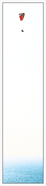
A clean uncluttered image with just the sea below and the parasailer high above. Cropping is good for it calls attention directly and instantly to the main focus - the parasailer sailing high above the ocean waters. It also gives the viewer a sense of height and distance. My only critiques on improving the image would be that the color on the parasail be more richer in hue such that it really pops of the page - here it looks a little washed out. Also if the parasailer could be in sharper focus such that more details are visible would be good. |
|
| Photographer found comment helpful. |
|
|
12/01/2005 10:38:00 PM |
10-- for the most original crop and use of negative space I've seen in a very long time--
gl
|
|
| Photographer found comment helpful. |
|
|
12/01/2005 05:50:40 PM |
|
6 - Like the concept. Criticism; obviously the size restrictions don't do this justice but even still, it seems too 'high key'/contrasted to the point where too much detail, especially in the 'sail' has been lost. Be nice to be able to 'discern' the horizon a little better (I can barely now), and have some more 'color' in the emptiness in between, somehow, while still retaining the concept you've gone for - if that makes sense. Wall size this might look much better, but again, my opinion, if you had have 'adjusted' this to try to suit it to this medium, especially for this Challenge, would have helped you a lot but who knows. The frame detracts in my opinion, especially at this size. Again, perhaps it would work 'wall size', but even then I can't see it actually 'enhancing' this shot/concept. |
|
| Photographer found comment helpful. |
|
|
12/01/2005 09:36:36 AM |
|
intresting crop. I don't like the border, you've captured a great feel in this image, but IMO the border is just too harsh for this shot. |
|
| Photographer found comment helpful. |
|
|
12/01/2005 08:50:42 AM |
|
my kids are asking, "what's this?!" haha |
|
| Photographer found comment helpful. |
|
|
12/01/2005 12:16:48 AM |
Man would this be cool in a larger version. I cant really see the detail but a 8 nonetheless
|
|
| Photographer found comment helpful. |
Home -
Challenges -
Community -
League -
Photos -
Cameras -
Lenses -
Learn -
Help -
Terms of Use -
Privacy -
Top ^
DPChallenge, and website content and design, Copyright © 2001-2026 Challenging Technologies, LLC.
All digital photo copyrights belong to the photographers and may not be used without permission.
Current Server Time: 06/30/2026 05:34:47 PM EDT.