|
|
|
Showing 3241 - 3250 of ~4217 |
| Image |
Comment |
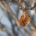
| 12/21/2005 07:20:48 PM | hangin' in thereby fordmanf1Comment: 5 - Nice capture. Criticism; wish it were 640. Looks like fairly good focus, but a slight 'tweaking' to get it sharper would likely make/have made this even better in my opinion. Like the composition, colors, perspective/angle and background. Good DOF. Up to 5 from 4. |  Photographer found comment helpful. Photographer found comment helpful. |
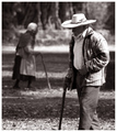
| 12/21/2005 07:19:21 PM | As life goes byby patrinusComment: 4 - Good concept. Criticism; wish it were sharper on the gentleman in the fore, even softer (no idea 'how') on the trees/etc in the very rear. A different crop, or else sharper angle/perspective and inclusion of 'legs/feet', and a slight tweaking of the toning too perhaps, would all have likely made this better in my opinion. | | Photographer found comment helpful. |
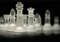
| 12/21/2005 07:06:59 PM | The leaderby unnevaComment: 6 - Nice and simple. Good 'ghostly' effects on the 'far pieces'. Criticism; difficult, perhaps a little more space at the top, and a slightly wider view to 'see' more of those 'ghostly pieces' and a fraction sharper on 'the king', may have all made this even better in my opinion. | | Photographer found comment helpful. |
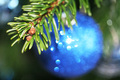
| 12/21/2005 06:55:16 PM | merry christmasby bevvyComment: 3 - Seemingly good potential. Criticism; the lighting is too harsh (looks like direct flash) in my opinion. The potential for the green and blue together looks good, but again the lighting detracts, or rather doesn't 'enhance' that. To see the greens and blues nice and 'vivid', would have made this a much better shot in my opinion. Perhaps also a slightly different angle, paying more attention to what is in the background on the left and right (using or losing it) - and sharper on the end of the pine(?) branch/stem/needles, would also have likely made this better in my opinion. The unusual 'bokeh' effect on the 'ball' (which I presume is some type of glitter), is good, but again, a variation in the lighting (contrast too perhaps), may have brought out more potential. Possibly even a little more 'height', top and bottom too may also have helped, especially at this size. Up to 3 from 2, mainly for the potential. | | Photographer found comment helpful. |
| 12/21/2005 06:49:23 PM | Cadence Rhythm Inflectionby jmritzComment: 6 - Very nice, especially colors. Criticism; mainly the cropping, if the crop were tighter on the left, and, if possible, a little more detail/texture in the seedheads and just more overall 'balance' in the cropping/framing, likely make this even better in my opinion. Good DOF. | | Photographer found comment helpful. |
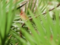
| 12/21/2005 06:46:51 PM | Female Cardinal in Palmettosby Lone-WolfComment: 2 - From what I can discern, looks like good potential here. Criticism; firstly needs to be 640, in this case width. From what I can discern, the cardinal is not as sharp as the palm frond/leaf behind it, so sharper focus on the 'main subject', possibly a tighter crop (quality dependent) and again the size, which would also allow for more of the shallow DOF to be 'seen', would all have made this better in my opinion. edit:typo Message edited by author 2005-12-28 20:55:03. | | Photographer found comment helpful. |
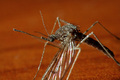
| 12/21/2005 06:42:04 PM | Mosquitoby shaverComment: 4 - Good potential. Nice simple colors. Criticism; different composition and cropping, and angle/focal points, all likely make this even better in my opinion. edit:typo Message edited by author 2005-12-28 20:57:07. | | Photographer found comment helpful. |
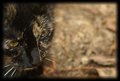
| 12/21/2005 06:40:49 PM | Make a Moveby PhilComment: 4 - Good potential. Criticism; if there was more cat, less frame and possibly even more height (to allow for more cat & impact at this size), make this even better in my opinion. More whiskers too would likely have given this something extra, and more 'balance' too, likely. | | Photographer found comment helpful. |
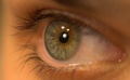
| 12/21/2005 06:27:48 PM | The eyes have itby NitinComment: 6 - Very nice. Excellent 'DOF'. Criticism; undecided on the light reflections in the eye, even just one may have made this better, but I also tried to visualize it without any as well - not sure, but your call anyway. Color is very nice. Perhaps a slightly different angle or crop, incorporating the fore bottom lashes and possibly even the brow - or just to contradict that, a different angle eliminating the brow (if that makes sense), may have made this even better in my opinion, not sure. The very good use of a shallow DOF is what really makes this shot, so well done. | | Photographer found comment helpful. |
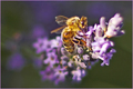
| 12/21/2005 06:21:56 PM | A sip of lavenderby burtctComment: 5 - Good potential. Criticism; sharper on the 'fore parts' of the bee, as seems to be on the far wing, etc and a tweaking of the lighting/contrast (which may not be needed if the focal point was adjusted), may have made this better in my opinion. Just noticed the purple/lavender in the background/bokeh, perhaps framing this with more height, to incorporate more of that, may also have given this something extra. Even just the lavender (with the same focus/sharpness/detail issues), without the bee, make for another (albeit different) good shot, in my opinion. | | Photographer found comment helpful. |
|
Showing 3241 - 3250 of ~4217 |
Home -
Challenges -
Community -
League -
Photos -
Cameras -
Lenses -
Learn -
Help -
Terms of Use -
Privacy -
Top ^
DPChallenge, and website content and design, Copyright © 2001-2025 Challenging Technologies, LLC.
All digital photo copyrights belong to the photographers and may not be used without permission.
Current Server Time: 06/24/2025 07:07:11 PM EDT.
|