|
|
|
Showing 311 - 320 of ~4217 |
| Image |
Comment |
| 08/11/2009 06:15:12 PM | Touchby davehamComment:  Critique Club Critique
First Impressions
Critique Club Critique
First Impressions
Ah - I liked this. I gave this a 6 during voting. Nice capture and nice light.
Photograph Information, Technicals & Composition Review
I think all your technicals work well with this image and are all quite sound. What this image would benefit from, in my opinion, is a much more refined crop and composition. Of course, this image would probably lend itself well to a b&w or toning conversion too - but 'another image'.
Composition suggestions would be: losing the car at the top of the image. Depending on what you had to work with and the quality, perhaps even a bold crop out of the 'bodies' - but not sure, might change the image too much and remove needed context. My favorite part is the water, light and of course the 'touching'. The backlighting really works well and contributes to the overall warm feel.
The OOF (out of focus) foreground on the right perhaps cropped a little more, but it does provide good 'lead' into the main subject. Perhaps the main subject (the touch/water) being placed on the 'thirds' more would enhance the image, but in this case, I don't think it matters that much.
Comments, Score & Placement Review
222/418, is fairly average placing and a score of 5.63 is quite good for a Free Study.
Ah - just looked at your profile and see this is your first entry. Congratulations on your first submission and welcome to DPC. I think this is a good image to kick it off with.
Your one comment received during the Challenge is very helpful.
Summary
Very nice moment captured and well seen. You did well to get the right parts in focus and work fast enough to capture all this. |  Photographer found comment helpful. Photographer found comment helpful. |
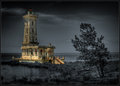
| 08/11/2009 06:02:39 PM | The Lighthouse at Point Abino - 1917by david_cComment:
Critique Club Critique
First Impressions
Hmm, I remember pondering this image for a while during voting (I gave it a 5). I did like it, but the more I looked at it, as a whole and also the lighthouse exclusively, the more I didn't think the processing/selective desat suited, or rather, complemented the image/scene/lighthouse. But of course, it's your image and vision.
Photograph Information, Technicals & Composition Review
Difficult, because anything I 'suggest' is going to change the image completely, but I'll 'give' anyway - perhaps mine will be a unique view, which you can take or leave as you see fit. With the image as is, I think it is stronger with a more refined crop, especially at the bottom and on the left. I'm a little OC with horizons and while I see the dilemma with the lighthouse if the image is straightened, a perspective correction may have allowed some adjustments to be made - but I'll hazard a guess that it would be difficult to do.
As for the toning, maybe just more 'soft' and subtle with the b&w tones, to allow the lighthouse to dominate more. I just wonder whether the image all b&w (and I know it is 'another image') would have more punch - but it's an out of the box type style and I'm a fan of that. It's individual.
There are some nice elements in the scene/image: the tree, the 'log' just behind it (although the angle doesn't allow that to come into play much), the clouds behind the 'light'. The greenish glass is also nice and, of course in b&w, that couldn't be appreciated.
I don't know if it is your masking and processing, but I get a 'spriteish' feel coming from certain parts of the image.
Also - glad to see you are pleased with a print of this. The details underappreciated at this size probably come into play a lot better. Would certainly make an interesting talking piece.
Comments, Score & Placement Review
8/418 - well, excellent result for you. 6.85 is also an excellent score.
An average of 7.56 from your commenters, and some interesting reactions by them. I always like the honest feedback provided during the anonymity of a Challenge.
Summary
As is, with a selective desat, maybe a little softer with the tones. Otherwise, a bold and individual entry that brings an edge to the 'competition' - which is always good. You will never please everyone's eyes, as long as your eyes are 'pleased' - that's the main thing. | | Photographer found comment helpful. |
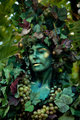
| 08/11/2009 05:19:37 PM | Vine Ladyby jnenvirComment:
Critique Club Critique
First Impressions
Hmm.. good potential, but snapshottish feel to it and blur issues. I gave this a 2 during voting.
Photograph Information, Technicals & Composition Review
Tough - with the image as is, I'd hazard a guess that either going for a very surreal and 'out there' kind of image: blurred up and processed heavily, or otherwise, maybe toning adjustments, as the greens clash. A shutter speed of 1/50 for street photography, is an unusual choice, unless you were aiming for some motion effect, in which case I think this needed more/slower shutter speed. But with an ISO of 500, it doesn't seem that that is the case.
Compositionally, I'm not sure what to suggest. I think definitely a big trim off the top would help, otherwise depends what you had to work with originally.
Comments, Score & Placement Review
403/418 - is low down, and your score of 4.47 is also telling of the reception of the image. I think it was both the subject matter, but also the way it has been portrayed (not focussed). As mentioned above, I think there is potential, but the model is not able to be directed by you and you take your time capturing an image, so you're left with trying to capture a street candid that requires a faster shutter speed and/or a variation in context/framing/etc.
You received two helpful comments, one of which extremely so.
Summary
Possibly good potential, but you need to be quick in these situations. Portraying your vision in an image is sometimes very difficult to do. Your viewers weren't there and all they see is a 'fresh take' on the 'frozen moment'. | | Photographer found comment helpful. |
| 08/11/2009 05:07:28 PM | Dorothy the Wizardby posthumousComment:
Critique Club Critique
First Impressions
Didn't get the connection with Oz when I voted this but did see it when I saw this image PC. I gave this a 5 during voting. First impressions, as best I recall were: regarding the title - Dorothy must have been a 'wiz' getting into a tangle with the balloon (yes, I know).
Photograph Information, Technicals & Composition Review
Nice composition and good moment capture. The b&w works quite well but there is some depth/drama lacking, in my opinion - just seems a little 'flat'. A more refined crop in a few places, albeit minor, would just 'finish' this off a little nicer.
I didn't 'notice' the ankles until I just read your comments.
Comments, Score & Placement Review
355/418 is lower down the pack than I would have guessed this would place. The image is quite sound in my opinion, perhaps just the subject matter didn't interest people that much, who knows. A score of 5.06 - well at least you made it over the 5 line..
Your one comment in Challenge likes the b&w processing.
Summary
A somewhat amusing capture, converted into an effective b&w image - for me, just a little more crazy processing, but that's just me - would have given it more of an edge, that I think would work well, given the situation. | | Photographer found comment helpful. |
| 08/10/2009 03:50:34 PM | Nightime Over the Ohioby jpochardComment:
Critique Club Critique
First Impressions
Quite a nice night shot, needs a slight perspective correction. I gave this image a 6 during voting.
Photograph Information, Technicals & Composition Review
With some of the lights starting to blend in together, I wonder whether you could have afforded to have a lower ISO, which would also have given a slightly softer feel. Although having said that, the processing has produced a fairly smooth feel. I don't know if you used a tripod or not, but there does appear to be some slight movement in the image - but that may be accentuated by some focal issues (difficult to judge). Perhaps also a slightly faster shutter speed... only by a few seconds.
Compositionally, because the image is weighted on the right hand side, there seems to be a lack of balance. The top area of the bridge so close to the top of the frame also enhances this, as does your framing. With a perspective correction and more finely tuned crop (difficult to make suggestions with the image as is), I think this would have produced a stronger image. Perhaps a square or even vertical framing might have worked for this shot, not sure.
Comments, Score & Placement Review
176/419 is a fairly good placing and the score of 5.77 is above middle of the road and for a Free Study, you are perhaps quite pleased with that. I guess the technicals and lack of 'drama' may have caused voters to move on fairly quickly from this 'scene'.
Two comments, one admiring the view/perspective and the other liking the capture. One mentions the border, which I tend to agree with - not sure it suits this image, but fairly minor.
Summary
If you get an opportunity to shoot this scene again, try experimenting with different technical settings, using a tripod and also trying to compose the scene in a balanced way - will help make life easier for you in pp. | | Photographer found comment helpful. |
| 08/09/2009 08:57:56 AM | Heritageby DigiFotoBuddyComment:
Critique Club Critique
First Impressions
I remember this one during voting. I liked the potential and the scene, I voted this a 6.
Photograph Information, Technicals & Composition Review
With an exposure of 1/25, I can see how the light would be overexposed in the windows, but you likely had the dilemma of poor lighting within the building. Maybe a deeper dof may have helped there, although having said that, the windows 'bright' do kind of add to the image - but I think it might be more interesting with some color there. Maybe a filter... not sure.
Composition wise: the tilt is unsettling but it looks like there may not have been much to work with to straighten - however perhaps a perspective correction may have been usable. the main dome at the top of the image is unbalanced and there are the tops of the columns poking in at the top of frame. One of those columns is missing and, while that is an interesting element of itself (and I did ponder it during voting), I think it is a detraction rather than an added element of interest, with the way the image is composed as is.
It is a fairly decent capture of the artwork and architecture, but it is seemingly all about the ceiling, but that is 'tilted' from the angle/perspective.
Comments, Score & Placement Review
300/419 is fairly low down the pack, although your score of 5.33 is not bad for a Free Study.
All of your comments are helpful and many provide some good honest feedback.
Summary
Good scene, variation in composition - possibly even with a really bold crop, if the quality was there, likely have produced a more interesting study into the interesting architecture. | | Photographer found comment helpful. |
| 08/09/2009 08:47:52 AM | Power And Strengthby Covert_OddityComment:
Critique Club Critique
First Impressions
I remember voting on this (gave this a 4). I remember wishing that the fore statue was in focus which I think would have created a stronger image.
Photograph Information, Technicals & Composition Review
Whilst the blue of the sky is quite nice, I think it causes the statues (and 'theme' of your image) to be less dominant, so I can't help but wonder about a toning applied and whether that would have created more drama in the image.
Perhaps a slightly deeper dof, or at least the fore statue the dominant focus - and perhaps also a slower shutter speed, to get the movement and shape and flow in the water, may have achieved more of what you seem to have been aspiring to (from your comments).
The tilt - yes, it works, it is 'ok', in my opinion, but I don't know that it is enhancing the image so much. I'd imagine that this straight but with an interesting angle, would perhaps be better - but of course, this tilt may be part of what you were aspiring to.
The contrasting overexposed areas of the water with the oof fore on the dark statue, are a little detracting and not working together that well.
Comments, Score & Placement Review
257/419 is fairly mid ground and not bad for a Free Study. Your score of 5.53 is quite good.
Most of your commenters really liked it, but with an average score from them of 6.5, makes me wonder where their scoring was.
Summary
I like the vision and think that a few more attempts at the scene may prove a challenge for you and allow you to 'achieve' what you have in your mind. Having said that, if this is your vision, then good - that's the main thing. | | Photographer found comment helpful. |
| 08/09/2009 08:31:50 AM | forest stream | San Gorgonio Wildernessby ErikTurnerComment:
Critique Club Critique
First Impressions
The big log. Nice water, color and scene, but the big log dominates too much. I gave this a 6 during voting.
Photograph Information, Technicals & Composition Review
On reading your processing, I can't help but wonder if the elements that you have enhanced are perhaps the elements that needed toned down. There does seem to be a touch too much contrast in places.
Composition wise: tough - the image is very busy, so much so that the more interesting elements, such as the stream, the flow and shape of the foliage on the slope and the interesting forest in the rear, all get lost. With the image as is, it is tough to suggest a crop, maybe going for a very bold crop on the right to bring just the stream and 'log' into play, not sure. There's no getting away from the big log and exposed root that dominate the image and compete with all the other elements.
More attention paid when 'in-situ' to angle and composition will make things a lot easier for you when it comes time to process the image and choose a crop and frame.
Comments, Score & Placement Review
Your one comment is helpful and perhaps reflects similar thoughts to what I was saying above.
A score of 5.26 is quite good for a Free Study and a placing of 318/419 is admittedly fairly low down the pack, but as mentioned above, there was probably nothing to hold the voters long enough to be drawn into the image and wander around.
Summary
A nice scene, but needs simplifying or otherwise a different vantage point to capture the feel a little more overall. | | Photographer found comment helpful. |
| 08/09/2009 08:17:53 AM | Disco Fever!by aliquiComment:
Critique Club Critique
First Impressions
Ah, look at that. You know I liked this and gave it a 7 during voting. First impressions, as best I recall, were: what is going on here.. where, what, how. Nice movement capture and the lighting really took this image to another level.
Photograph Information, Technicals & Composition Review
Reading your Photographer's Comments: "Slight rotate (by that I mean I flipped it over) " - funny - so he was upside down, ahh, it all makes a little more sense now.
Composition wise, I think the composition is strong and well placed, I like that you've flipped it and it does kind of go with your unique title. I really like the profile of his/her face and the lighting on it and the way that has caught the eye. The minor distractions in the rear, perhaps cloning out. Maybe, maybe a slight rotate to get the fore bar 'straight', but depends of course if you had the room to work with.
Comments, Score & Placement Review
199/419, tough one - I'm guessing you know this is a slightly 'out there' image, so would likely have never placed too high. It is disappointing, and I'm making a presumption, that most didn't stop to linger and appreciate what they were looking at. Which you certainly don't see often. A score of 5.69 - hm, a little low perhaps, but again, for a semi out of the box kind of image, that is probably pretty good.
Your commenters: all really liked it, hence your 7.42 score on average from them. No 'improvement' feedback - but it is tough with an image like this.
Summary
It's unique - I wonder about a print of this on a wall - but he/she would then need a name. That's just my warped mind. And what is he looking at... (don't answer, that's part of the interest in the image).
| | Photographer found comment helpful. |
| 08/09/2009 08:07:52 AM | High Ho Silverby pats66Comment: PS
I see this is your first Challenge entry. Congratulations on taking the plunge and welcome to DPC. | | Photographer found comment helpful. |
|
Showing 311 - 320 of ~4217 |
Home -
Challenges -
Community -
League -
Photos -
Cameras -
Lenses -
Learn -
Help -
Terms of Use -
Privacy -
Top ^
DPChallenge, and website content and design, Copyright © 2001-2025 Challenging Technologies, LLC.
All digital photo copyrights belong to the photographers and may not be used without permission.
Current Server Time: 06/18/2025 09:09:05 PM EDT.
|