|
|
|
Showing 3041 - 3050 of ~4217 |
| Image |
Comment |
| 01/13/2006 07:30:42 PM | Green Sees Redby KitaComment: I gave this a 5. The shapes were fairly 'strong' and sat well against the red background. The 'criticism' I had was that for a 'front on' shot, there seemed to be a slight 'leaning' at the top, going 'backwards' - if that makes sense. Also the 'barcodes' detracted (took attention away from the main subject(s)) a little, but not much you could have done about that. Honestly, I didn't 'connect' with the title 'pun' (play on words) while voting, but perhaps should have - it was a good use of title. Perhaps a slight variation in lighting, trying to create more 'depth' in the shot 'somehow', plus what I mentioned about the overall 'surface' of the cans/tins being 'level' - likely have given this even more impact in my opinion. Looks like you paid attention to the direction of the 'swirls' on the cans/tins and the direction of the writing, so well done, minor details like that will always help. On a closer look, not sure if you had these 'stacked on top of each other' (if so I bet they kept falling down and you had to 'prop them up' on the sides) or if they were flat on a surface and you took this 'overhead' - either way, I think a variation in lighting and either completely 'level' surfaces, or perhaps some type of variation to make one, or two, or whatever, 'pop up' to emphasize (make it stronger) the shape(s), may also have helped give this a little extra, not sure. edit:typos Message edited by author 2006-01-13 19:33:59. |  Photographer found comment helpful. Photographer found comment helpful. |
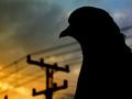
| 01/11/2006 07:02:06 PM | Pigeon Headedby briantammyComment: Unusual silhouette. The colors and lines in the background add to this in my opinion. Perhaps a little 'zoomed out' may have given this more impact, not sure. Also, whilst difficult to achieve, a fraction more detail in the edge of the silhouette/feathers, may have also given this something extra, in my opinion.
| | Photographer found comment helpful. |
| 01/11/2006 06:42:02 PM | hungby missinseattleComment: I gave this a 4. The main shape to me was the circle, the bell in the middle was of course another shape but not as 'classic' as the circle, and not what I would deem a 'classic bell shape' (if that makes sense). I think if you had incorporated more space around the circle (depending what you had to work with of course), this at 640 (height in this case) and sharper (looks more like 'blur'/shake issues rather than focus, but not sure), would all have made this better in my opinion. Also, minor, but your title draws attention (for those that read it) to the bell, which, although minor, detracts from the 'strongest shape' in this shot. | | Photographer found comment helpful. |
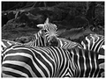
| 01/11/2006 06:27:28 AM | stripesby crayonComment: I gave this a 5. Definitely was more of a pattern shot than a shape shot in my opinion. The fact that the Shape Challenge followed the Pattern Challenge - didn't help a lot of people. Maybe, dependent on what you had to work with quality wise, a tighter crop/zoom in on a more distinct shape within the pattern somewhere may have helped this, not sure. As for your b&w v the color, my opinion is (especially after viewing the color), that, given the background in this shot and the amount of it, the color version works better (although the green a bit more vivid to boost the contrast would have helped in that in my opinion). Again though, a variation &/or tighter crop of this, would make the b&w more effective, in my opinion. edit to add:likely a 5 as well if you'd submitted the color version instead Message edited by author 2006-01-11 06:29:16. | | Photographer found comment helpful. |
| 01/10/2006 09:52:43 PM | Viola!by rebs138Comment: 3 - Good concept. The 'composition'/placement seems fairly good. Criticism; blurry mainly. Attention also paid to other aspects like the ceiling corners(?)/line reflected in the mirror, the few 'blown'/glare/reflection issues (but hard to control/adjust in basic) and the choice of cropping out part of the 'S' and the white 'something' cropped out (sorry don't know the correct term for it) would all have made this better in my opinion. Not sure that the b&w/toning works in this. | | Photographer found comment helpful. |
| 01/10/2006 09:43:02 PM | shape? twistedby Paxton215Comment: 4 - Like the concept. Coloring is nice and simple. Criticism; to me, the more definitive shape in this shot is in the wire fence, so more (and sharper) focus on that would have made this better, especially for the Challenge, in my opinion. 640 (width in this case) would also have helped this a lot. | | Photographer found comment helpful. |
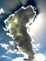
| 01/10/2006 09:28:43 PM | Heavens Lightby xXxscarletxXxComment: 6 - Like the cloud shape and light capture. Criticism; seems a bit of oversharpening on the edges, which for basic editing, was likely difficult to control. Contrast seems fairly good in the cloud itself but some minor issues in the sky, but again, difficult to control/adjust in basic. | | Photographer found comment helpful. |
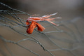
| 01/10/2006 09:28:11 PM | Shapely Barrierby neenee1999Comment: 7 - Like this. Criticism; mainly which it were a little sharper to show more texture, but you may have lost that good DOF so not sure. edit:typo Message edited by author 2006-01-11 00:48:09. | | Photographer found comment helpful. |
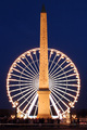
| 01/10/2006 09:26:35 PM | Giant pizza cutterby charieComment: 7 - Like this and your title. Criticism; difficult, but maybe cropping out the 'people' may have made this better in my opinion, not sure. Might just be the perspective/angle, but given the overall 'symmetry' and balance, looks like this needs a fraction nudge rotate up on the left, just seems 'slightly' off, but fairly minor. | | Photographer found comment helpful. |
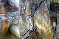
| 01/10/2006 09:23:41 PM | Fracture Zone — Pond Ice & Sandby Bear_MusicComment: 7 - Like it. Criticism; a little grainy upper left/dark areas. Nice simplicity. Want to say 'sharper', but likely is and difficult to discern at this size. | | Photographer found comment helpful. |
|
Showing 3041 - 3050 of ~4217 |
Home -
Challenges -
Community -
League -
Photos -
Cameras -
Lenses -
Learn -
Help -
Terms of Use -
Privacy -
Top ^
DPChallenge, and website content and design, Copyright © 2001-2025 Challenging Technologies, LLC.
All digital photo copyrights belong to the photographers and may not be used without permission.
Current Server Time: 06/26/2025 04:03:21 AM EDT.
|