| Image |
Comment |
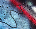
| 03/13/2010 04:08:15 PM |
Untitledby kleskiComment: 7 - I like the abstractness and the colors - can't help but wondering about focussing on a more interesting area of the image, i.e.: a tighter crop and even more abstract, if the quality was there (and maybe even if it wasn't). |
 Photographer found comment helpful. Photographer found comment helpful. |
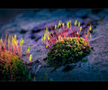
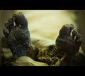
| 03/13/2010 04:06:40 PM |
Coming Back To Lifeby gyabanComment: 6 - I like the subject and for me, the beauty of the little scene and the light, are what appeal most and bring this closer to 'art', however I don't think the full potential has been reached. I also am distracted by the OOF fore on the left and the dark/black areas in the rear. |
| Photographer found comment helpful. |
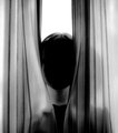
| 03/13/2010 04:01:19 PM |
untitled 4by tateComment: 7 - Personal preference, but I like this better with just the neck and head. |
| Photographer found comment helpful. |
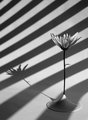
| 03/13/2010 04:00:16 PM |
Quantisation by paynekjComment: 7 - I like the quirkiness, but overall seems a little 'dull', color/tonewise. The perspective seems slightly tilted too. |
| Photographer found comment helpful. |
| 03/13/2010 03:59:07 PM |
Inglorious Expositionby JimiRoseComment: 7 - Like the texture that is visible and would like to see more of it, especially on both sides of the frame. |
| Photographer found comment helpful. |
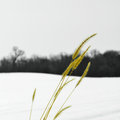
| 03/13/2010 03:57:59 PM |
untitledby davidwComment: 7 - Like the simplicity, the lines, curves, seemingly color on b&w aspect - given the image as is, perhaps the grass either sharper or softer for added effect - also does seem slightly unbalanced overall, whether because of the crop at the bottom and/or the amount of sky - not sure. |
| Photographer found comment helpful. |
| 03/13/2010 03:56:27 PM |
Hand Paintedby tehbenComment: 7 - Like the concept, would like to see more of the 'hand painting' (OOF fore berries/hips on hand) and perhaps a less 'horizontal framing' - just seems unbalanced, especially with the thumb/left side of the image, if you're keeping the fingertips in - but your call. |
| Photographer found comment helpful. |
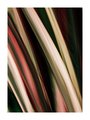
| 03/13/2010 03:54:53 PM |
Flowby MelethiaComment: 7 - Nice movement/texture abstract, I like the colors, but wonder about more saturation or hue - but that's just personal preference - not my call. A more refined crop, especially bottom left, to eliminate distractions, make it even better in my opinion. |
| Photographer found comment helpful. |
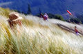
| 03/13/2010 03:53:19 PM |
Summerby rinacComment: 7 - Definitely a nice feel to this, which is enforced by your title. A few elements in the scene detract/distract my imagination though, i.e.: the blue pole(?) with yellow at the top, the 'busyness' in some parts, the windsock in front of the sign (fairly minor) and while also fairly minor, the slight tilt I just find distracts. |
| Photographer found comment helpful. |
| 03/13/2010 03:49:52 PM |
|
| Photographer found comment helpful. |
Home -
Challenges -
Community -
League -
Photos -
Cameras -
Lenses -
Learn -
Help -
Terms of Use -
Privacy -
Top ^
DPChallenge, and website content and design, Copyright © 2001-2025 Challenging Technologies, LLC.
All digital photo copyrights belong to the photographers and may not be used without permission.
Current Server Time: 06/17/2025 02:14:35 AM EDT.