| Image |
Comment |
| 11/22/2007 02:38:29 PM |
Love Lies Bleedingby JaymiComment: Nice image. Like your composition. Looks like a Chenille Plant or Red-Hot Cat's Tail - Acalypha hispida. |
 Photographer found comment helpful. Photographer found comment helpful. |
| 11/22/2007 02:34:35 PM |
Poppyby JaymiComment: Nice image of a california tree poppy. |
| Photographer found comment helpful. |
| 11/17/2007 06:37:33 AM |
|
| Photographer found comment helpful. |
| 11/17/2007 06:07:01 AM |
|
| Photographer found comment helpful. |
| 11/17/2007 06:04:53 AM |
|
| Photographer found comment helpful. |
| 11/16/2007 11:30:57 PM |
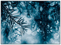
Hexagonsby krukvaextComment: Now that's a bokeh overload (I mean that in a good sense). Interesting image. Guessing it is too busy in color. Like to see more of a focal point though.. difficult. |
| Photographer found comment helpful. |
| 11/16/2007 11:29:00 PM |
Arches in the Blue.....by NikonJebComment: Nice image, but looks like some pixelation/something issues. Blue toning is nice, but I see traces of red, so not sure (for this Challenge). Fairly minor, but the symmetry seems out, but could be your intent. The gradient is nice - hopefully natural, 'in image'. |
| Photographer found comment helpful. |
| 11/16/2007 11:26:20 PM |
Pink Rose on Black...by 777STANComment: 7 - Nice image. Like the composition. Difficult, but my eye is looking for some balance at the top with the black, so perhaps the anthers, and that area, a bit darker - but unless you did that manually in pp, an overall contrast adjustment looks like it would blow that petal out. Like your tone choice. |
| Photographer found comment helpful. |
| 11/16/2007 11:24:22 PM |
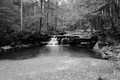
AveryTunnelby twade1Comment: Good potential. Looks like this is very grainy (and apologies if that is intentional), so you may have resizing/pp issues. This bigger (640), if the quality was there would be better. The tones are nice in this image but, I wonder about a variation for added effect, especially in this Challenge. |
| Photographer found comment helpful. |
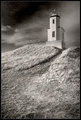
| 11/16/2007 11:22:15 PM |
Sentinel of Haro Straightby Sunshine86Comment: 7 - Nice image. Like your composition. Difficult, but the lighthouse either softer or sharper - just seems to be 'in between', if that makes sense. |
| Photographer found comment helpful. |
Home -
Challenges -
Community -
League -
Photos -
Cameras -
Lenses -
Learn -
Help -
Terms of Use -
Privacy -
Top ^
DPChallenge, and website content and design, Copyright © 2001-2025 Challenging Technologies, LLC.
All digital photo copyrights belong to the photographers and may not be used without permission.
Current Server Time: 06/27/2025 03:23:46 PM EDT.