|
|
|
Showing 231 - 240 of ~1263 |
| Image |
Comment |
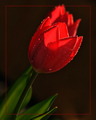
| 04/08/2008 03:25:33 AM | Morning Glowby gwe21Comment: Hi Erica. This shot is nearly a PB, so you can't complain there. :) This is a nice shot of this flower. When you are using a spray bottle, try to spray softer for larger drops, rather than blasting at full squeeze with lots of little drops. The exposure is pretty good, although I'd like to see a little more light on the green leaves, and a reflector would help to lighten the front of the flower too. I don't like the border at all. The red-on-black colour scheme is a very strong passionate scheme, and doesn't quite reflect the relaxation of 'morning glow'. Perhaps some orange sunlight falling across some pillows, or a cottage porch or rustic fence or something like would help to convy the relaxation of morning glow a little better? Just some thoughts, but in the end, well done on getting a top-2 image! (Oh, I just read the other comments, and I hadn't even realised this was 2 flowers! I thought it was all 1 flower, because they merge together) |  Photographer found comment helpful. Photographer found comment helpful. |
| 04/08/2008 03:18:25 AM | Dying of Thirst!by Dirt_DiverComment: Hi Joseph - here's a critique...
Nice graduated background colours, and the blue contrasts well with the red flowers - almost too well that the flowers are almost disconnected from the background in a disconcerting way. The blown highlight would be improved by moving the light further from the background, and maybe snooting it to get the edge shadows back. The dying flower is almost a silhouette here, making it lack interest next to the live flower. The crop is also wider than it needs to be, so the flowers get a bit lost in the big frame. So, a little more front fill-light on the wilted flower, a little less back light to remove the blowout and a slightly closer crop, and this image would be much improved. I also think it would be better a little smaller. Some images benefit from using the full 720x720 pixel size, but I do think some images just get lost in the maximum size, and this is one of them that would actually look more at home at 640x640. | | Photographer found comment helpful. |
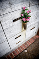
| 04/08/2008 03:11:06 AM | Remembranceby breadfan35Comment: Hi Chris, a critique for you...
I quite like this image. The partial desat and the limited DOF work well. I think the row of bricks and the rock on the ground are a little conflicting with the feel of the shot, and are a distraction. There's also a strange closed in feeling in the shot, and the viewer starts at the flowers, and is pushed down onto the blurry floor. It's not until the third or fourth jump back up the image that they might have time to read the name before their eyes fall back to the floor. Looking at this image is a bit like trying to climb a slippery wall. :) The left 3rd of the image never even gets a look-in. But as I said, I do quite like the effect and colours. | | Photographer found comment helpful. |
| 04/08/2008 03:02:25 AM | Watching the Dancersby OmanOtterComment: Hi Sean, here's a critique for you...
It's a pity this shot relies on it's title to explain what they are doing. The photo itself makes me wonder why these men are sitting there. There's a range of people and expressions, but they look a little bored. On the RHS, I would crop off the end of the row, and remove the blown-out highlight in the background. The backlighting gives a nice rim-light to define some outline points of each face. Some shadow adjustment in photoshop would help to bring up the rest of the faces to see their expressions better, and this would really help the viewer connect with the subjects. The overall photo looks a little crooked, and this might also be helped by cropping the RHS, so the eye has no reference to know it's crooked. :)
| | Photographer found comment helpful. |
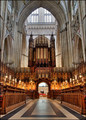
| 04/08/2008 02:53:45 AM | Gloriousby MelethiaComment: Hi Deb, here's a critique for you...
Interesting to look at the image below you in the scores - different place, but almost the same image! :) This is an amazing grand cathedral, and a good HDR shot. For me, the fact that it's not quite straight is rather unsettling. Being HDR, there is a lot of amazing detail here, but the strength of a good HDR is that the overall composition is still strong in the midst of the detail, and I feel that your image lacks a good focus point - a resting place for the viewer. Local contrast is maybe a little high, but exposure and colour are good.
| | Photographer found comment helpful. |
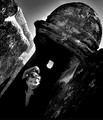
| 04/08/2008 02:46:13 AM | Tilt En Vogueby colorcarnivalComment: Hi Michelle, a critique for you. I actually really like this image, but I think your own comments probably sum up why it didn't score well. I think the tilt works really well. Particularly with his funky pose, it doesn't look odd that he's tilted. The highlight on the face is a big negative. Ideally, he would be shadowed with a diffuser, and maybe a reflector used to bring his face up a little, and maybe some lightening in PS. Ideally, I think he would be closer to the camera. There's a funny line on his collar. Maybe just a black t-shirt would be better. The high contrast editing is too much for me. I often do this, and have to look at it again the next day, and then add some fill-light. The heavy editing look to the sky would also bring the votes down I think. It is a nice effect, but looks unnatural. As another idea, it might be interesting to see this shot in colour, or maybe a selective desat. But overall, I think it's pretty cool. This is definitely worth going back there for a reshoot.
| | Photographer found comment helpful. |
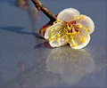
| 04/08/2008 02:35:22 AM | Blossom on Iceby Pug-HComment: Hi Pug, here's a critique for you.
These flowers are appearing in a few photos this month. Must be the right time of year. :) Interesting texture in the shiny paint. I don't think it quite looks like ice, but no matter. The colours are not bad, although a little shadow boost and saturation boost might help. Being a car, it's more a grey blue - perhaps a real blue blue might look nicer. The negatives for me are the crop and the lighting. The left side of the image isn't really adding anything. There's another reflection of something else there, as well as the flower stem and it's shadow, all distracting from the subject of the flower and it's reflection, and the line of the stem leads the eye out of the picture. I'd remove whatever else was making the other reflection. The shallow DOF is nice, although some of the petals are a little blurry. But a nice idea | | Photographer found comment helpful. |
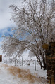
| 04/08/2008 02:28:00 AM | After the Stormby impilotComment: Hi John, here's a critique for you. Pug-H is getting ahead of me in the critiques, so I'm trying not to read his first. :)
I like the play of colours here with the blue strip of sky, and the all-purvasive browns in the foreground. I would tend to include a little more in this image. The tree on it's own is not enough. The posts are distracting sitting on the edges of the image like this. They don't quite work to define the image, and they aren't sure if they want to be in or out of the picture. Also, the vanishing point is close to the edge of the image. I'd like to see it included, and possibly even a little of the road beside. The line of a road can be a very powerful composition tool to direct the viewer's eye. | | Photographer found comment helpful. |
| 04/08/2008 02:17:13 AM | "1575" or "What Remains"by epescalaComment: Hi Lisa, here's a critique for you...
For me, composition is the main negative for this shot. There are a lot of competing lines - horizontals on the hedge, floor lines, and in the architecture, moving toward perspective diagonals, as well as many vertical details on the building. However, none of these lines are significant enough to form the important composition. Lots of detail lines, but no real composition. The centre of focus is probably the sticking out arch, which is on the right of the image, and looking right off the edge, so the viewers eye starts on the right of the image, and then gets pushed past the little background building and powerlines and off the right of the image.
The high contrast makes the image a little dark overall. Perhaps a little shadow boost in photoshop could help this, but I would try to find another viewpoint with better lighting, or maybe bracket the exposures and mix them in photoshop to get some shadow detail. The dramatic sky is nicely exposed.
| | Photographer found comment helpful. |
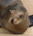
| 04/08/2008 02:02:40 AM | I am smiling!by actnoutComment: This looks to be a small crop from a much larger image. It may not be obvious at first glance, but it is quite apparent to the trained eye, and I see a few others commented on it too. You've obviously made the decision to crop right down, which is fine, but it's best to make this decision before the shutter is pressed, and get closer if you can. If this was a full photo of the seal's head, I would say crop it closer to get rid of the odd-looking pose and the distracting background, but it's already cropped beyond the technical limit, so maybe there was a wider composition that was usable? Anyway, enough about the cropping. Let's move on. The colours are slightly warm, which is not a bad thing here. The pose is a little odd, like a giant worm with a seal's head. :) The title is a little cheesy. It might have been better to go with the obvious "Seal", or better, the official name of this type of seal. I know it's fickle, but I think a cheesy title does actually pull down the score of the photo. Despite it's minor faults, I think this photo should have scored better than it did. | | Photographer found comment helpful. |
|
Showing 231 - 240 of ~1263 |
Home -
Challenges -
Community -
League -
Photos -
Cameras -
Lenses -
Learn -
Help -
Terms of Use -
Privacy -
Top ^
DPChallenge, and website content and design, Copyright © 2001-2025 Challenging Technologies, LLC.
All digital photo copyrights belong to the photographers and may not be used without permission.
Current Server Time: 08/06/2025 11:55:08 AM EDT.
|