| Author | Thread |
|
|
04/12/2008 01:34:34 PM |
|
I like the vibrant colors and high-contrast. |
|
 Photographer found comment helpful. Photographer found comment helpful. |
|
|
04/08/2008 08:13:26 PM |
|
Chris, I like this image and I know nothing about how you pp it only to say that I like the look of it. |
|
| Photographer found comment helpful. |
|
|
04/08/2008 04:14:52 PM |
|
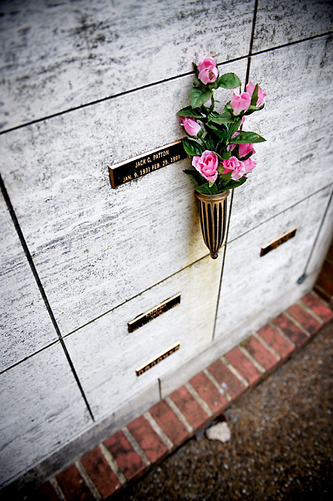
This is kinda a strange image because the technique used was very well done and the post processing was also of a high caliber. But were this goes wrong was in subject matter as its the only thing I can see that doesn't really pop for me. The problem is that theres nothing really unique about the photos subject matter(not every one knows who Patton was think that this is the famous general). Maybe if shot at a different angle so that you got more wall tombs in the photo and cropped the ground out to give it more of a never ending feel. But really this is a superb photo crisp, sharp and in my opinion worth much more then what it got. |
|
| Photographer found comment helpful. |
|
|
04/08/2008 01:17:57 PM |
|
I like your use of the vignette, specially with the title you used, it gives it a very intimate feeling. I like the gritty look you've given to the image. One thing I would change is the crop on the left side, i'd like to see the whole square instead of having it chopped off. Also, i'm not a fan of the brick in the bottom, but there is really nothing you can do about those. I think their colors competes with the flowers since the rest of the frame is sort of monochromatic or with very little color. Maybe you could desaturate very very little the bricks, so that there is still color in them, but a tad less (just a suggestion, it might not do anything for the image). Hope this helped |
|
| Photographer found comment helpful. |
|
|
04/08/2008 01:17:43 PM |
|
I really like the DOF on this shot and the way you processed it. I personally would have gave it a 10 and I don't see why it scored as low as it did. I think you got ripped off. Only thing I would have done different with this picture is clone out the rock at the bottom of the screen. Other than that this picture is very good. Great work |
|
| Photographer found comment helpful. |
|
|
04/08/2008 09:27:17 AM |
|
I do like the shallow DOF, putting the focus where it should be. The angle works, but I'm not a fan of the crop. I would like to see the entire square that belongs to the subject, and the corner on right side of the photo, IMO, needs to be gone. |
|
| Photographer found comment helpful. |
|
|
04/08/2008 06:26:36 AM |
|
Excellent composition with very good lines - the flowers, the name - those things are what one sees and is drawn back to. Tis is one of the few times I like the use of a vignette - it's not overdone and it serves a useful purpose. I like your chosen angle and DOF - both again serve to highlight the subject well. Overall it has a nice sense of peace. The only change I would suggest is cropping out the white object on the ground - if it has significance, it's lost at this size presentation. |
|
| Photographer found comment helpful. |
|
|
04/08/2008 03:11:06 AM |
Hi Chris, a critique for you...
I quite like this image. The partial desat and the limited DOF work well. I think the row of bricks and the rock on the ground are a little conflicting with the feel of the shot, and are a distraction. There's also a strange closed in feeling in the shot, and the viewer starts at the flowers, and is pushed down onto the blurry floor. It's not until the third or fourth jump back up the image that they might have time to read the name before their eyes fall back to the floor. Looking at this image is a bit like trying to climb a slippery wall. :) The left 3rd of the image never even gets a look-in. But as I said, I do quite like the effect and colours. |
|
| Photographer found comment helpful. |
Comments Made During the Challenge  |
|
|
04/04/2008 09:30:31 PM |
|
Sad fact of life. Well done. |
|
| Photographer found comment helpful. |
|
|
04/04/2008 09:25:28 PM |
|
Excellent use of DOF to draw the eye to the subject, and a good portrayal of an emotion. |
|
| Photographer found comment helpful. |
|
|
04/03/2008 10:28:20 PM |
|
Excellent DOF, a very moving photo |
|
| Photographer found comment helpful. |
Home -
Challenges -
Community -
League -
Photos -
Cameras -
Lenses -
Learn -
Help -
Terms of Use -
Privacy -
Top ^
DPChallenge, and website content and design, Copyright © 2001-2026 Challenging Technologies, LLC.
All digital photo copyrights belong to the photographers and may not be used without permission.
Current Server Time: 07/01/2026 10:56:15 AM EDT.