| Author | Thread |
|
|
04/09/2008 11:55:26 AM |
|
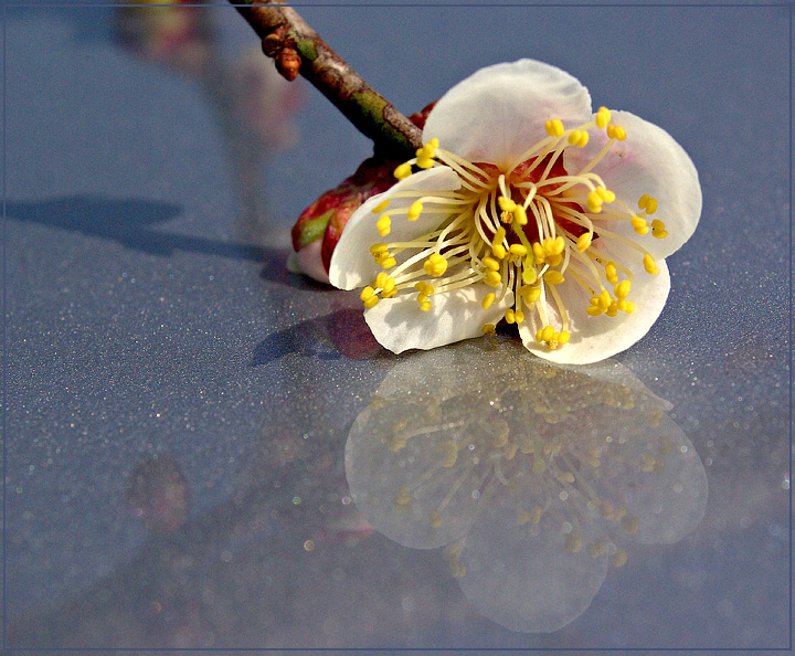
It's a nice shot, but I think there's too much of the car in it. I would have liked to see a tighter crop on the flower. The fact that the branch comes in from the top is a little weird. The reflection of the flower is nice. |
|
 Photographer found comment helpful. Photographer found comment helpful. |
|
|
04/09/2008 09:22:47 AM |
|
Well I thought this was beautiful and i gave this a 7 on the first pass and unfortunately did not have time for a second re-evaluation. I'm thinking there are two reasons why I did not give it a higher go around the first time. 1) The background noise. Not sure why it's there at ISO 200 but maybe because of saturation? and 2) I wanted to see more of the flower in focus because to me, that is the main subject. Not sure how you fix that at f22? Step back a little further? Anyway, I still like it lol. |
|
| Photographer found comment helpful. |
|
|
04/08/2008 07:39:42 PM |
|
For me, the reflections of the branches are distracting and take away from the rest of the image. Perhaps cutting the stem much closer to the flower....although from the reflections it looks like the branch might have been pulled down for the picture...not actually cut. I also don't want to sound like a broken record, but I think a tighter crop would help. |
|
| Photographer found comment helpful. |
|
|
04/08/2008 02:31:14 PM |
I definitely agree with Deb  Melethia on this one. A tighter crop would have been better, also focusing more on the flower/reflection. I like your idea of using the car for the reflection, I'll need to try that one of these days ;-) Melethia on this one. A tighter crop would have been better, also focusing more on the flower/reflection. I like your idea of using the car for the reflection, I'll need to try that one of these days ;-)
I slightly desaturated my 4th place shot (the petal) and then toned it a sepia colour while still having some of the original pinky colour. It's interesting and easy to do and makes quite a difference (just in case you want to try it).
All in all, you have a very nice image here, David. Sensitively photographed. |
|
| Photographer found comment helpful. |
|
|
04/08/2008 01:06:25 PM |
|
I had a really hard time seeing ice in this picture. I just kept thinking car metal or plastic. But I liked the bright flower and, thinking of ice, the brightness made me think of a very cold, bright, winter day. But I still couldn't see ice. Then I read your description that it is really the hood of your car... Anyhow, I like the bright colors. I think if you brought the forwardmost stamens into focus, and if you closed-up more on the flower with a soft bokah in the background, it would work better for me. |
|
| Photographer found comment helpful. |
|
|
04/08/2008 11:44:08 AM |
Great idea with the use of your car, I like the little speckles (water droplets? dust? dirt?) it works nice, specially the out of focus ones in the front. As mentioned by others, the extra reflections are distracting and the light seems a little bit too harsh. To soften the light you could hold a piece of white paper between the sun and the flower, assuming there's no wind, you should be able to use long shutter speeds to compensate for the loss of light. I think the paper would help soften the shadow. Something i'm not particularly liking is the stem, those red, green and brown tones seem very aggressive, contrasting with the peaceful look of the flower. Since you have control over everything, why not cut the stem off? or hide the stem behind the flower. Hope this helps
|
|
| Photographer found comment helpful. |
|
|
04/08/2008 07:17:41 AM |
|
there is something else in the reflection, cutting right through the blossom that really distracts. Also, when viewing this image, my attention is drawn more to the glitter of the paint than the flower. |
|
| Photographer found comment helpful. |
|
|
04/08/2008 05:23:33 AM |
|
First, I like the use of your car as opposed to ice - adds a nice texture that ice doesn't have and makes for an interesting reflection. Where yours differs from Irene's, I think, is the degree of simplicity. Yours has more to see, and consequently is more "cluttered". What I like about that are the different lines - the reflection of the stem, the shadow of it - but those elements are the ones that reduce the simplicity, the impact of the shot. For DPC purposes (and general KISS purposes, which I can't follow but can most definitely advise!) try a tighter crop, focusing on the flower and it's reflection. Not sure if you'd like it better or not. |
|
| Photographer found comment helpful. |
|
|
04/08/2008 02:35:22 AM |
Hi Pug, here's a critique for you.
These flowers are appearing in a few photos this month. Must be the right time of year. :) Interesting texture in the shiny paint. I don't think it quite looks like ice, but no matter. The colours are not bad, although a little shadow boost and saturation boost might help. Being a car, it's more a grey blue - perhaps a real blue blue might look nicer. The negatives for me are the crop and the lighting. The left side of the image isn't really adding anything. There's another reflection of something else there, as well as the flower stem and it's shadow, all distracting from the subject of the flower and it's reflection, and the line of the stem leads the eye out of the picture. I'd remove whatever else was making the other reflection. The shallow DOF is nice, although some of the petals are a little blurry. But a nice idea |
|
| Photographer found comment helpful. |
Comments Made During the Challenge  |
|
|
04/05/2008 11:43:57 AM |
|
Nice capture, the focus is kind of soft. |
|
| Photographer found comment helpful. |
|
|
04/04/2008 11:12:40 PM |
|
I don't care for the inner border, it's almost invisible in places. I think it either needs to go away or stand out more. Other than that, this is great. |
|
| Photographer found comment helpful. |
|
|
04/04/2008 04:48:19 AM |
|
Home -
Challenges -
Community -
League -
Photos -
Cameras -
Lenses -
Learn -
Help -
Terms of Use -
Privacy -
Top ^
DPChallenge, and website content and design, Copyright © 2001-2026 Challenging Technologies, LLC.
All digital photo copyrights belong to the photographers and may not be used without permission.
Current Server Time: 07/01/2026 02:12:56 AM EDT.