| Image |
Comment |
| 07/06/2005 04:03:21 PM |
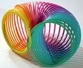
Slinkyby CreativeFlyPhotoComment: Good idea, great colors! I am not an expert on lighting so I can't make suggestions no the lighting, but the shadows being cast distract me. Maybe counter balancing the light on the other side would help? - 7 - JeB |
 Photographer found comment helpful. Photographer found comment helpful. |
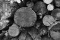
| 07/06/2005 04:02:31 PM |
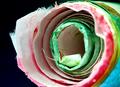
Rolled up handmade paper.by docpjvComment: I love handmade paper!!! It makes for excellent mats! There is a little bit of harsh lighting that distracts me a bit, as well as the front left paper in the foreground being out of focus. For some reason, my eyes keep looking at that point. - 6 JeB |
| Photographer found comment helpful. |
| 07/06/2005 03:58:08 PM |
Flowerby olhobemabertoComment: Not a traditional circle, and I can appreciate that. The harshness in the upper right in contrast with the excessive darkness on the left side throws me off a bit... - 5 - JeB |
| Photographer found comment helpful. |
| 07/06/2005 03:57:22 PM |
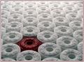
Heroesby Army of nOneComment: Neat concept and great execution! You've placed the focal point well off-center and it works well. I think the color balance could have been adjusted a bit. I think this would work stronger with a more vibrant red. - 8 - JeB |
| Photographer found comment helpful. |
| 07/06/2005 03:56:41 PM |
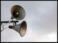
Loud and Clearby yael27Comment: Neat concept and good use of negative space. The frame bothers me just a bitwith the small pixel white border... it looks like the mast is just floating, which it isn't. - 6 - JeB |
| Photographer found comment helpful. |
| 07/06/2005 03:55:35 PM |
|
| Photographer found comment helpful. |
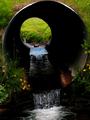
| 07/06/2005 03:54:34 PM |
Getting throughby lastefComment: Neat shot! I like this a lot... The top crop bothers me a little bit, being so tight but not perfectly tight. I don't know what I would do to fix it though... I'd have to see what a loose crop and a tighter crop would look like. Great clarity, focus, and saturation. - 7 - JeB |
| Photographer found comment helpful. |
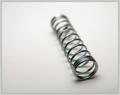
| 07/06/2005 03:50:42 PM |
"Sprung From The Pen...."by tfarrell23Comment: Neat shot, neat idea. I think this would have been a stronger image if I was looking a little bit more through the item... a little lower PoV. I like the shallow DOF used and good clean backdrop. - 7 - JeB |
| Photographer found comment helpful. |
| 07/06/2005 03:46:04 PM |
Tomatoesby christie3Comment: Neat shot - I'd like to see the color version of this to see how vibrant it was. Why the b/w decision? Neat composition, I like the 3 elements that you decided to use... a bit darker than it maybe should be on the right hand side? - 6 - JeB |
| Photographer found comment helpful. |
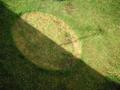
| 07/06/2005 03:36:42 PM |
sundialby melilabComment: Neat idea, but it seems to be lacking in "pop." Maybe a little tighter crop and more defined dial portion would make it stand out more to me? - 6 - JeB |
| Photographer found comment helpful. |
Home -
Challenges -
Community -
League -
Photos -
Cameras -
Lenses -
Learn -
Help -
Terms of Use -
Privacy -
Top ^
DPChallenge, and website content and design, Copyright © 2001-2025 Challenging Technologies, LLC.
All digital photo copyrights belong to the photographers and may not be used without permission.
Current Server Time: 08/16/2025 06:29:24 AM EDT.