| Image |
Comment |
| 05/08/2006 02:43:07 AM |
Careful, I spitby KelliComment: LOL. This animal reminds me of that old puppet "lambchops" (probably because of the expression). This has a snapshot quality about it, which may account for the score from "all users". A little more composition might have helped. |
 Photographer found comment helpful. Photographer found comment helpful. |
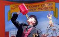
| 05/08/2006 02:38:55 AM |
Kook sets fire to Coney Islandby KelliComment: Nice placement of the central figure. The colors seem a bit faded to me (chiefly because gas containers are usually a vivid red and this one seems a bit washed out - of course it could be the sunlight, too). Good sense of humour in this one. |
| Photographer found comment helpful. |
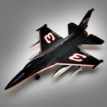
| 05/08/2006 02:34:16 AM |
Seniorby nards656Comment: Nice clean shot with an effective use of white space around the plane with gradual graying as you move away from the plane. There is a minor bit of room reflection around the fusilage, but I can't tell whether it is the camera or something else in the room. Getting rid of all traces of room reflection is a bear of a problem...but worth trying hard for the sake of the image. I don't get the title...perhaps I am just dense.
Generally, this is a good clean shot. |
| Photographer found comment helpful. |
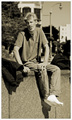
| 05/08/2006 02:28:17 AM |
No place to lie his weary head, but $5 richer this day.by ericwooComment: If I hadn't read your comments I wouldn't have found anything exceptional about this guy - except that he has an expressive face (that's probably because there is no way to photograph a person to reveal their speech). Fairly clean socks don't suggest hard times either. I do think this photo is a good portrait. I like the slight blurring of the background so as to reduce distractions. The monochromatic tone works well too. |
| Photographer found comment helpful. |
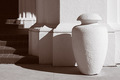
| 05/08/2006 02:21:22 AM |
Light and shadowby MelethiaComment: I like the geometric shapes, the pattern of shadows, and the duotone. Good focus too. Detail in the shadows is good too. Frankly, I don't know what you might do to improve on this, except to try and reduce the blown out light area on the right side of the vase/vessel. I would have scored this a 6 or 7. |
| Photographer found comment helpful. |
| 05/08/2006 02:15:14 AM |
Parade vendors appeal to all agesby MelethiaComment: I love the subject matter - the baby's reaction to Spongebob is priceless. On the other hand, I'm not sure it fits really well with the "photojournalism" topic, even with a fairly broad definition...unless we include the "neighborhood news" section of the local paper(in which case, almost anything goes).
I like the tight cropping for this picture because a wider picture would probably include a lot of distractions. The blurring of the background also helps focus on the moment and the baby. |
| Photographer found comment helpful. |
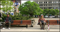
| 05/08/2006 02:06:10 AM |
Two worlds - One bus stopby timfythetooComment: I like this photo quite a bit. I read your comments before posting this comment. As far as I am concerned, "photojournalism" is a broad enough catagory to include this picture. It would have been nice if the background were not quite so distracting...but we don't get to place our bus stops where we like them. : )
Good crisp focus and colors. Since this wasn't posed I guess you got lucky with the umbrella and tennis ball. I love their body language too. I would have voted a 6 on this one, 7 if the background wasn't so busy. |
| Photographer found comment helpful. |
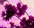
| 05/05/2006 03:40:26 AM |
Profiles of Purpleby KelliComment: Beautiful purples, but the complementary yellow color seems too washed out. I haven't read any other comments yet, but I suspect "focus" issues predominated. This would have been better, I think, if the yellows were more obvious and the flowers were more sharply focused. I like the composition. Nice use of diagonals. |
| Photographer found comment helpful. |
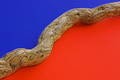
| 05/05/2006 03:36:04 AM |
Divisionby nards656Comment: Good job. Love the idea and the colors. The vine/wood piece seems slightly out of focus (unless it's my tired eyes that are not focusing). Other than that, I really like this photo and would have scored it a 6 or 7. |
| Photographer found comment helpful. |
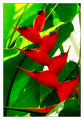
| 05/05/2006 03:33:04 AM |
Naturallly Complementedby ericwooComment: Good strong colors here...although the yellowish area of the leaves is a bit washed out on my monitor, I suspect from saturation. The composition is really helpful, too. I like how the flower and the leaves interact...at first glance they almost seem to be spiraling upwards together. The lines formed by the leaves and flowers give this photo a lot of abstract punch. |
| Photographer found comment helpful. |
Home -
Challenges -
Community -
League -
Photos -
Cameras -
Lenses -
Learn -
Help -
Terms of Use -
Privacy -
Top ^
DPChallenge, and website content and design, Copyright © 2001-2025 Challenging Technologies, LLC.
All digital photo copyrights belong to the photographers and may not be used without permission.
Current Server Time: 08/01/2025 01:32:39 PM EDT.