| Image |
Comment |
| 05/18/2006 05:11:51 AM |
|
 Photographer found comment helpful. Photographer found comment helpful. |
| 05/18/2006 05:05:37 AM |
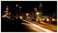
Twinkle, Twinkleby ericwooComment: I thought this picture was done well. I like the range of tones from white lights to pitch black sky and left foreground. I like the inclusion of the foreground because it balances the skyline and helps add depth to the photo. The leading lines of the road way draw my eye into the heart of the picture. The star-burst street lights are an added plus. |
| Photographer found comment helpful. |
| 05/18/2006 05:01:50 AM |
Mission San Jose, founded 1720by MelethiaComment: I think the floor area in this photo is a bit washed out. I think a bit more darkening would have solved that and given the whole picture more crispness. I might have cropped out the little piece in the upper right hand corner because my eye keeps going up there and that is not the focal point of the photo. Composition is otherwise excellent. The colors are good, the subject matter is intriguing, and the photo has even more potential. Judging by the scores, I think I might be more critical than most voters who seem to like it even more. |
| Photographer found comment helpful. |
| 05/18/2006 04:55:35 AM |
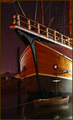
The Santa Mariaby timfythetooComment: I liked this shot a lot. The noise in the sky was a little distracting, but other than that, I liked the colors, lighting, focus, and subject matter. I gave it an 8. |
| Photographer found comment helpful. |
| 05/18/2006 04:47:25 AM |
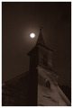
St. Joseph'sby DanSigComment: Technically, this photo is very good. Clean lines, sharp detail and good tonal range. I think it did not score higher because it lacks impact. Composition might have been improved by shooting from an angle rather than straight on, or backing up and putting the buildings off-center, or perhaps cropping much of the sky out (or alternatively to add much more sky to emphasize the upward sweep metaphorically). I'm not sure about this, but think the photo needed a bit more punch. |
| Photographer found comment helpful. |
| 05/14/2006 02:19:58 PM |
|
| Photographer found comment helpful. |
| 05/14/2006 02:10:40 PM |
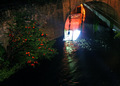
Abandon all hope....by Elvis_LComment: This is a nice image under difficult lighting. I wish the shot were not cropped at the top (if indeed it was cropped) to give the archway a bit more framing. I like it this way too. Good composition. |
| Photographer found comment helpful. |
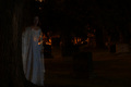
| 05/14/2006 01:58:42 PM |
Lost in Memoriesby BrielleComment: I really like this idea, but the background is so dark on my monitor that I almost missed what you were doing. Composition is good (what I can see of it). I am sorry I can't be more positive, I think this could have been a ribbon. |
| Photographer found comment helpful. |
| 05/14/2006 01:00:58 AM |
|
| Photographer found comment helpful. |
| 05/14/2006 12:59:38 AM |
|
| Photographer found comment helpful. |
Home -
Challenges -
Community -
League -
Photos -
Cameras -
Lenses -
Learn -
Help -
Terms of Use -
Privacy -
Top ^
DPChallenge, and website content and design, Copyright © 2001-2025 Challenging Technologies, LLC.
All digital photo copyrights belong to the photographers and may not be used without permission.
Current Server Time: 08/02/2025 02:04:31 AM EDT.