| Author | Thread |
|
|
05/30/2006 06:03:49 PM |
I love the natural warm Antique feel to this classic image..... Maybe just a little too tightly cropped as some areas are a little busy.
I missed this in the challenge, and really like it a lot.....
I would like to see more of the dark sky, as it has a "magic" feel to it.
Message edited by author 2006-05-30 18:05:12. |
|
 Photographer found comment helpful. Photographer found comment helpful. |
|
|
05/25/2006 11:15:37 PM |
hello again,
i apologize for the delay on this one.
i like this shot a lot.
my only real problem is the top mess of cables and masts and stuff. unsure how to fix it. |
|
| Photographer found comment helpful. |
|
|
05/21/2006 01:38:33 PM |
I like this. Its busy, but not too crowded a composition. The viewpoint works well, even if it was the only angle you could get. I have to admit I don't personally like the border - maybe I've been around dpc too long, 'cause I used to like that style of border.
I can't quite put my finger on it, but there's something about the top railings that isnt quite right - possibly a little oversharpened?
Its a good clean, dynamic image, deserving of its score/placing. I know you were stuck for choice with the angle, but I'd like it if there was nothing distracting behind in the b/g. |
|
| Photographer found comment helpful. |
|
|
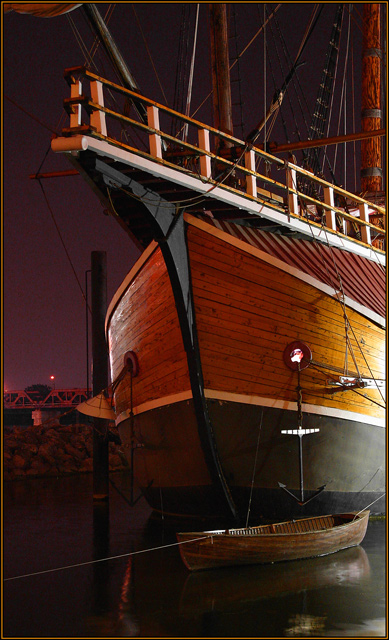
05/18/2006 07:04:23 AM |
[[trading post]]
lovely image, composition and lighting is perfect, the only distracting thing is the small piece of sail that is visible in the top left corner. |
|
| Photographer found comment helpful. |
|
|
05/18/2006 04:55:35 AM |
|
I liked this shot a lot. The noise in the sky was a little distracting, but other than that, I liked the colors, lighting, focus, and subject matter. I gave it an 8. |
|
| Photographer found comment helpful. |
|
|
05/17/2006 08:08:00 PM |
Trading Post comment
Caution - night photography can be addicting. I've only tried it once, but it's very seductive. I'd never have thought this was in Columbus, Ohio, nor would I have thought it a scale replica. Excellent job in disguising both facts. I gave this a 7 - really like the tones and the perspective, and the light on the right is both intriguing and creates lovely reflections on that side. Another excellent score, too! |
|
| Photographer found comment helpful. |
|
|
05/17/2006 05:43:54 PM |
Trading post...
WOW! This is really an eyecatching photograph! The wood colors are excellent and the small craft at the bottom is really popping. I think the angle is fantastic. The only advise I could offer on this would be to crop from the top just a tad to eliminate that small piece of sail? or whatever is hanging there. You would still have all the lines and poles going up without that grabbing your eye. |
|
| Photographer found comment helpful. |
|
|
05/17/2006 06:02:17 AM |
Hey there from the Critique Club
Alright...how the heck does this keep happening. I make a Trading Post comment, then I pull yours from the CC. Well, her goes...
Camera Work/Technical: Great focus. Everything is very crisp and crystal clear. Nice choice of the high ISO to keep the shutter speed as quick as possible. That ocean can be tricky, even in calm water. I also like the depth of field choice here. Everything that the eye can see appears to be focused. The background is a little too noisy. If you shoot in RAW, upping the shadows would help out a lot. As far as PP, I have no idea.
Lighting: Excellent, excellent lighting. The available lights give this shot a really nice, peaceful feeling. No area is overexposed and no area is underexposed.
Composition/Content: Stupid kids, but you still put together a great composition. Your leading lines are near flawless here. Starting with the skiff line, the eyes are pulled into the frame and all around to the various elements. Your texturing and coloring here is terrific. My only critique for the composition would be to remove just a little bit off of the top to get rid of that object in the upper right corner.
My Opinion: Excellent capture! I really don't think that this one ended up with the score it deserved. This is especially cool since it was your first night shoot. You got a great eye. |
|
| Photographer found comment helpful. |
|
|
05/17/2006 05:25:44 AM |
--Trading Post--
HA, I beat you this week by a mere 0.001. I do like this shot quite a bit, but I'd like to see you shadows a bit deeper and darker. Upping the shadows would have done wonders for that noisy sky in the background, and would have probably vaulted you well ahead of mine. Nice work! |
|
| Photographer found comment helpful. |
Comments Made During the Challenge  |
|
|
05/16/2006 06:05:20 PM |
|
Great DOF, looks like a painting |
|
| Photographer found comment helpful. |
|
|
05/16/2006 02:45:05 AM |
|
Nice composition and lighting. Well done! |
|
| Photographer found comment helpful. |
|
|
05/15/2006 12:50:23 PM |
|
I like this shot, good colors and compositon. Well done. |
|
| Photographer found comment helpful. |
|
|
05/14/2006 10:07:53 PM |
|
The little wooden rowboat in the shadow of the great Santa Maria is perfect. |
|
| Photographer found comment helpful. |
|
|
05/13/2006 10:35:03 PM |
|
very nice lighting on this. Needs to be cropped just a tad on the left. Small remnant of light is distracting. Great photo...10 |
|
| Photographer found comment helpful. |
|
|
05/13/2006 12:16:28 PM |
Image is well lit. I might have tried to use a more shallow DOF to blur the dock and the light in the background. The light on the right is a little distracting.
Good luck |
|
| Photographer found comment helpful. |
|
|
05/13/2006 11:37:06 AM |
|
Yikes dude, this is an excellent shot, and stopped me in my voting tracks (I usually come back and comment after voting is done). I think this photo is an outstanding accomplishment. I love the choice of composition/crop, which works especially well due to the presence of the small boat at the bottom. If not for that, the crop on the larger ship would look awkward and unnecessary. The detail and texture throughout the photo are outstanding, my eyes just want to roam from top to bottom and from side to side, always finding something new to study and appreciate... I swear I've been hung up on this shot for 5 minutes now. I've got to move on, but I'll be back to read your photographer's comments after the challenge. Well done!! |
|
| Photographer found comment helpful. |
|
|
05/12/2006 05:34:46 PM |
|
Normal subject but well done 7 pionts from me and one of best .. ice |
|
| Photographer found comment helpful. |
|
|
05/12/2006 03:41:58 PM |
|
|
|
05/12/2006 10:46:30 AM |
|
I love contrast between Santa Maria nad a small boat next to it. It's almost like a family picture. The sky is quite noisy, but the composition, colour, capture is divine. 9. |
|
| Photographer found comment helpful. |
|
|
05/12/2006 03:08:20 AM |
|
This is a nice photo, I like the perspective. It's a little too dark at the bottom and IMHO would have looked sharper with more water reflection/detail since the eye focus falls there in the black spot first. Overall it's interesting and pleasing to look at. Nice work. |
|
| Photographer found comment helpful. |
|
|
05/11/2006 04:49:19 PM |
|
| Photographer found comment helpful. |
|
|
05/11/2006 09:02:42 AM |
|
Very nice tonage! <---is that a word? I really like the feel, and the color coordination to the mood. I could certainly see it on my wall. GL |
|
| Photographer found comment helpful. |
|
|
05/10/2006 11:55:53 PM |
|
| Photographer found comment helpful. |
|
|
05/10/2006 09:51:02 PM |
|
Nice. My eye does get distracted by the brightness on the right, but nothing a bit of PS burning wouldn't fix. Good job. |
|
| Photographer found comment helpful. |
Home -
Challenges -
Community -
League -
Photos -
Cameras -
Lenses -
Learn -
Help -
Terms of Use -
Privacy -
Top ^
DPChallenge, and website content and design, Copyright © 2001-2026 Challenging Technologies, LLC.
All digital photo copyrights belong to the photographers and may not be used without permission.
Current Server Time: 06/28/2026 11:13:57 AM EDT.