| Author | Thread |
|
|
05/25/2006 11:03:14 PM |
hello again,
sorry for the delay in this one.
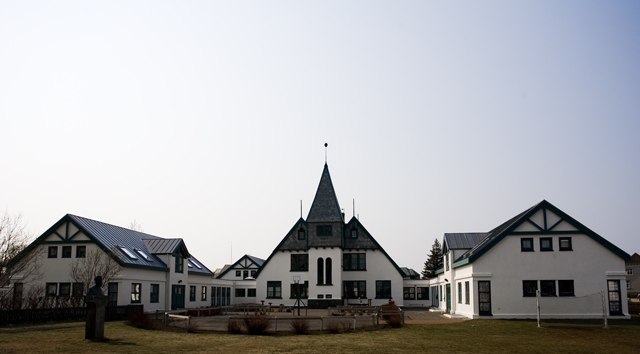
i thought it was a bit average. the sky was burnt and uninteresting. the white church (though symbolic) was uninteresting, and the placement of it all seems a bit touristy.
from the looks of it. ifn you could have moved over to the left a bit. you could have salvaged the sky and captured a more unique perspective of the church. possibly getting a bit more detail out of the statue in the foreground. |
|
 Photographer found comment helpful. Photographer found comment helpful. |
|
|
05/21/2006 01:31:57 PM |
You've got a good composition here, but because of the harsh lighting there's not a lot of contrast, and the sky is very washed out. It could have been helped by a graduated filter, or, if it had been advanced editing, combining two RAW exposures, to keep some detail in the sky.
I hope you don't mind, I had a play around in PS elements wth it. I was struck by the impact of the almost symmetrical shapes of the buildings, and the dynamics of the outline. Although I'm not really into digital art, this one was screaming out to be made into a high-contrast graphic.
So, just for a bit of fun (hope I havent tainted the integrity of the photo :P):

edit: duh, forgot how to post thumbs for a second there
Message edited by author 2006-05-21 13:32:39. |
|
| Photographer found comment helpful. |
|
|
05/20/2006 07:00:52 PM |
Trading POst -
I didnt get around to voting in this challenge. I would have scored this a 4 or 5. The focus seems off on the whole shot - a bit too blurry. The sky could have been cropped out some more as it really doesnt have any detail or color that adds anything to the shot overall. The buildings are cool but a bit far away. Maybe if you had focused on the middle building by itself and left the other two out it could have been a more interesting shot. |
|
| Photographer found comment helpful. |
|
|
05/18/2006 04:47:25 AM |
|
Technically, this photo is very good. Clean lines, sharp detail and good tonal range. I think it did not score higher because it lacks impact. Composition might have been improved by shooting from an angle rather than straight on, or backing up and putting the buildings off-center, or perhaps cropping much of the sky out (or alternatively to add much more sky to emphasize the upward sweep metaphorically). I'm not sure about this, but think the photo needed a bit more punch. |
|
| Photographer found comment helpful. |
|
|
05/17/2006 08:02:00 PM |
Trading Post comment
I gave this one a 5. I think it would be much more dramatic in black and white due to the limited color naturally available. I do rather like the centered composition as it suits this structure well. Though it makes for unusual proportions, I think it looks better if the sky is cropped significantly. |
|
| Photographer found comment helpful. |
|
|
05/17/2006 05:37:10 PM |
Trading post...
There seems to be too much to look at in this picture. It's nicely composed but distant. Also, my eye seems to be drawn to the tree slash person looking thing (maybe a statue in front of a small tree?). I think a tighter crop of just the central building would have done better, IMHO. |
|
| Photographer found comment helpful. |
|
|
05/17/2006 05:13:00 AM |
--Trading Post--
Interesting composition. I think that you met the challenge just fine, but you included too much for the voters to look at. Its just a bit busy. A different point of view would have vaulted this one into a much better score. |
|
| Photographer found comment helpful. |
Comments Made During the Challenge  |
|
|
05/16/2006 07:22:20 PM |
|
the blue fading to white in the sky is very nice but i would have less forground in the image. |
|
| Photographer found comment helpful. |
|
|
05/14/2006 01:48:03 PM |
|
The image is a little boring and doesn't really jump out at you. |
|
| Photographer found comment helpful. |
|
|
05/13/2006 10:06:03 AM |
|
Nicely framed. I think I would like to see less of the sky. All that bright sky may be what is driving the building into under exposure. Maybe try a different time of day. |
|
| Photographer found comment helpful. |
|
|
05/12/2006 07:58:10 AM |
|
Hard shot to compose. I think it's lost in the buildings made out of ticky-tacky on either side. I doubt that I could have done better, but there you go... |
|
| Photographer found comment helpful. |
|
|
05/11/2006 12:00:46 PM |
|
Image doesn't seem quite in focus. Lots of bland, washed out sky that does not add to the photo. |
|
| Photographer found comment helpful. |
|
|
05/10/2006 04:48:26 PM |
|
IMHO there is too much sky in this photo considering the sky isn't very interesting. The horizon line where the eye falls is too low. Nice clarity on the rooftops, but think your camera might could have given you more with this shot. |
|
| Photographer found comment helpful. |
|
|
05/10/2006 04:11:12 PM |
|
While probably a very nice place, the image seems flat. |
|
| Photographer found comment helpful. |
|
|
05/10/2006 02:00:58 PM |
|
Blown sky. :( symmetric shot. :( dull colors. :( that's tough. Well, people say they like to know why people vote low. 4. |
|
| Photographer found comment helpful. |
Home -
Challenges -
Community -
League -
Photos -
Cameras -
Lenses -
Learn -
Help -
Terms of Use -
Privacy -
Top ^
DPChallenge, and website content and design, Copyright © 2001-2026 Challenging Technologies, LLC.
All digital photo copyrights belong to the photographers and may not be used without permission.
Current Server Time: 06/28/2026 03:49:26 AM EDT.