| Image |
Comment |
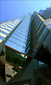
| 07/11/2006 01:28:38 AM |
Glass Towersby timfythetooComment: I like this photo quite a bit. I especially like the lower panels and the reflections in them. I didn't vote in this challenge, but would have scored this a 7. The only change I would consider would be to add a bit more saturation as the picture seems a bit hazy to me because of the pastel sky tones. (of course that could also be my monitor.) |
 Photographer found comment helpful. Photographer found comment helpful. |
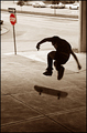
| 07/11/2006 01:25:08 AM |
No Skateboarding Allowedby timfythetooComment: My giving you a critique is like the student correcting the professor...it is seldom warranted. Be that as it may, I will add my 2 cents: I like the stop sign in red and everything about the skate board and rider...the blur is fine. The only thing I might suggest is to crop the line of cars out of the picture at the top and the front of the car on the left. This would mean the stop sign is pretty close to the edge and the one way sign might be cropped out altogether. But when I simulate the crop this way it makes for a cleaner picture and I prefer it that way. |
| Photographer found comment helpful. |
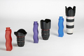
| 07/11/2006 01:14:24 AM |
shapes and sizesby DanSigComment: I like the colors of the bottles and the lighting in this photo. The focus looks a bit soft to me, but I tend to like softness in images. Given the limitations of this challenge I am not sure I would recommend anything else. |
| Photographer found comment helpful. |
| 07/02/2006 04:06:53 PM |
|
| Photographer found comment helpful. |
| 07/02/2006 08:36:31 AM |
Growing Wildby KelliComment: Trading Post
I love the color and the focus. Nicely done. Bokeh could have been a larger feature by cropping further out from the flower. Over all, though I think this is one of your better efforts. I would have given this a 6, possibly 7 with more bokeh. |
| Photographer found comment helpful. |
| 07/02/2006 08:33:29 AM |
End of the worldby KelliComment: Trading Post
I would like to have seen this be a bit sharper. I like the idea a lot and the composition is good. B&W is a good choice given the subject matter. I would have given this a 5 if I had been able to vote. It's just to blurred for my taste. |
| Photographer found comment helpful. |
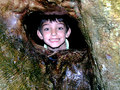
| 07/02/2006 08:30:01 AM |
Stuckby KelliComment: Trading Post.
I like the framing and the expression on the boy's face. I might have cropped this a bit closer to emphasize the boy rather than the frame...but either way it works for me.
The lighting seems harsh...like the flash was working overtime. The effect is to put light a bit unnaturally on his face.
I was out of town and couldn't vote. But had I been able, this would have been a 5, perhaps 6, for me. I think it is better than the scores indicate (a score of 1,2,or 3 seems pretty harsh, IMHO) |
| Photographer found comment helpful. |
| 07/02/2006 08:23:23 AM |
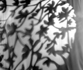
Trees on a fenceby KelliComment: Trading post
I am afraid this is going to sound like a broken record, but I also think that the focus is off and the shadows are not crisp. I didn't vote in this challenge because I was out of town, but I probably would have been in the 4 - 5 range. I almost think this might have been better if the crop was not so close...to give more perspective at what I was looking at (beyond a shadow)...is it a window? ...a wood carving? I can't tell. (o.k. I just saw the title. Now I know what I am looking at. All the same the picture didn't really clue me in.) Message edited by author 2006-07-02 08:24:53. |
| Photographer found comment helpful. |
| 07/02/2006 08:18:10 AM |
Beyond Understandingby nards656Comment: Trading Post
This one is too processed for my taste especially the leaves in the background. I am not sure I get the point of the shot...looks like he is just hanging out on the deck, so I am afraid I don't see the "desolation". The black area lacks definition so I can't tell what it is. The culmination of all of this is that I really can't quite figure this one out, I am sorry to say. I didn't vote in this challenge, because I was out of town. It's probably just as well as I wouldn't have helped your score any given my inability to figure it out and the extent of the PP. lol. |
| Photographer found comment helpful. |
| 07/02/2006 08:12:30 AM |
Mickey to the Rescueby nards656Comment: Trading Post
I like the idea, but the colors are a bit over the top for me. I was out fo town and couldn't vote, but I would have scored it a 5 or 6. I would have leaned toward a higher score if the colors weren't so saturated (especially his hat, which has few details). |
| Photographer found comment helpful. |
Home -
Challenges -
Community -
League -
Photos -
Cameras -
Lenses -
Learn -
Help -
Terms of Use -
Privacy -
Top ^
DPChallenge, and website content and design, Copyright © 2001-2025 Challenging Technologies, LLC.
All digital photo copyrights belong to the photographers and may not be used without permission.
Current Server Time: 08/05/2025 12:12:51 AM EDT.