| Image |
Comment |
| 07/27/2005 12:23:20 PM |
Moonlight Melonby ShutterPugComment: Everything here is at work. Very nice composition. Lighting is fantastic. Focus is beautiful. It really shows the deep texture of the melon. Very creative. I like the border too. Very well done. Keep up the good work. |
 Photographer found comment helpful. Photographer found comment helpful. |
| 07/26/2005 02:40:15 AM |
This Time, I'm Gonna Get Youby AlainComment: I really like this shot Very creative with what would have been just another golf shot. Had the two golfers in the rear not been present this would have been an even better shot. The focus was lost unfortunately on the grass in front of the golfer but still a nice shot. His face is a little too dark. Everything else is very pleasing to look at. Nice job. |
| Photographer found comment helpful. |
| 07/26/2005 02:19:18 AM |
Water T-Ballby DaMoNarchComment: Suffering from a lack of subject focus. The face is too dark. A fill flash would have helped and it may have suffered from the wrong ISO. Could be my monitor. I wish we had the ability to zoom in on the pictures submitted. It would be tremendously helpful. It looks like a very fun game. At over a 100 degrees today I wish I was there. |
| Photographer found comment helpful. |
| 07/25/2005 05:55:59 PM |
|
| Photographer found comment helpful. |
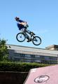
| 07/25/2005 01:58:10 PM |
360 Lookbackby liv4him330Comment: Very nicely done. A few minor flaws but overall you managed to capture a very impressive stunt. The rider could have been in focus and would have added to the shot. I know you couldn't move the building in the background but, it is distracting. Maybe less DOF would have blurred it out. The composition is fine. Maybe if you had gotten closer and lower to the ground you could have captured him in nothing but sky. I shoot at a local skate park and I actually lie on the ground and shoot up. Although only with the riders I am familiar with. Exposure seems fine also. Overall I really like the shot except the fore mentioned flaws. Great job. Keep up the good work. |
| Photographer found comment helpful. |
| 07/25/2005 02:28:41 AM |
beachby DebohComment: The first thing that hits me is the big empty space on the right. The back ground if very over powering. Try less DOF. Rule of thirds would have helped this shot quite a bit. Had you composed the shot more to the left and given a bit of the defense it would have faired much better. The focus is suffering here also. It's tough to catch a moving tatget like that but keep up the work. I sense the force is stong in this one...hahaha just a little lame Star Wars humor. |
| Photographer found comment helpful. |
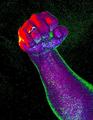
| 07/25/2005 01:12:45 AM |
The Colors of Defianceby SJCarterComment: This is a little difficult to critique. There are too many ways in which you can view this photo. The colors are very dramatic as is the statement. It conveys an array of emotions depending on the viewers state of mind. It could be anger or happiness, victory or defeat. It could mean acceptance or defiance. My immediate impression was victory due to my state of mind. As I viewed it later other emotions and impressions came to mind. I like it beacause of the diverse meanings. On a technical note it may have been over saturated and a bit too much contrast. Composition is great. Lighting was very creative. I would like to see the original to compare what has been done. The focus could have been better but I think all of these issues can be cast aside if you are viewing from another perspective. It meets and falls short of so many different planes. Over all I really enjoy the picture and would love to see more like it. Very fine job. Keep up the good work. |
| Photographer found comment helpful. |
| 07/24/2005 03:21:19 PM |
The single mom. by docpjvComment: What a fantastic shot and it really hits the Challenge. It is very pleasing and well rounded. The shot causes the eye to wonder comfortably through out the shot. There are no over powering areas. Even the background is pleasant and adds to viewing. The only thing I could possibly be critical of would be the mothers face. It may be my monitor but it seems a bit too much sharpening was used. Again It may be my monitor. Over all this is the nicest picture I have had to critique and by far the easiest. PERFECT. Well done keep up the awesome work. Message edited by author 2005-07-24 15:22:10. |
| Photographer found comment helpful. |
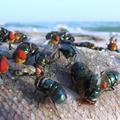
| 07/24/2005 03:00:59 PM |
Seaside Nurseryby rox_roxComment: Oh the smell...make it go away!
Uhhhgg. I have to take this shot in increments. Everything seems to be in order here. DOF is great. Subject matter is definately there. Focus is awesome. I can even see the little fly sucker attached to the fish. The only thing I see wrong with this photo other that the photo itself is the flies eyes. Something is off here and I am sorry I cant put my finger on it. Maybe over sharpened? Would love another opinion from one of the senior members. Maybe they can pick it out. This is technicaly a very good picture. A bit too disturbing for me though. I am just thankful that it's fish and not there favorite food. Keep up the good work. Very nice. No fish tacos for a month though. |
| Photographer found comment helpful. |
| 07/20/2005 12:44:37 AM |
On Deck.jpgby rasdubComment: Interesting composition. Sports shots are my favorite. If you could have held off just long enough to catch the ball this would have been 100x better. Not taking anyhting from this shot it is still an impressive shot. Can I go with you next time these are nice seats. |
| Photographer found comment helpful. |
Home -
Challenges -
Community -
League -
Photos -
Cameras -
Lenses -
Learn -
Help -
Terms of Use -
Privacy -
Top ^
DPChallenge, and website content and design, Copyright © 2001-2025 Challenging Technologies, LLC.
All digital photo copyrights belong to the photographers and may not be used without permission.
Current Server Time: 08/04/2025 08:22:13 PM EDT.