| Image |
Comment |
| 06/24/2003 06:19:22 PM |
Hot Jobby DennisFComment: Men at work. Definately meets challenge. I do think it would have been better in color. The sepia tone just doesn't seem to go here. 5 Good luck in the challenge. |
 Photographer found comment helpful. Photographer found comment helpful. |
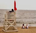
| 06/24/2003 06:17:26 PM |
On Dutyby JB707Comment: It looks cold here. Perhaps it's the lighting or it just plain was a cold day. This picture could probably have been in better focus. I'm not able to read the sign. You did meet challenge, however, it might have been nice to see the front of the lifeguard stand. 5 Good luck in the challenge. |
| Photographer found comment helpful. |
| 06/24/2003 06:13:56 PM |
In The Saddleby RuchartComment: I'm not so sure I like the angle of the shot. Otherwise a very nice photo of a working person on the job. Definately meets challenge. 6 Good luck in the challenge. |
| Photographer found comment helpful. |
| 06/24/2003 06:10:52 PM |
Measure Twice Cut Onceby autoolComment: Nice clear picture and definately meets the challenge. Might have been better to take the picture the other way or at an angle where you can see the faces of the men, but this works okay too. 7 Good luck in the challenge. |
| Photographer found comment helpful. |
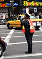
| 06/24/2003 06:08:09 PM |
34th & 8thby MarkS224Comment: Very good subject for this challenge. Seems this photo is quite blurred and an attempt was made to sharpen. Perhaps also a little over saturated. Just doesn't seem right. 4 Good luck in the challenge. |
| Photographer found comment helpful. |
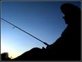
| 06/24/2003 06:04:59 PM |
Retirementby dodobirdComment: Very nice silohette (sp?) picture. I like how the setting sun refects in his glasses. 8 Good luck in the challenge |
| Photographer found comment helpful. |
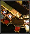
| 06/24/2003 06:00:59 PM |
Breaktime...by tfarrell23Comment: This looks like this image was taken from one of the mirrors in the casino. Am I right? Angle just seems a bit akward, especially since there aren't people filling the chairs in the middle. Also, seems just a tad over sharpened to me. 5 |
| Photographer found comment helpful. |
| 06/24/2003 05:57:26 PM |
Last Chop of the Dayby sanandanComment: Very nice photo! Definately someone at work. I'm curious as to what she is cutting. I like how she is smiling, like she's proud to have her picture made. The yellow tapestry in the background is a little distracting, but other than that, a well put together picture. 9 Good luck in the challenge. |
| Photographer found comment helpful. |
| 06/23/2003 09:23:49 PM |
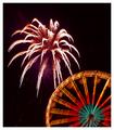
Highlights for Children - 4th of July Issueby rj324Comment: Hi Ray,
Greeting from the Critique Club:
I think I've done a critique on one of your photos before. I still enjoy seeing your work. For the current photo, I'm very impressed...especially since you didn't use a tripod for this.
Composition: It really is a pretty photo. Although it would have been nice to see a more colorful firework, I still think that the colors are nice. I also like the red streaks that turned out looking like curled ribbon confetti. They showed up nicely. The photo is well framed. The huge firework above the ferris wheel located in the bottom corner of the photo works well.
Technical: Well done for a night time firework shot. I'm still quite impressed of the quality you did get given that it was taken without a tripod. It really would have been better, though, with one. You can tell there was shakiness by looking at the ferris wheel. It really isn't as sharp as it could have been. The firework burst does look good.
Challenge: This is probably the area that hurt you in the scoring, especially with those that take the name of the challenge seriously. Highlights has never used photographic images for their covers. Almost any other magazine would have been fitting for this photo.
Overall: The photo itself is nice...probably deserving a higher score than what you got. I really do belive that the choice of magazine is what hurt you most of all. Perhaps just a little better clarity would have put you closer to the 6 point range if not higher. I wasn't able to vote on this challenge, but if I had, I would have scored it a 6.
Good luck to you and hope this critique has helped you some.
Connie |
| Photographer found comment helpful. |
| 06/23/2003 04:39:16 PM |
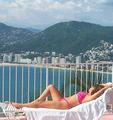
Travel & Leisureby brentpaughComment: Hi Brent!
Greetings from the Critique Club:
Composition: You have a very nice picture here that could definately be on the cover of your selected magazine. However, I do agree with some of the comments that you recieved concerning the towel and railing issue. I do believe that the railing is the most distracting of the two. It really does get in the way of the scene in the background. In any event, the model is nicely posed with nice colors. The clouds are beautiful.
Technical: Is is nicely cropped and the focus is good. I do agree that the colors are bland and could be brought out better by some adjustment to contrast. Otherwise it is a nice photo, in my opinion.
Challenge: Definately meets challenge. With the improvements, I could very easily see this on the cover of a magazine.
Keep up the good work with your photography. I checked out your profile to see some of the other things that you have done. I really like your Fenway picture. Will be anxious to see what else you come out with.
I hope this critique is helpful to you.
Connie |
| Photographer found comment helpful. |
Home -
Challenges -
Community -
League -
Photos -
Cameras -
Lenses -
Learn -
Help -
Terms of Use -
Privacy -
Top ^
DPChallenge, and website content and design, Copyright © 2001-2025 Challenging Technologies, LLC.
All digital photo copyrights belong to the photographers and may not be used without permission.
Current Server Time: 08/05/2025 06:21:58 PM EDT.