| Image |
Comment |
| 08/20/2005 02:20:46 PM |
|
 Photographer found comment helpful. Photographer found comment helpful. |
| 08/20/2005 11:22:00 AM |
Lighthouse "Paard van Marken"by AzrifelComment: i like this one the best as the yellow of the others doesnt do the beautiful lighthouse or scene justice like the blue does. i would try to make your grass greener around the lighthouse. it would really make the photo pop for me. and try to remove the blue color cast from the light house with the lasso tool and droping the blue sats. these two small things would make this an excellent photo IMHO :o) |
| Photographer found comment helpful. |
| 08/20/2005 11:08:14 AM |
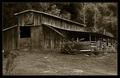
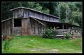
Unstable Stable (Tri-Tone)by SDWComment: i like the old timey feel u gave this with the tri tone color but i think i like the color version best. Im just a color kinda girls i guess. :o) ~Cher~ |
| Photographer found comment helpful. |
| 08/20/2005 11:05:10 AM |
Unstable Stableby SDWComment: nice comp and great colors here. nit pick for this one is a tad too much blue on the top of the barn. just pull the blue sats down(or just darken i think) and this would be another perfect photo of yours. excellent work! |
| Photographer found comment helpful. |
| 08/20/2005 11:01:54 AM |
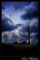
Fruitlessby SDWComment: I love the darkness of this. gives a spooky feeling :o) i think the grass blur is perfect for this photo. sky and clouds are great. did u use a filter? |
| Photographer found comment helpful. |
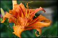
| 08/20/2005 10:56:10 AM |
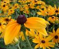
Orangeby SDWComment: i went to comment on your 4second photo and decided that u already got enough there and when i clicked this photo i was blown away. i just love the strong colors and the water drops. only tiny tiny nit pick on this one is the string or something hanging from the top stamien(sp) this is truly one of your most beautiful shots.its nice to see the same flower done by different photographers and no two will lokk the same. great eye you've got there!
off to look at a dark photo of urs i saw......:o)
couldnt get this photo outta muh mind so i had to come back and fav it Message edited by author 2005-08-20 11:36:28. |
| Photographer found comment helpful. |
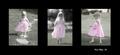
| 08/19/2005 02:24:42 PM |
Composite II - Walkingby KevinRiggsComment: hmmm...dont really know how to put this and make myself clear enough. i love the selective desat of these hotos but i think for the last two i would rather see the grass completly B&W with only the little girls dress in color like the first. i see a progression of the grass greener in each step and i like it just fine but would rather the 2nd 2 look more like the first. if i dont make sense just let me know and i will try to be clearer if i can. i love the comps of all 3 but i wish it was bigger to be able to see more detail..JMHO :o) |
| Photographer found comment helpful. |
| 08/15/2005 08:55:16 AM |
|
| Photographer found comment helpful. |
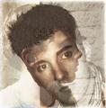
| 08/15/2005 07:25:23 AM |
In My Brother's Eyesby JutildaComment: awesome technique! i just love it.this makes me want to go into my PS7 and try to figure out how to do this myself. this one is also going straight to my favs! excellent job with the tone as the tone adds to this photo. awesome awesome awesome! |
| Photographer found comment helpful. |
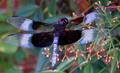
| 08/14/2005 10:59:45 AM |
Dragonflyby SJCarterComment: this one is my absolute fav! a bit too much NI here too for me but awesome photo. u made him look alive and well.great job. thanks so very much for sharing these. I now know the difference between a damsil and a dragon. :o) |
| Photographer found comment helpful. |
Home -
Challenges -
Community -
League -
Photos -
Cameras -
Lenses -
Learn -
Help -
Terms of Use -
Privacy -
Top ^
DPChallenge, and website content and design, Copyright © 2001-2025 Challenging Technologies, LLC.
All digital photo copyrights belong to the photographers and may not be used without permission.
Current Server Time: 08/13/2025 04:06:58 AM EDT.