| Image |
Comment |
| 05/15/2006 01:02:44 AM |
Delightfully Psychotic Cyclistsby MelethiaComment: --Trading Post--
Great sports capture, but I think that its stretching it a bit with the title. I like your composition here, and the DOF is nice. I think that this one would have done very well in a different type of challenge. |
 Photographer found comment helpful. Photographer found comment helpful. |
| 05/15/2006 12:59:14 AM |
Staccato stilled; bass line lingersby MelethiaComment: --Trading Post--
Very nice, and one of the better rhythm shots in my opinion. The composition is terrific, and I do feel drawn deep into the photo. The shot is nicely crisp, and I also do not believe that the USM is too much. I would like to see the sky a deeper blue, perhaps with a CP filter during the shot. Nice work, as well seen. |
| Photographer found comment helpful. |
| 05/15/2006 12:54:54 AM |
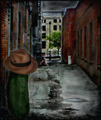
Dill Pickle Conspiracyby timfythetooComment: --Trading Post--
I really like the alley shot, but the pickle looks too much like it was added as a composite. While naturally out of place, it really stands out here. Again, great creativity. I have no idea what could have drawn a higher score. |
| Photographer found comment helpful. |
| 05/15/2006 12:53:03 AM |
Rainbow Rythm by timfythetooComment: --Trading Post--
What more could I add? Nice work, and very creative. You have all the perfect elements for the ribbon here. Well done. |
| Photographer found comment helpful. |
| 05/15/2006 12:49:06 AM |
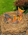
Documenting Predatory Chicksby tngrndreamComment: --Trading Post--
I really like this one, but your flash is a bit harsh. Great subjects and excellent depth of field. Perhaps difficult, but I'd like to see that red bush composed out of the shot. This one should have done much, much better. |
| Photographer found comment helpful. |
| 05/15/2006 12:44:39 AM |
|
| Photographer found comment helpful. |
| 05/15/2006 12:42:31 AM |
Dad's Patricide Comedyby chaliceComment: --Trading Post--
I don't get it. This is definitely not a sub-5 photograph. Great lighting, nice composition and excellent focus. The title works nicely with the capture, as well. My only critique would be to shift over to the viewer's left more. The door jamb is a little distracting. Nice work despite the score. |
| Photographer found comment helpful. |
| 05/15/2006 12:25:49 AM |
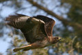
Eyes like a hawkby MacDonaldComment: Hey there from the Critique Club
Congrats on your best-scoring photograph to date, as well as a top 30 finish. Your focus is dead on and the composition near flawless. Looking through your past challenges, this is one of your best entries. I think the only reason this image fell outside of the top ten is because of the cliche you chose. The title really makes the viewer strain to look at the eyes, whereas a title similar to "fly like a bird" may have guided the viewer to look more at the entire image. That's the way this site goes. You can submit a near-perfect image, but get hung out to dry with the title. I would have still scored this one in the 7-8 range, as all the elements come together to draw the viewer into the photo. Nice work. |
| Photographer found comment helpful. |
| 05/14/2006 11:51:40 PM |
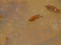
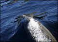
Bubbling under the surfaceby CaillieComment: Hey there from the Critique Club
Congrats on your best scoring photograph to date. I like your choice of subjects here and your composition is terrific. This one fits the challenge very well, but its almost hard to recognize. While the focus is very crisp and the exposure is on, the animal moving through the water creates a distortion that would be very hard to overcome. This one would have gotten a 5 or 6 from me, so I think that it finished well. I think that this photo is about as good as it could be considering what you were working with. Nature isn't very easy to script, at least not when I try to do it. Nice work, and I'm sure that your scores will continue to climb. |
| Photographer found comment helpful. |
| 05/14/2006 11:46:02 PM |
“Red Sky at Night, Sailor’s Delight. Red Sky in Morning, Sailor’s Warning”by GIS_boyComment: Hey there from the Critique Club
Congrats on the top 40 finish. You really have some nice work in your portfolio, and this one is no exception. You have a crisply focused, nicely colored image. I do think that the sun itself is a bit too centered, but not enough to drop a point in voting. I think that the fishermen are just a bit too small, and increasing their size would really increase the impact of this photo. The various horizontal lines work well to carry the viewers' eyes up the "steps" of the photograph. Nicely seen and well captured. |
| Photographer found comment helpful. |
Home -
Challenges -
Community -
League -
Photos -
Cameras -
Lenses -
Learn -
Help -
Terms of Use -
Privacy -
Top ^
DPChallenge, and website content and design, Copyright © 2001-2025 Challenging Technologies, LLC.
All digital photo copyrights belong to the photographers and may not be used without permission.
Current Server Time: 08/04/2025 06:09:00 PM EDT.