|
|
|
Showing 671 - 680 of ~1006 |
| Image |
Comment |
| 06/01/2006 10:42:52 PM | Failure: Another Loser DPC Score!by chaliceComment: --Trading Post Comment--
Camera Work/Technical: Very nice focus, depth of field and great toning to give a very secluded feel to the photograph. I think you lost a little detail in the black shirt, but that's easily remedied with a slightly longer exposure.
Lighting: I like it. The lighting works very well to provide you with some very interesting tines in this one.
Composition/Content: Not bad, but I'd like to see where that right arm goes. It really pulls me out of the frame, and there is nothing in that area to get me back into it.
My Opinion: I said earlier that it makes me think too much. That might have been after hanging out with my buddy Sam Adams too long that particular evening. I think that it's very creative, and it does portray failure. I do not believe that it is a sub-5 photograph, but I also don't think that it was exactly what the voters were looking for.
Eric
|  Photographer found comment helpful. Photographer found comment helpful. |
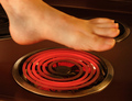
| 06/01/2006 10:33:01 PM | Hot Footin' Itby chaliceComment: --Trading Post Comment--
Camera Work/Technical: Very nice exposure control, and I think that the motion blur adds to the overall feel of the photograph. Perfect white balance, and great choice of aperture to keep the entire frame in focus.
Lighting: The lighting in this one works very well. You did a very nice job bringing out the red of the burner, and your skin tones all look properly lit.
Composition/Content: Very interesting. The leg and foot serve very well to draw the viewer's eye into the frame, and the burner works well to keep it there. The toenails are too much. They really stand out against the motion blur of the foot. I think that I would have left them dirty.
My Opinion: You met the challenge, but, as mentioned before, feet do not normally score very well. There are some small improvements that would make the shot a better photograph, but I don't think your scoring would benefit much either way. This is an odd place sometimes.
Eric
| | Photographer found comment helpful. |
| 06/01/2006 10:25:52 PM | Man in a Panama Hatby chaliceComment: --Trading Post Comment--
Camera Work/Technical: I agree with Artyste. This one is lacking a little focus. Focus is the most difficult part to master when putting together a self-portrait, especially with a background that is empty. I do like the warmth from the white balance that you chose, and I think that the depth of field would be nice if the main subject was in focus.
Lighting: I like it! I would like to see you catchlights dodged a little to really bring them out, but I like the effect you created with your light source. You achieved a very nice balance between highlights and shadows.
Composition/Content: Very nice composition here. I like the position that you were captured in, and even the cropping of the hat works very well.
My Opinion: I recognized you right away, so you met the challenge perfectly. With a bit more attention on the focus, I think that this one would have been close to a 6. Nice work with the lighting, just get that focus worked out.
Eric
| | Photographer found comment helpful. |
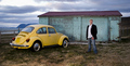
| 06/01/2006 05:53:40 AM | Meaning of life is being yellow!by birgirComment: Hey there from the Critique Club
Camera Work/Technical: Great focus and great use of your WB and post-processing to capture wonderful colors and great detail. The overall image feels like it has a slight tilt to the right, most noticeable at the body of water.
Lighting: Excellent! Great lighting, and a near flawless use of flash to get nice detail from the background and sky, as well as everything in the main subject area.
Composition/Content: While the various colors and your choice of background make for a terrific photo, there is not enough of you in the frame for the challenge at hand. I think a tight crop with you on that great background would have served this challenge much better.
My Opinion: You met your goal for this photo, but I think that the potential of your setup held a much higher score. Great lighting and a wonderful scene choice definitely pulled the score well up, but a tighter crop would have made it even better.
| | Photographer found comment helpful. |
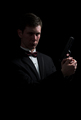
| 06/01/2006 05:25:13 AM | 007by smykComment: Hey there from the Critique Club
Camera Work/Technical: Very nice focus and spot on white balance. Overall, nice exposure, and the settings you selected yielded fine results.
Lighting: The lighting here is lacking a little. It looks like too much spot light, whereas a diffused source would have given much more appealing results.
Composition/Content: I do like the composition here, but I would recommend cropping off some of the negative space at the top and bottom of the frame. While the eye moves from the face, down the shirt, and over to the hand and gun, it stops and gets fixed on the top and bottom negative space.
My Opinion: Nice job meeting the challenge, and I think that this one scored appropriately. I like this capture, but the voters were apparently looking for something a little different. I think by removing the some of the negative space and diffusing that lighting a bit, this one would have scored a bit higher.
| | Photographer found comment helpful. |
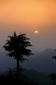
| 05/29/2006 12:46:47 AM | The Sourceby TejComment: Hey there from the Critique Club
Camera Work/Technical: The main feature here is the beautiful silhouette that you were able to create against an amazing sunrise/set. The tree silhouette looks nicely focused, and the exposure was excellent for the look you were after.
Lighting: Great exposure work with lighting as your subject. AS was mentioned earlier, I really like the graduated color from top to bottom, and it's even more appealing knowing that there was only slight post-processing.
Composition/Content: The scene you composed to share with us is very, very appealing. The change that I would suggest was already suggested in your comments. Those branches on the right are a bit distracting, and I think they should have been cropped out.
My Opinion: While a very nice and wonderfully appealing photograph, I don't really feel like this one portrays heat. I think that it scored at its potential. | | Photographer found comment helpful. |
| 05/29/2006 12:23:13 AM | | | Photographer found comment helpful. |
| 05/28/2006 08:04:54 PM | Time to go!by LaMerryComment: Hey there from the Critique Club
Camera Work/Technical: Everything technical about this photograph is dead on, in my opinion. Great focus that yielded tremendous detail (right down to the finger prints), great WB and exposure control and very nice depth of field use.
Lighting: Also very nice. Again, everything technical about this image is near flawless.
Composition/Content: This may be what hurt the score. While you have produced a very nice image from a technical standpoint, the subject struggles to hold the viewer's interest for very long. I'd also like to see the rest of that top finger included in the frame. It really pulls the eye up and out of the frame, and away from the main subject.
My Opinion: You met the challenge perfectly, and you did it with an image that was near flawless technically. With a subject that provided a bit more interest, this one would have scored a great deal higher. | | Photographer found comment helpful. |
| 05/28/2006 07:54:05 PM | Gossipby yjoshiComment: Hey there from the Critique Club
Camera Work/Technical: I think that the biggest issue here is the focus that looks too soft. I can see that the toys are indeed in focus, but the haze persists. I think that a slight levels adjustment and an s-curve adjustment to a curves layer would have helped this one tremendously.
Lighting: While not bad overall, it seems a little more harsh on the right side. Shifting your light source, or better yet, adding another light from the left would have also helped.
Composition/Content: Great composition and nice, colorful content. The only change I think that I'd make it so shift the content down a bit so that Mickey's ear isn't so close to the top of the frame.
My Opinion: You met the challenge, and did so without using the typical 'fruit & flowers' type of composition. Making the image a little more crisp and moving the content down a bit would have surely drawn a much better score. | | Photographer found comment helpful. |
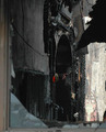
| 05/27/2006 06:43:48 AM | firehandby KronusComment: Hey there from the Critique Club
Camera Work/Technical: Great focus and very interesting depth of field. I can also tell that ht WB is spot on for this scene. Really nice exposure control, keeping the details in the highlights as well as the dark areas.
Lighting: The lighting here is a little distracting. The eye of the viewer is initially drawn to the bright area beyond the hand. Cropping that out would have improved this photograph tremendously.
Composition/Content: Your subject is a bit small and too centered for my personal taste. I'd like to see the bright wall cropped out, and that would make the composition even more interesting. I do like the busted window that you chose for the natural framing of the shot.
My Opinion: While it loosely fits the challenge, it is not what I had in mind for an environmental portrait. My opinion of an environmental portrait is a person immersed in their work or play environment, looking at the camera with some sort of expression that is noticeable. Perhaps the firefighter standing at the window, or close to it, with his arms crossed and a dirty face. Even with that opinion, I think that this one would have scored higher with a little tighter composition. Overall, nice work, and being a long time paramedic, I always appreciate nice photos of public safety. | | Photographer found comment helpful. |
|
Showing 671 - 680 of ~1006 |
Home -
Challenges -
Community -
League -
Photos -
Cameras -
Lenses -
Learn -
Help -
Terms of Use -
Privacy -
Top ^
DPChallenge, and website content and design, Copyright © 2001-2025 Challenging Technologies, LLC.
All digital photo copyrights belong to the photographers and may not be used without permission.
Current Server Time: 08/06/2025 05:37:34 AM EDT.
|