| Image |
Comment |
| 06/13/2006 02:59:22 PM |
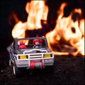
Toys to the Extremeby DjabordjaborComment: Hey there from the Critique Club
Camera Work/Technical: While your focus is nice and crisp on the driver's face, your depth of field choice looses some much needed detail in this image.
Lighting: Your lighting is very nice. Everythings seems evenly lit, and you lost no detail in your highlights or shadows.
Composition/Content: The composition you chose is the main strength of this image. The toy is up front in the viewer's face, but positioned very nicely to draw the eye deep into the frame and back to the fire.
My Opinion: I think this one is far superior to your original entry, as did the voters. I believe that it would be even better with a slightly deeper depth of field.
Eric
|
 Photographer found comment helpful. Photographer found comment helpful. |
| 06/13/2006 02:39:49 PM |
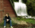
I'm serious, Eye was framedby jdannelsComment: Hey there from the Critique Club
Camera Work/Technical: Great focus on the water, but I think that I prefer the original with more water and a bit more shallow depth of field.
Lighting: You lighting is a bit harsh. The shadows on the left and the highlights on the right contrast a bit too much for my personal taste.
Composition/Content: Definitely another great capture, but, as I mentioned above, I think you need more of the water in the frame.
My Opinion: Reading back through the comments on your last one, you did exactly what the voters asked, and they scored you lower. I think both images are very nice and creative, but I prefer the original.
Eric
|
| Photographer found comment helpful. |
| 06/13/2006 02:32:36 PM |
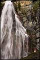
Reanimation, improved or not?by KrisbyComment: Hey there from the Critique Club
First of all, congrats on your best scoring entry to date. It looks like your are starting to see what the voters like. Nice work.
Camera Work/Technical: You did a very nice job keeping all your major elements pretty well focused while achieving a nice soft feel to the waterfall. Looking at the image closely, I see just a bit of blur on the face of the model. At least I think I do with the size of the image we have available. You captured beautiful tones and colors in all parts of the image.
Lighting: Terrific! Your lighting is very nice for this type of image. The waterfall is a tough overexposed, but not enough to be a distraction, nor detract from the overall quality of the image.
Composition/Content: The only change I'd make with this composition would be backing out just a little to get those feet off the bottom of the frame. All other elements are positioned where they should be to create a very nice flow.
My Opinion: I agree with the voters, this one is far superior to the original. Well seen and very nicely captured.
Eric
|
| Photographer found comment helpful. |
| 06/13/2006 02:12:58 PM |
Grandeurby rjksteschComment: Hey there from the Critique Club
Camera Work/Technical: Your choice of settings provided a nice soft feeling to the waterfall while keeping all elements in the image crisply focused. Your tones and coloring are exactly what my eye would expect to see.
Lighting: Your lighting is also very nice. You achieved a nice balance between contrasting lights and darks, yet very little detail was lost with blown highlights or harsh shadows.
Composition/Content: Your composition for this one feels a little cramped. I think including more of the waterfall at the top of the frame would alleviate this tension.
My Opinion: I, along with the voters, prefer the fist image more. While I am not a big fan of soft waterfalls, the softness that you achieved with your first entry, as well as a better shooting position, made it a better photograph. I believe that this one scored pretty close to its potential.
Eric
|
| Photographer found comment helpful. |
| 06/13/2006 01:04:13 AM |
|
| Photographer found comment helpful. |
| 06/13/2006 12:42:49 AM |
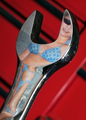
Polished Toolby fotomann_foreverComment: Hey there from the Critique Club
I recognized this one right out of the gate. Nice work combining two of your previous challenges and coming back with another nice capture. Congrats on your second highest score to date.
Camera Work/Technical: Terrific focus on the wrench and the reflection of your model. I do find the depth of field leaving me desiring to see just a little more of what's back there. Great colors and perfect skin tones.
Lighting: Very nice. Everything is evenly lit with adequate highlights and shadows to give this one a very nice contrast.
Composition/Content: I prefer the composition that you achieved in your Untitled entry. I think including a bit more of the background would add more of the red that contrasts very nicely with the blue of the model's swimsuit.
My Opinion: Nice work meeting the challenge, and meeting it in excess. You did a great job combining to challenges into yet a new one. I agree with the score, as well as the fact that you placed somewhere between the two you combined. It is way better than the original DQ, but not quite as nice as the Untitled.
Eric
|
| Photographer found comment helpful. |
| 06/12/2006 09:54:03 PM |
|
| Photographer found comment helpful. |
| 06/12/2006 09:51:23 PM |
Reanimation, improved or not?by KrisbyComment: Yeah, GREATLY improved. I can;t remember your user name, but I remember the shot being too cropped. This time, great work. You've included enough of all the elements to make this very interesting without feeling too crowded. Very nice. |
| Photographer found comment helpful. |
| 06/12/2006 02:30:44 PM |
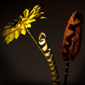
artificialby gocComment: Hey there from the Critique Club
First of all, congrats on your second highest scoring challenge entry to date.
Camera Work/Technical: Everything in the frame appears nicely focused, but I think that the post-processing is a little harsh. You finished with a very interestingly textured image, but I think some of your original shot info was lost.
Lighting: I think that your lighting here is near flawless and makes this image dramatic and powerful. You did a terrific hob with contrasting your highlights and shadows to project a warm, moody feeling.
Composition/Content: You also put together a very powerful composition. Both the flower and the lufa work very well as leading lines that draw the eye up and down both sides of the image. The lighting and the twirly thingie add very interesting texture that makes the eye want to see every little portion of the capture.
My Opinion: This one clearly meets the challenge very well. I think with a little less post-processing, you would have preserved some of the image detail, as well as pulled a little better score.
Eric
|
| Photographer found comment helpful. |
| 06/12/2006 05:11:02 AM |
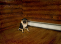
Dirty Little Biker Boyby ShutterPugComment: Hey there from the Critique Club
Camera Work/Technical: I am impressed that you could get such a crisp image with him in such crisp focus at 1.3 seconds. He must be well trained.
Lighting: Your lighting is very, very nice. There is a warm feeling to the image and there are no harsh shadows or blown highlights.
Composition/Content: I like the leading lines that are provided by the flooring and wall logs, but I think that the floor heater is a bit distracting. More than likely, that wasn't avoidable as you chose the perfect spot in the room for his position. All the lines converge nicely at the subject.
My Opinion: Very nice wok meeting the challenge in such a creative manner. Do you have an outfit that matches? ;)
Eric
|
| Photographer found comment helpful. |
Home -
Challenges -
Community -
League -
Photos -
Cameras -
Lenses -
Learn -
Help -
Terms of Use -
Privacy -
Top ^
DPChallenge, and website content and design, Copyright © 2001-2025 Challenging Technologies, LLC.
All digital photo copyrights belong to the photographers and may not be used without permission.
Current Server Time: 08/10/2025 02:41:00 AM EDT.