|
|
|
Showing 571 - 580 of ~1007 |
| Image |
Comment |
| 07/05/2006 04:28:01 AM | Moonlit Pierby kgearyComment: Hey there from the Critique Club
First of all, congrats on your best finish to date, as well as a 6+ score. It takes many of us much longer than three challenges to make that mark.
Camera Work/Technical: First off, I am happy to see the straight horizon line. It is perfect! Accidental horizon tilts are a pet peeve of mine, so I always appreciate a straight one. I also like your depth of field choice for this one. All the rocks are crisply focused, as is the (wonderfully horizontal) horizon and the buoy. I also like your WB choice, giving this a great, moody feel.
Lighting: The light that the moon provided is also very nice. This was a great time of day to provide the great mood that you produced here. I might have used a graduated natural density filter to enhance that sky a little, but I couldn't be sure without being there. Very nice lighting.
Composition/Content: This is one of the main strengths of the image. The rock wall serves very well to pull the viewer deep into the image and feel the mood. Even though it was probably 230 degrees that day, this one produces a cold and lonely feeling.
My Opinion: I think that this one met the challenge in a very creative way. I also believe that it should have scored a bit better, as it is much better, in my opinion, than some of those that finished ahead of it. Voters here like vivid colors, so maybe a red or orange sky would have vaulted it up a bit. Personally, I prefer it just the way you captured it.
Eric
|  Photographer found comment helpful. Photographer found comment helpful. |
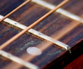
| 07/05/2006 04:13:38 AM | Physics...by ApeeComment: Hey there from the Critique Club
Camera Work/Technical: I agree with the General. I would have changed the focus around on this one and used a deeper depth of field. While I can see what's moving, the fret bars are very distracting and compete very heavily with the motion of the subject.
Lighting: Your lighting is very nice and very even. There were no details lost with in the highlights or shadows.
Composition/Content: I also like your angle for this shot. It serves very well to pull the viewer's eye up and into the frame, but the frets take over and pull it away from the subject of the challenge.
My Opinion: I think that this one scored pretty close to its potential as it is. Giving this one a deeper depth of field and a longer exposure would have surely pulled this one out of the sub-5 category.
Eric
| | Photographer found comment helpful. |
| 07/05/2006 04:07:53 AM | Stealth Sedanby levyj413Comment: Hey there from the Critique Club
Camera Work/Technical: I think that your focus emphasizes your background a bit too much. If you could have caught the blur on a more shallow depth of field, I believe that your score would have benefited.
Lighting: Your lighting came out terrific. It is the main strength of this image.
Composition/Content: While the pole does give away the fact that the image was shot at a tilt, I do not believe that it detracts from the capture at all. It adds some interest to the photo, and actually helps move the viewer around the frame.
My Opinion: I really like it, but I think that it relied too heavily on the title. Keep in mind that these challenges have 200, 300, even 400 entries, and the voters spend very little time trying to figure out what is in the frame. I think that this image is far better than a 4.8, but it just took too long to figure out what was there. Nice work, and I look forward to more.
Eric
| | Photographer found comment helpful. |
| 07/05/2006 04:02:37 AM | Stealth Sedanby levyj413Comment: Hey there from the Critique Club
Camera Work/Technical: I think that your focus emphasizes your background a bit too much. If you could have caught the blur on a more shallow depth of field, I believe that your score would have benefited.
Lighting: Your lighting came out terrific. It is the main strength of this image.
Composition/Content: While the pole does give away the fact that the image was shot at a tilt, I do not believe that it detracts from the capture at all. It adds some interest to the photo, and actually helps move the viewer around the frame.
My Opinion: I really like it, but I think that it relied too heavily on the title. Keep in mind that these challenges have 200, 300, even 400 entries, and the voters spend very little time trying to figure out what is in the frame. I think that this image is far better than a 4.8, but it just took too long to figure out what was there. Nice work, and I look forward to more.
Eric
| | Photographer found comment helpful. |
| 06/27/2006 06:20:38 AM | The pastby DufusComment: Hey there from the Critique Club
Camera Work/Technical: The image is nicely crisp and well-focused, but I think that I'd like to see this one with a much more shallow depth of field. While the background is not terribly overpowering, it is still a bit distracting.
Lighting: I think that the lighting is too harsh. I do like the backlit feeling of the animal skin, and the nicely contrasting shadows cast by her working hands, but the entire frame seems a bit washed out.
Composition/Content: I believe that your choice of subject matter is the strongest element of this image. This is a lady doing something that is well out of the ordinary in today's technology-dependent society. So, terrific subject, but the composition is a bit off. I see some literal framing, but the framed feeling of the image could have used more attention.
My Opinion: Nice work meeting the challenge in a very creative way, and with very creative subject matter. I think this one would have pulled a better score with some lighting adjustments. As it is, I think that it scored pretty close to its potential.
Eric
| | Photographer found comment helpful. |
| 06/15/2006 11:26:57 PM | Cliff and cloudy night IIby MadMan2kComment: Hey there from the Critique Club
Camera Work/Technical: I like your focus, including a great depth of field that goes beyond the clouds and nicely exposes the stars in focus. I also like the time of exposure here, catching the ever so slight drifting of the clouds.
Lighting: You did a very nice job in an often difficult, low light condition. You were able to keep the stars and the cloud highlights from losing detail, while also capturing a long enough exposure to paint a very nice red coloring on the cliff.
Composition/Content: This is the one area that I do believe that the original was better. This one is interesting from a minimalist viewpoint, but I find myself feeling like the cliff was accidentally chopped off. I'd really like to see more of it, as the color complements the sky very nicely.
My Opinion: The two shots are vastly different in content and execution. I, against the opinion of the voters, do not see this one as far superior to the original. Rather, I believe that this one scored pretty close to its deserved potential, whereas the initial entry was actually much better than the voters gave it credit.
Eric
| | Photographer found comment helpful. |
| 06/15/2006 01:07:01 AM | Eyes IIby banmornComment: Hey there from the Critique Club
Camera Work/Technical: Your clarity and focus is much, much better than your original entry. Your contrast in this one is also better than the original.
Lighting: In the original, your lighting looked a little flat and hazy. In this one you did a nice job overcoming that.
Composition/Content: This is where I believe the voters scored you lower for this entry. This one seems a bit more crowded with the droplets too close together. The other entry seems a bit more relaxed with the droplet spacing more spread out.
My Opinion: I believe that everything except the composition is better than your original. Unfortunately, the composition was crowded just enough to pull your score down.
Eric
| | Photographer found comment helpful. |
| 06/15/2006 12:54:39 AM | High Contrast Challenge: infernal catby dragonladyComment: Hey there from the Critique Club
Camera Work/Technical: I see the main focus is one the eye that is in shadow, leaving the bright light a bit soft. I'd like to see that reversed, and even a slightly deeper depth of field.
Lighting: Your lighting is the main strength of this image. You did a very nice job with limited highlights to create a great low key image.
Composition/Content: I like the composition that you chose here. It has a nice centered profile feel to it that really works for this image.
My Opinion: This one is hands down better than the original entry. The first one lost the feeling of a photograph. This is a nice animal portrait, even though I am not a cat person. Well done.
Eric
| | Photographer found comment helpful. |
| 06/13/2006 10:15:33 PM | Dreamin' of Home IIby rayg544Comment: Hey there from the Critique Club
Camera Work/Technical: Very nice technical work with this image. The ghosting is more effective here with a better play into the image. This feels better than the standing position in the original.
Lighting: The lighting is also better in this image. The side of the building was a bit blown in the original. Not so here. I also like the individual lights that you captured.
Composition/Content: This is where I really like the original. Sure, you took the pole out of your head, but the track played an integral part of the last image. It served well to pull the viewer deep into the image.
My Opinion: I like it, but I still prefer the original. This is a better shot from a technical standpoint, but the composition of the original is better. That is where the voters noticed, I believe.
Eric
| | Photographer found comment helpful. |
| 06/13/2006 07:19:30 PM | Hot Damn ! II (Beverage)by 3eyedcrowComment: Hey there from the Critique Club
Camera Work/Technical: Great focus and very interesting death of field. The quality of this exposure is far better than the original submission. Your choice of ISO 100 produced a much better result.
Lighting: Again, much better than the original. I do think I would prefer the bottle behind the flaming glass to give the label a little light boost.
Composition/Content: While the composition is very similar, the details of the content are much more evident in this capture, thus producing a better image.
My Opinion: I think that this one is better than the voters credited you for. Your lighting change alone is worth more than the small score change they gave you.
Eric
| | Photographer found comment helpful. |
|
Showing 571 - 580 of ~1007 |
Home -
Challenges -
Community -
League -
Photos -
Cameras -
Lenses -
Learn -
Help -
Terms of Use -
Privacy -
Top ^
DPChallenge, and website content and design, Copyright © 2001-2025 Challenging Technologies, LLC.
All digital photo copyrights belong to the photographers and may not be used without permission.
Current Server Time: 08/09/2025 05:05:38 PM EDT.
|