|
|
|
Showing 291 - 300 of ~1005 |
| Image |
Comment |
| 03/12/2009 05:49:35 PM | |  Photographer found comment helpful. Photographer found comment helpful. |
| 03/12/2009 05:47:18 PM | Enchanted Pupby togtogComment: Interesting pet portrait. Halloween, I presume. I like the sepia toning, but the graininess of the background couples with the low gran of the subject gives this one an unpleasant halo look to me. | | Photographer found comment helpful. |
| 01/03/2009 08:04:33 PM | Old barbershop chairsby snafflesComment: Hey there from the Critique Club
Camera Work/Technical: Great focus and a I like the fairly deep depth of field. I also like your choice to use selective desaturation for this one, though I am not normally a selective desat fan. The red behind the headrest of the chair in the foreground is a bit distracting.
Lighting: Nicely lit. I like that the city background is a touch overexposed. It really helps to keep the eye focused on the subjects.
Composition/Content: I'd like to see the entire footrests. Chopping such a small portion of the chair off seems like more of an accident that intentional composition.
My Opinion: I took this one as more of an open challenge, so you met the challenge no matter what YOU wanted for Christmas. I like the image, but I think the composition could have been a bit better. 5.6 is a pretty strong score for the image as it is.
Thank you for the opportunity to provide a critique on your entry,
Eric
| | Photographer found comment helpful. |
| 01/03/2009 07:54:33 PM | Expert Editingby posthumousComment: Hey there from the Critique Club
Very interesting image, though I disagree completely with the expert editing category. I find this type of work and creativity much more interesting and appealing than anything anyone could do with digital art. This is photography and using the tools of photography. I like the detail you caught here, and I like the drabness and moodiness that you created with the capture. Nicely creative, but I'd expect nothing less from your work. This one I like.
Thank you for the opportunity to provide a critique on your entry,
Eric
| | Photographer found comment helpful. |
| 01/02/2009 03:13:16 PM | One Diamond Ringby peterComment: Hey there from the Critique Club
It looks like I may be becoming your personal critique provider :)
Camera Work/Technical: I do like the crisp focus on the diamond. Your primary focal point is exactly where it should be. I can also see the voters' complaints that the image looks soft. I personally like the shallow depth of field, and I believe that it is exactly what you were attempting to capture. However, images that seem soft often do not do well here. The coloring and saturation do feel a bit too warm for my taste. With just a little bit of a cooling filter, the yellows are toned down, and the reflection is also a bit less harsh and distracting. It also brings out some very nice blue hues in the stone itself. Here is what I envision it should be:
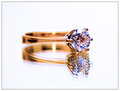 Lighting:
 Again disagreeing with some of your previous commenters, I also like the high-key feel tat you created.
Composition/Content: The centered composition fits this capture very well. The reflection, though, is horribly distracting. Reflections are hard to capture, especially with a normal mirror. I just bought a large piece of frosted glass to see if this will capture reflections better than a mirror. The problem with a standard mirror is that the reflective surface is below another piece of glass. There is a pretty good discussion HERE about using a painted piece of glass. There is also a specific type of mirror that has the reflective surface on the outside, though the name of it escapes me right now. I tried to scan the forums for it, but we have the most unfriendly forum search tool. You may want to take a look there, and I wish you better luck with it.
My Opinion: You met the challenge well, thought that particular ring will probably look out of place on your hand. Although, you may grab some attention from a whole new crowd. I think that the voters were a little harsh on this one, but the yellow hue is tough to overcome. Without that, I think this one would have been better understood, thus pulling a bit better of a score.
Thank you for the opportunity to provide a critique on your entry,
Eric
| | Photographer found comment helpful. |
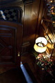
| 01/02/2009 02:43:42 PM | All I want for Christmas is...you.by NacoComment: Hey there from the Critique Club
First of all, welcome to DPC and congrats on a new personal best score. You are on a great pace with 2 challenges in since joining on December 11. Keep it up! This is the absolute best way to learn.
Camera Work/Technical: Fantastic focus, especially for a 1/8 second shutter speed, and you captured a great range of warm tones.
Lighting: I like the warm, hopeful feeling that you created with the lighting. I do, however, I agree with the other commenters that the light above the door is a bit distracting. I also agree that the door is a bit too dark, thus digging a hole for the eye to get trapped inside. Adding just a touch of fill-flash would have helped this one tremendously. This would have also helped with that blow out lamp shade.
Composition/Content: Terrific point of view, as others have already pointed out. This the main strength in my opinion. You have painted a nice picture of the anticipation a loved one's return. I'd like this one better if it had the shadow of someone preparing to enter. As it is, it feels a little empty.
My Opinion: This was a very nice idea that was decently executed. I think you would have grown the score a bit with a little more attention on your lighting, as well as adding a human shadow in the door. As it is, 5.5 is a nice score for this image, and I agree with the voters on its placement.
Thank you for the opportunity to provide a critique on your entry,
Eric
| | Photographer found comment helpful. |
| 01/02/2009 02:28:19 PM | A Couple of Blue Ribbons ;-)by LonzComment: Hey there from the Critique Club
First off, always try to include some info about the shot in the Photographer's Comments section. It really helps out when we know what the photographer was thinking and what equipment/lighting/etc. were used, especially when you request a critique.
Camera Work/Technical: Nicely done, though the image seems to have a slight tilt to it. The focus seems right, though it looks like noise reduction was over-utilized.
Lighting: You must have had some really bright light to shoot this at f/19 and ISO 100. I do like the highlights and reflections that you caught here.
Composition/Content: The composition is interesting, but I think the image suffered from commonality, thus hurting your score. These are done too much on here, and I cannot imagine that these can be made with any original ideas anymore.
My Opinion: 6 is a very generous score for this type of shot, but this is my opinion only. I think that these shots are overdone here, thus scoring them with any type of strong score is difficult.
| | Photographer found comment helpful. |
| 12/19/2008 08:55:14 AM | Long Island Sunriseby boss351Comment: Hey there from the Critique Club
Camera Work/Technical: I tend to agree with Derek here. The saturation, contrast, and the softness of the clouds make my eye immediately disagree with what its seeing. Unfortunately, that is one of the losses of HDR.
Lighting: I like the color layer you have at the bottom of the frame. I'd really like to see this one processed without the HDR.
Composition/Content: Nicely composed, and a perfectly straight horizon. Very nice.
My Opinion: I think that this entry was scored and placed appropriately.
Thank you for the opportunity to provide a critique on your entry,
Eric
| | Photographer found comment helpful. |
| 12/09/2008 11:51:19 PM | one more gust and ill fall for youby mbrutus2009Comment: Hey there from the Critique Club
Camera Work/Technical: You did a very nice job focusing on the subject of the image. It remains very clear and crisp while the background is blurred. The depth of field you chose for this capture is perhaps the strength of the image. You did a terrific job of isolating your subject with the depth of field that you chose.
Lighting: I like the lighting, though I'd prefer a little more contrast. You have some interesting shadows on those leaves that could have really been brought out with a slight curves adjustment.
Composition/Content: While I hold no firm belief that photography should consist as a list of rules, I would like to see this one lean a little more toward the rule of thirds. With this being a challenge that was focusing on hanging on, I'd like to see that leaf stem at the intersecting thirds line.
My Opinion: I really appreciate that you added your comments on why this image was shot, as well as your thoughts on scoring. It really helps critique the image, and is especially important when requesting thoughts from the critique club. I am happy to see that you placed above your expectations. I think that the score was fitting for the image.
Thank you for the opportunity to provide a critique on your entry,
Eric
| | Photographer found comment helpful. |
| 12/09/2008 11:38:02 PM | Wendy at the parkby dRockComment: Hey there from the Critique Club
Camera Work/Technical: Well, after 3 and a half years of waiting, this is a pretty nice entry. It looks like your focal point is nicely placed, and I like your depth of field use. i can see just enough detail in the background ot know what I am looking at, yet the blurring prevents it from competing with the subject for my eye's attention.
Lighting: I do like the start that you had with your lighting here. However, I thin that you could have added just a bit more fill light to her right side as well as closed that aperture just a bit to keep the hot spot off of her hair. The light falls off just a little too much leaving her right hand a bit too dark for my taste.
Composition/Content: I really like how this image has been composed. The crop keeps enough background, yet really serves to accentuate the subject.
My Opinion: I like it, but I'd like some slight lighting changes. Even still, I feel that 5.4 was a little low for this one.
Thank you for the opportunity to provide a critique on your entry,
Eric
| | Photographer found comment helpful. |
|
Showing 291 - 300 of ~1005 |
Home -
Challenges -
Community -
League -
Photos -
Cameras -
Lenses -
Learn -
Help -
Terms of Use -
Privacy -
Top ^
DPChallenge, and website content and design, Copyright © 2001-2025 Challenging Technologies, LLC.
All digital photo copyrights belong to the photographers and may not be used without permission.
Current Server Time: 08/05/2025 04:49:23 AM EDT.
|