|
|
| Image |
Comment |
| 10/27/2009 05:11:21 AM | flight patternsby posthumousComment: Hey there from the Critique Club
Well, you just missed the sexy curve, and thankfully missed the brown as well. You ended up with a fat woman that has large breasts and very small ankles an feet. The image definitely has tension and interest, but the softness and business is somewhat difficult for my eye to linger on. I will say that the flow of the subject matter itself definitely keeps my eye wandering the frame. I always look forward to your entries. While not always 'DPC Friendly' they are never lacking thought and creativity.
Thank you for the opportunity to provide a critique on your entry,
Eric
|  Photographer found comment helpful. Photographer found comment helpful. |
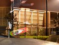
| 10/27/2009 04:57:44 AM | Ghostly Skaterby dustingoodingComment: Hey there from the Critique Club
My thoughts on the image: You had the beginning of a very neat and interesting image here. The concept is terrific, but there are some obvious flaws in execution, in my opinion. I agree with all the comments below except for the perfect composition.
My ideas for improvement: Agreeing with Steve, the background is a bit too busy for my eye to be happy hanging out in the frame. Perhaps rotating your point of view more towards the front of the subject would have remedied this. Of course I can;t be sure as I have no knowledge of the surroundings, but I think a slightly different point of view would have grown the score. Some rotation would also take away the distracting tree and bright light in the top left corner. Also, my eye wants to see the entire skater. Chopping off his head places this more in the realm of an accidental snap shot rather than an intentionally composed work of art.
Where I would have/did score this entry: I did vote in this one and I gave it a harsh 4. However, with some moderately easy compositional changes, this one would have surely pulled a 6 or 7 from me. I love the concept, but your execution needs some adjustment.
Thank you for the opportunity to provide a critique on your entry,
Eric
| | Photographer found comment helpful. |
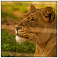
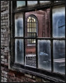
| 10/22/2009 06:17:04 AM | The Lookoutby QuigleyComment: Hey there from the Critique Club
My thoughts on the image: Definitely interesting. I appreciate the oddity of the subject, and I do like the crisp focus you achieved, as well as a nice depth of field. The window, though, is a bit distracting to my eye.
My ideas for improvement: Back off from the window a bit and reduce the distortion of the frame itself. I still maintain that I like the depth of field, but I'd like to see the window frame becomes a little less prominent to the overall image.
Where I would have/did score this entry: I did not vote in this challenge, but this one would have drawn a 4 or a 5 from me. I think that the voters scored you appropriately.
Thank you for the opportunity to provide a critique on your entry,
Eric
| | Photographer found comment helpful. |
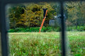
| 10/22/2009 06:11:10 AM | Lion through enclosure windowby tinkie2010Comment: Hey there from the Critique Club
My thoughts on the image: My eye is immediately drawn and held by the line running through the middle of the image. I agree with Kai in that aspect of the image. I also agree with Kari in the fact that the lion, your main subject, isn't very crisp, not is there enough of the window to see this as an intentional composition. As it is, it looks more like a vacation snapshot.
My ideas for improvement: Show me the window. I'd also like to see a stronger composition which would, in my opinion in relation to the challenge, include the window frame that you were peering through.
Where I would have/did score this entry: I did not vote on this particular challenge, but I would have more or less agreed with the voters. This would have been a 3 or a 4 from me. I do believe that you meet the challenge, but it isn't obvious, nor is your main focal plane where in needs to be.
Thank you for the opportunity to provide a critique on your entry,
Eric
| | Photographer found comment helpful. |
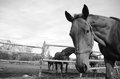
| 10/22/2009 06:01:30 AM | Why are you on the ground?by snafflesComment: Hey there from the Critique Club
My thoughts on the image: Your clarity and crispness are fantastic. I also like the tones you captured on the horse itself. Overall, the image feels too bright, and there are some compositional issues that precluded this one from breaking that 6 range.
My ideas for improvement: Single Delvista out and away from the rest of the pack and shallow up that depth of field. The horses in the background are very distracting, particularly because they intersect his head at such an awkward spot on the image. I'd also fill the frame more with the horse's head, especially with such a bright, relatively boring sky.
Where I would have/did score this entry: I did vote on the challenge, and I gave this particular image a 6. It really fell somewhere between 5 and 6 for me. I do think that it met the challenge well, but I'd like to see a much different composition while still meeting the challenge topic.
Thank you for the opportunity to provide a critique on your entry,
Eric
| | Photographer found comment helpful. |
| 10/19/2009 02:04:15 AM | | | Photographer found comment helpful. |
| 10/08/2009 05:45:21 AM | Risingby WCpilotComment: Hey there from the Critique Club
My thoughts on the image: The first thing that strikes me about your capture is the pose. The flow you created is wonderful and the form is beautiful. I feel that the branches from her tattoo continue to flow through her body and into the form she is creating. Your composition is the strength of this particular image. Well created.
My ideas for improvement: I'd like to see to see better, more even lighting and even more contrast to the image as a whole. I think that lighting her from the camera from might have yielded a better result to the overall image. Don't get me wrong, I love the shadows and drama you created with the lighting. My only complaint is the semi-hot spot on her hands. That area immediately grabs my eye and competes for attention from the overall frame. Also, a bit of a curves adjustment would have added a nice bit of contrast to the capture.
Where I would have/did score this entry: As is, I would have placed this one right there near the peak of your bell curve. I would have voted this one in the 6 or 7 range. With a little more contrast and even lighting, this one would have easily edged closer the the front page. Again, well seen and nicely captured. Growing the score on this one would have been relatively easy considering the strength of the image that has already been created.
Thank you for the opportunity to provide a critique on your entry,
Eric
| | Photographer found comment helpful. |
| 10/08/2009 04:39:14 AM | The Nurse Who Loved Meby Pipe_DreamComment: Hey there from the Critique Club
First of all, congrats on a new personal best. This one was well deserved.
My thoughts on the image: I love it. These form-type nudes are absolutely among my favorites. The clarity and sharpness you captured here make this a very dramatic and strong image when paired with the lighting you chose. Well seen and very well executed.
My ideas for improvement: Perhaps the only thing that I would have shot for is a bit deeper depth of field. I'd also like to see the right breast and nipple in crisp focus as well.
Where I would have/did score this entry: Had I voted in the challenge, this would have been one of the few 9s or 10s I would have handed out. Congrats again on a new personal best, as well as a well-deserved top 5 finish.
Thank you for the opportunity to provide a critique on your entry,
Eric
| | Photographer found comment helpful. |
| 10/08/2009 04:30:37 AM | The back Scenic routeby MagnumphotographyComment: Hey there from the Critique Club
My thoughts on the image: Without reading the description, there would be no way to know that there was nudity even implied here.
My ideas for improvement: This one just needs to fit into the challenge. There is nothing that I could constructively suggest to make this one a better abstract.
Where I would have/did score this entry: Unfortunately, I would have been just another 1 vote had I voted in the challenge.
Thank you for the opportunity to provide a critique on your entry,
Eric
| | Photographer found comment helpful. |
| 10/08/2009 04:16:13 AM | Alone at lastby snafflesComment: Hey there from the Critique Club
My thoughts on the image: I do indeed like the ass. That's my first thought. I do also like the mono-toning that you created with your post-processing. The tones are nice, but a little flat to my eye. The pose is classic, and I like the flow that you created with your positioning.
My ideas for improvement: I don't care for the crop that you chose for the image. The narrow frame makes my eye feel trapped and unable to explore. The focus also seems soft to me. I am guessing that this was a self-portrait which would perhaps explain the softness.
Where I would have/did score this entry: I didn't vote on any entries from the nude challenge this time around as I have spent far too much time at work lately. Had I cast a vote in this entry, it would have probably fallen into the 4-5 range. I do love the idea of your image here, and I think you have a really, really strong start. I jut think that the execution and main focal area should have been in a different area. Nice work, and again, I do like the butt you presented here.
Thank you for the opportunity to provide a critique on your entry,
Eric
| | Photographer found comment helpful. |
Home -
Challenges -
Community -
League -
Photos -
Cameras -
Lenses -
Learn -
Help -
Terms of Use -
Privacy -
Top ^
DPChallenge, and website content and design, Copyright © 2001-2025 Challenging Technologies, LLC.
All digital photo copyrights belong to the photographers and may not be used without permission.
Current Server Time: 07/30/2025 05:59:11 PM EDT.
|