|
|
|
Showing 251 - 260 of ~1290 |
| Image |
Comment |
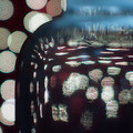
| 06/26/2006 10:13:18 AM | [ H O P E ]by gocComment: I think this is a very good attempt on your part.
As was stated, the title kind of understates the feeling of the image. the word HOPE can be related to desolation, but not in this image. I would of expected some human emotion when you provide a title like HOPE.
The image is great, no need to give a detailed critique. Just remember that the title of the image is part of the package deal. You have a week before the voting starts. Step away from the submission in the future. Give yourself a day to get the image out of your head. Go back to the image later on, and decide for your self if the very first impression you get from the image and title are working like your want.
The image should give meaning to the title, not the other way around.
55 is better than 56th place, or last for that matter.
Regards.
|  Photographer found comment helpful. Photographer found comment helpful. |
| 06/26/2006 10:03:48 AM | | | Photographer found comment helpful. |
| 06/26/2006 08:02:53 AM | Weddingby cp5140Comment: Your work has great potential, but why are you underexposing? Your blacks are way too deep. You need more texture for it to be convincing. same with your whites.
Pure blacks, pure whites with an 18% gray scale tonal value that conveys the light in a way where you still have texture makes for a great black and white.
I have sites, and threads bookmarked for such conversion if you are interested. PM me. | | Photographer found comment helpful. |
| 06/23/2006 10:09:29 AM | Re-visiting Monet ... in a dreamby elee3009Comment: Yes, good title.
Highly impressionistic, great comp, excellent color,great light, excellent movement, barely got your focal plane on the red flower, whites a bit blown but nt disturbingly, blacks ok, | | Photographer found comment helpful. |
| 06/23/2006 10:05:51 AM | Je T'aimeby tcmartinComment: what no flower???;)
great comp, blacks too deep, whites not there, crisp, nice movement, nice texture, light good, | | Photographer found comment helpful. |
| 06/23/2006 10:03:07 AM | Off the Frontby mosesmComment: finally, no flowers.
comp but cutting the wheels off of the athlete makes him look disconnected, great movement and the blue sign on right could of been cropped out making the bg cleaner, nice lines, light nice, color ok, great txture, great emotinonal value, | | Photographer found comment helpful. |
| 06/23/2006 09:58:57 AM | | | Photographer found comment helpful. |
| 06/23/2006 09:56:16 AM | A Winter's Embraceby MichaelCComment: Nice comp, nice texture, the focal plane seems to be n the ladies shoulder so therefore soft on the rest of the image, good tones, ok light, nice movement | | Photographer found comment helpful. |
| 06/19/2006 07:30:19 PM | Lonelyby postoakinversionComment: excellent comp, minimalistic feel, great color, great texture, excellent light, great movement, nice lines | | Photographer found comment helpful. |
| 06/19/2006 07:28:51 PM | | | Photographer found comment helpful. |
|
Showing 251 - 260 of ~1290 |
Home -
Challenges -
Community -
League -
Photos -
Cameras -
Lenses -
Learn -
Help -
Terms of Use -
Privacy -
Top ^
DPChallenge, and website content and design, Copyright © 2001-2025 Challenging Technologies, LLC.
All digital photo copyrights belong to the photographers and may not be used without permission.
Current Server Time: 08/19/2025 11:14:42 PM EDT.
|


![[ H O P E ]](https://images.dpchallenge.com/images_challenge/0-999/510/120/Copyrighted_Image_Reuse_Prohibited_349325.jpg)