| Image |
Comment |
| 01/29/2003 07:09:52 AM |
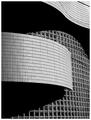
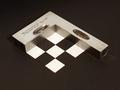
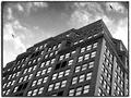
Wall of Windowsby NatashaComment: very elegant lines and shadows in this solid composition. maybe a litlle generous with the sharpenning |
 Photographer found comment helpful. Photographer found comment helpful. |
| 01/29/2003 07:06:23 AM |
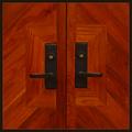
Door #13by zadoreComment: Very nice and simple tonal and structural composition. My champion this week. Maybe a tad more contrast could still improve it. |
| Photographer found comment helpful. |
| 01/29/2003 05:34:08 AM |
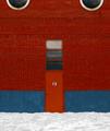
Adornmentby crabappl3Comment: nice composition and idea. I think it ccoould be improved with more brightness, less red and a tad of sharpenning |
| Photographer found comment helpful. |
| 01/29/2003 05:15:58 AM |
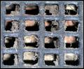
Fresh Air Vent?!by MonaComment: you allready have sixteenn little frames in this image, why add an extra one? Nice texture rendering. |
| Photographer found comment helpful. |
| 01/29/2003 04:58:13 AM |
|
| Photographer found comment helpful. |
| 01/29/2003 04:48:47 AM |
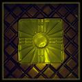
Square Shimby GeneralEComment: Nice combination of industrial objects. This would have been a great candidate for B&W. goood job. |
| Photographer found comment helpful. |
| 01/29/2003 04:32:32 AM |
Shadow of a squareby dimitriiComment: Nice expressionist shot. I tried this one as it is with Saturation -50, hue -10, all the wood details reappear. A little less expression but more classic charm. |
| Photographer found comment helpful. |
| 01/29/2003 04:18:48 AM |
MULT COLORby kevinswopeComment: interesting idea for a composition, color progression is a little harsh. I would try for that one (if you use photoshop) to pull up the hue to +40 OR to decrease the saturation to -45 to get a smoother color progression. hope this helps. |
| Photographer found comment helpful. |
| 01/28/2003 01:14:37 PM |
Door In The Floorby magnetic9999Comment: If you could have created some eye contact between the two the illusion would be much more powerfull, good work. |
| Photographer found comment helpful. |
| 01/28/2003 01:01:04 PM |
|
| Photographer found comment helpful. |
Home -
Challenges -
Community -
League -
Photos -
Cameras -
Lenses -
Learn -
Help -
Terms of Use -
Privacy -
Top ^
DPChallenge, and website content and design, Copyright © 2001-2025 Challenging Technologies, LLC.
All digital photo copyrights belong to the photographers and may not be used without permission.
Current Server Time: 07/31/2025 05:00:40 PM EDT.