| Image |
Comment |
| 12/15/2003 02:53:15 AM |
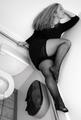
Out of Shapeby alanfreedComment: Too bad you did'nt have he reflex to pan left a little. Very close to an exceptional picture. Best of my show this week. |
 Photographer found comment helpful. Photographer found comment helpful. |
| 12/10/2003 08:47:28 AM |
eau de toiletteby grigrigirlComment: I see the silent morality squadron has rightfully and properly sanctioned such a disgraceful and inappropriate idea.
Great composition and great use of an unusual decor for this type of shot.
I have no idea what your level of French is, so you may yet know this:
“toilette” (singular) always refers to body cleansing;
“toilettes” (plural) refers to the room the Americans “rest” in, and to the actual ceramic contraption as well. Message edited by author 2003-12-10 17:11:45. |
| Photographer found comment helpful. |
| 12/08/2003 07:01:28 AM |
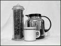
Coffee in the Morningby newtune3Comment: Hi from the Monday morning Critique Club
Good attempt at creating a classic still life. The overall effect, though, is a little static and does not quite vehicle for me an atmosphere of scents and aromas.
Composition: This is debatable and certainly not an absolute rule but main subjects placed dead center in an open environment rarely enhance a composition.
Another rule of thumb of “classic” photography could apply here: If the space surrounding you main subject is not adequately contextual to your message or intent, zoom in.
There is also some puzzling verticality problems, seems like the picture is a bit tilted + the surface where your props stand was uneven.
Content: To bring your viewer to get a smell of your coffee beans and brew, this is what I would suggest: Use an angle higher up for your camera so we can see the inside of the cup and bean jar (open lid of course).
If shot against a dark background, use hot liquids so some suggestive steam shows in your composition. I would even make the steam be the main subject of the picture.
Hope this helps, all the best, JJ
|
| Photographer found comment helpful. |
| 12/07/2003 01:57:19 PM |
Daaaad!!by cbellerComment: Sunday Night Critique Club Special
Altogether a good and fun picture with surprisingly good lighting for a snapshot.
Composition wise a few flaws: To bad your subject is positioned dead center; putting your model on the left of the frame would allow more of the toilet to bee seen (I did not notice what your son was actually doing the first time I saw this image) and would strengthen the composition. Also avoidable: the scalping of your progeny shows in what haste you took that one but does not improve the overall appearance of the picture.
This was a “near great picture”. I know it is hard to think of all those things and also succeed at clicking at the right time.
I have always been amazed at all the parameters seasoned photojournalism pros can think of in a split second when they are capturing in style an event in motion.
All the best, JJ
|
| Photographer found comment helpful. |
| 12/06/2003 02:33:41 AM |
Bread and Wineby e301Comment: I certainly hope you will be gratefull that I spared you from the worst possible ranking. |
| Photographer found comment helpful. |
| 12/04/2003 03:57:11 AM |
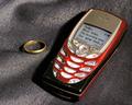
Shocking Messageby oskarComment: Critique Club Time
This, I must say, is usually a surprise! The occurrence that this type of news would be announced this way though, is a little beyond what I am ready to believe.
The way you have stages your image situated it long after the original astonishment. I would fist have to recover from such news for a while before thinking of taking my ring off...
The good point of this image is you are telling us a story that will keep us wondering for a while. And there are not many entries this week that will do that.
Technically, the background is a little dull and the more than soft focus does not add to this image’s appeal. You would have been better off, I think, capturing the phone hand held (to situate the scene at the “surprise moment”) and having the message occupying more of the composition.
Hope this helps,
All the best, JJ
|
| Photographer found comment helpful. |
| 12/04/2003 03:30:20 AM |
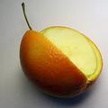
It's not always what you expectby Bela45Comment: A brief entry from the Critique Club
Good idea that probably would have worked better on a darker background and with gentler lighting on the apple part. There is probably a question of timing with this idea that does not quite work: the fact that you chimerical fruit has been neatly cut and that part of it is already disposed of situates this scene way after the moment of original astonishment.
Keeping in scene the missing quarter and possibly the tool that cut it would have meant more work, I know, but would have depicted convincingly this impression of sudden surprise.
All the best, JJ
|
| Photographer found comment helpful. |
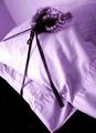
| 12/02/2003 06:26:30 AM |
Don't forget to leave your tooth under your pillow for the toothfairy...by WILDBLUEComment: Hi, I will be your Critique Clubber this week.
I don’t quite agree with the critique below that considers this image uninteresting. This is altogether quite intriguing. Probably shows my ignorance but I have no idea what this baroque object is all about. Is it children equipment? Fairy gear of some kind? Hairpin? A ballroom dagger?
The composition is harmonious but I personally would not encourage the tonal choice you made.
“Don't forget to leave your tooth under your pillow for the toothfairy...” probably lacks of the minimum brutality a slogan does require.
Had a look on you portfolio, you have a good sense of composition and seem to have mastered the technical side of things quite well. My advice to you would be to start worrying a little less on the aesthetic aspect but make yourself a point of allways telling a story with your photographs. Try also introducing more physical humanity in your images. This is maybe not the direction you want to go but I am sure this would make you progress.
All the best, JJ
|
| Photographer found comment helpful. |
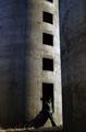
| 11/27/2003 04:02:42 AM |
Left out in the Coldby NazgulComment: Good morning from the critique club.
Nice setting impeccably composed with strong lines, rhythm and good textures.
Unfortunately, I think the young person and his shade do break that strong rhythm in the middle of this scene.
I would have suggested to move your character slightly to the left of the composition where light and shade meet. Or maybe having him sit on this window opening.
Also, having your main subject a little less visible would have been an enhancement meaning wise.
Good photographic work,
All the best, JJ
|
| Photographer found comment helpful. |
| 11/25/2003 08:40:45 AM |
High Wire Cowby KINGComment: Critique Club Time
Your Highness,
Congratulations on finding the appropriate book title for your entry!
It seems, though, that the excitement related to your new purchase has led you to show some uncustomary haste I your creation process.
At first glance, I see two “classic flaws” and an incongruity you could have avoided easily by:
1°) leveling your horizon (slanted horizons will invariably give a snapshot feel to a picture)
2°) placing you main subject in a more harmonious manner (this is debatable and certainly not an absolute rule but main subjects placed dead center in an open environment rarely enhance a composition.)
3°) moving one step ahead to by-pass the blurry grass patch hiding the cow’s reflexion in the foreground.
I think you will probably agree with me that this is not your most accomplished or well thought of shot and lets keep it at that.
Good luck with your new camera
JJ
|
| Photographer found comment helpful. |
Home -
Challenges -
Community -
League -
Photos -
Cameras -
Lenses -
Learn -
Help -
Terms of Use -
Privacy -
Top ^
DPChallenge, and website content and design, Copyright © 2001-2025 Challenging Technologies, LLC.
All digital photo copyrights belong to the photographers and may not be used without permission.
Current Server Time: 08/06/2025 01:58:49 AM EDT.