| Image |
Comment |
| 04/27/2005 01:56:15 PM |
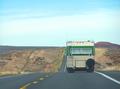
On the road again...by snowleopard10101Comment: This seems to be a little too busy too meet the challenge defintion. Would have been much better to catch a photo of this at, say, the crest of a hill so that there would be less visual intereference from the surrounding landscape. |
 Photographer found comment helpful. Photographer found comment helpful. |
| 04/27/2005 01:45:37 PM |
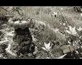
Hiddenby Mr_PantsComment: The only reason I feel that this doesn't quite meet the challenge is that the bushes make the image so busy. Otherwise it's quite a good photo. |
| Photographer found comment helpful. |
| 04/27/2005 01:41:17 PM |
fly awayby suemackComment: Meets the challenge quite well, but a couple of things detract from the image. First and foremost, it's out of focus. The sky would have made a better background if you could have managed this on a clear day. Also, this would have been more interesting to me had the seagull been flying into the pic instead of out of it. |
| Photographer found comment helpful. |
| 04/27/2005 01:34:18 PM |
An Eveningby Joe_CoolComment: I like the color and it seems to fit the challenge pretty well. However, the tilted horizon is really annoying, and the focus could have been better on the fence & tractors. |
| Photographer found comment helpful. |
| 04/27/2005 01:32:52 PM |
Waiting a Berthby SteveinnzComment: Here's a photo that could have scored really well with me. It fits the challenge description perfectly. Unfortunately, your horizon is tilted and the image is WAY out of focus. Better luck next time! |
| Photographer found comment helpful. |
| 04/22/2005 09:00:22 PM |
Rock: The Abandoned Fountainby mocabelaComment: The foreground flowers, while they add depth to the composition, are distracting because of their brightness. Perhaps this shot from another angle would work better? |
| Photographer found comment helpful. |
| 04/22/2005 08:58:42 PM |
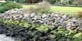
Rock y Bedby sharkavComment: Good idea. Nice colors. Out of focus. Also, a slightly tighter crop would pull the focus more to the center shrubbery; as it stand now, it looks like the bushes on either end are accidentally chopped off which gives the photo an unfinished feel. |
| Photographer found comment helpful. |
| 04/22/2005 08:53:03 PM |
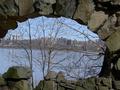
Over the river and through the rock....by Jamie2772Comment: I like the concept. The trees in the center are too busy and distract/detract from the city skyline. The left side of the arch is cut off, which gives an out of balance feel to the photo which is emphasized by the tilted horizon. On the plus side, the focus and DOF is good, and the lighting on the stones is good. |
| Photographer found comment helpful. |
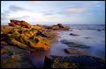
| 04/21/2005 11:20:57 AM |
Ragged by TychoComment: Beautiful colors and textures. Love the lighting. Very nice work. |
| Photographer found comment helpful. |
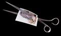
| 04/21/2005 11:19:44 AM |
Scissors!by wheeleddComment: Love the composition on this one - having the scissors on the diagonal is more interesting than if they'd been horizontal or vertical. |
| Photographer found comment helpful. |
Home -
Challenges -
Community -
League -
Photos -
Cameras -
Lenses -
Learn -
Help -
Terms of Use -
Privacy -
Top ^
DPChallenge, and website content and design, Copyright © 2001-2025 Challenging Technologies, LLC.
All digital photo copyrights belong to the photographers and may not be used without permission.
Current Server Time: 08/05/2025 06:56:09 AM EDT.