|
|
|
Showing 251 - 260 of ~873 |
| Image |
Comment |
| 03/01/2006 11:46:47 AM | Blueby KivetComment: If you don't have an iron, then I have two suggestions. The first, to help eliminate or reduce wrinkles, toss sheet in a hot dyrer for about 10 minutes and remove and hang up immediately and let it hang overnight before using. The second suggestion, if you don't want to hang the sheet up overnight or can't get access to a dryer, dampen (don't wet) the sheet and wad it up tightly, let it dry wadded up. The first suggestion will give you a smoother background, the second one a more randomized wrinkly background. |  Photographer found comment helpful. Photographer found comment helpful. |
| 02/28/2006 09:24:09 AM | | | Photographer found comment helpful. |
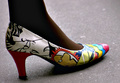
| 02/27/2006 05:59:44 PM | The Face of Fashionby benhurComment: An unusual shoe, to be sure, but a very static and awkward angle and crop. I think a more appealing composition would be her seated, either in profile or facing the camera, with her legs crossed and the feet held away from the body slightly. That could be cropped just above the knees and still keep in line with the concept of the shot, yet be more appealing to the viewer and more flattering to the model. | | Photographer found comment helpful. |
| 02/27/2006 09:16:30 AM | Carter's Little Sleepersby neophyteComment: This is a cute snapshot. I don't mean that in a derogatory way - it simply does not _look_ like a planned and set up shot, even though I can see that it was. I think that what causes the snapshot 'feel' is the fact that he looks like he's on a downhill slide (due to the angle) and the fact that the light is quite harsh (I'm guessing on-board flash). Also, the crop is quite tight - both at the top and on the right-hand side.
I know that taking set up pictures of infants is not the easiest form of photography, since sometimes just catching them in a cooperative mood is difficult, but I also think that with just a few changes, this could be re-shot and turn out looking less like a snapshot and more like a deliberate portrait. If you have access to a largish window with good light, try placing your background and subject so that they are lit with natural light. If it's too bright, a thin muslin or light and filmy white curtain will soften the light without diminishing it too much. The other major change that would really help to improve this shot would be to watch the angle at which you shoot. Like I said, he looks like he's tilted downhill. By moving the camera down just a little and further to the right, I'm pretty sure you'll see an improvement.
I hope some of this helps. This is a very cute little one, and having really nice pictures of him will be a treasure in the years to come. | | Photographer found comment helpful. |
| 02/27/2006 09:05:50 AM | beautiful in Basic Blackby kiwinickComment: This, to me, is a good shot, but just a couple of things keep it from being a 'great' shot. The lighting is excellent - no hot spots, no deep and distracting shadows in the wrong places, just a soft, beautiful glow that perfectly illuminates the model. The composition is quite nice.
What prevents the 'greatness', for me, is, first and foremost, the pose and the crop. The pose she is in, with her hips thrust forward and slightly to the side, really overemphasizes her hips and makes her look extremely bottom-heavy, which I suspect is not really the case in 'real life'. The crop cutting across her hips at the widest point really makes it worse. In addition, cropping where you did is a bit awkward in reference to her hands. The other things that bother me are really more of the nit-picky variety: her right earring is overly large for her face and really looks unbablnced and out of place, and her hair looks like it could have withstood a good brushing just before the sutter was clicked.
Again, good photo, just not *quite* a great one. | | Photographer found comment helpful. |
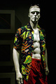
| 02/27/2006 08:57:43 AM | Men's Wearby banmornComment: The strong overhead light simply does not work for me. Had the model been a 'real' human (which I would have much preferred), the eyes would have been shadowed to the point of obscurity (as they are with the mannequin). A reflector or a fill light would help considerably in lighting the face. Also, I think more care should be taken with the background in relation to the models and his outfit - the sunglasses get almost totally lost in the dark bg - there isn't quite enough 'separation' there. Another thought about the bg - it would seem more 'professional' if picture frames in the background were _either_ removed before the shoot _or_ lit so that they looked like they were lieft in intentionally. | | Photographer found comment helpful. |
| 02/27/2006 08:52:30 AM | Damatic Dressupby chris_clarryComment: I think the main detractor for me with this photo is the lighting. I understand that the lighting was used to create a 'mood', and I'm all for that kind of thing - I even like the concept of it. However, I think that perhaps the lighting is falling on the wrong body parts for it to be really effective - the hand and arm are very 'hot', and the rest of the photo is pretty much lost in shadow. The pose is interesting (though I would have preferred to see her looking up at the camera from that position), and the composition is quite nice. The fact that the 'important' parts (her face, her outfit) are so shadowed, though, really undermines the impact of the photo. | | Photographer found comment helpful. |
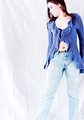
| 02/24/2006 08:52:17 PM | 2006by Postgate1Comment: OK. I realize the white string thing is part of the outfit, but, man! It's seriously distracting! Also, I'm not too sure about the use of sepia toning with this one. I think color might have worked a little better. | | Photographer found comment helpful. |
| 02/24/2006 08:05:50 PM | | | Photographer found comment helpful. |
| 02/24/2006 05:56:56 PM | Formalities Asideby O'HolleranComment: Love the concept, and the composition is good, even if the crop seems a little tight. The light is quite harsh, though, and she looks exceedingly bored. | | Photographer found comment helpful. |
|
Showing 251 - 260 of ~873 |
Home -
Challenges -
Community -
League -
Photos -
Cameras -
Lenses -
Learn -
Help -
Terms of Use -
Privacy -
Top ^
DPChallenge, and website content and design, Copyright © 2001-2025 Challenging Technologies, LLC.
All digital photo copyrights belong to the photographers and may not be used without permission.
Current Server Time: 08/05/2025 06:55:07 AM EDT.
|