| Image |
Comment |
| 04/24/2003 05:19:28 AM |
Texas Nativeby cmrk74Comment: This is pretty good. It could've used one more "sharpen" to make it even better. Good portrayal of texture and I really like the DOF. |
 Photographer found comment helpful. Photographer found comment helpful. |
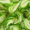
| 04/24/2003 05:18:17 AM |
Swirling Greenby timj351Comment: This looks a lot like a painting with the sort of swirly brush stroke appearance of the leaves. The lighting is just a bit flat and I think you should've adjusted the framing slightly so that the swirly thing was at one of the thirds as opposed to dead center
|
| Photographer found comment helpful. |
| 04/23/2003 03:22:34 PM |
Scattered at Sunriseby mrbarquetComment: Greetings from the Critique Club
By Inspzil
Composition - This is my favorite kind of image to critique, not a bad image with loads of potential. This image might have been better served to focus on the hill more as opposed to having it way off to the side. I don't know what the landscape had to offer over there though, so there may be a perfectly good reason why you didn't. The sky is awesome. Great colors and very well exposed. Too bad there weren't a few more trees or anything to add a little texture to your silhouette. Overall I say its a good composition.
Technical - This is where this image falters a little and I think it's all in the focus or lackthereof. This shot really sharp with a little of anything as a silhouette would be awesome. It needs to be sharp though with clearly visible silhouettes or it really loses our attention that the sky initially grabbed. Very good job exposing this properly. Your timing was excellent.
Overall - My feeling about this image is that its pretty good, but really has a world of potential. A couple of people in this pic with it a little closer to make them more distinguishable would be great. Sometimes the people just aren't around though, especially at sunrise. This is a nice shot. Good luck and keep shooting these sunrises. - Inspzil |
| Photographer found comment helpful. |
| 04/23/2003 02:01:06 PM |
The Thawby jgal76Comment: Greetings from the Critique Club
By Inspzil
Composition - This is not a very compelling image. The point of the photo is simple enough, but it doesn't say much else to me. It doesn't really have a lot going for it. There needs to be something more to this, like some kind of subject, but for the life of me I can't think of what. I guess I don't have a lot to say about this. I think an overhaul of the whole composition is about the only answer I have to solve the problems with this photo. Give the viewers something to focus on and keep their attention.
Technical - This is fairly well taken. Snow shots are tough, especially when that's pretty much what you were going for. It seems a trite washed out nearest the grass. Sacrificing some exposure time though may darken the greens in the grass a little more than you want though. Tough call...
Overall - This meets the challenge, but aside from that there isn't too much I can tell you or suggest. I think a nice clean spring slate would be the best place to start. The snow is finally gone around here, for now. Hope spring brings you lots of nice pics. Good luck in future challenges. - Inspzil |
| Photographer found comment helpful. |
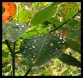
| 04/23/2003 11:53:10 AM |
Acid Rain Showerby EnzoComment: Greetings from the Critique Club
By Inspzil
Composition - Really good subject depicted here. It reminds me of something I'd see in a gardening magazine. The raindrops look suspiciously like mercury from their very shiny appearance. I would have cropped the top of this off and some of the right side to in order to really emphasize the 2 leaves that have the cool drops on them. I think it would've brought it into a better perspective with the big main leaf in front, and the smaller leaf as a backup nicely to the left and slightly behind. You have the DOF to do it and this photo is taken well enough that it would've done a lot to enhance the drops on this leaf.
Technical - This is as well taken as any picture in the whole challenge. You've done a great job with the exposure. But really on the whole I think this picture is taken as well as you could take it and probably a lot better than I could. I wouldn't change anything about the way you took this.
Overall - A little different crop and I think you'd have had a serious contender on your hands. It would've brought the leaves into pseudo-macro mode and really made them shine even more than they do. I think a lot of this photo is perception and if you give the viewers only one real thing to see, then they have no choice but to like it :) At least that's what I think. Congrats on a great pic. Good luck in future challenges - Inspzil |
| Photographer found comment helpful. |
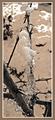
| 04/23/2003 09:46:10 AM |
Jack Frost Felt Abit of a Prickby MartinComment: Greetings from the Critique Club
By Inspzil
Composition - Generally this is a nice pic. I think the subject is a little lacking, but it is a very well taken photo. There really isn't too much specifically wrong with the composition. The thing I like most about it is the branch coming from the top left of the picture down to meet the other branches. It makes for good perspective. It gives us kind of a leading line. The aspect ratio of this photo is a little troubling for me. I would've rather seen it in a different portrait ratio where it isn't this thin.
Technical - I really like the way this was taken. I think the DOF you used is optimal for this. The branch leading down from the top is mostly in focus. The stuff underneath isn't, but we know what it is. The tonal quality of the pic is nice. The brownness of it makes it like sort of a sepia. It makes for a nice pic.
Overall - Not a bad photo at all, just not a real compelling subject. Very well taken and the color choice is good. If it matters, I kinda like the border. THe other commenters didn't generally like it but I think it works. I have to agree with some of them on the aspect ratio thing. Well that's about all I have to add. Good luck in future challenges - Inspzil |
| Photographer found comment helpful. |
| 04/23/2003 05:47:12 AM |
Red Tulipsby AzrifelComment: Showing them going on for quite some time is an effective tool for this photo showing quantity. Good work. |
| Photographer found comment helpful. |
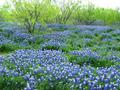
| 04/23/2003 05:43:26 AM |
Bluebonnets and Mesquite Treesby goodtempoComment: Nice colors in the foreground. The sky looks like it might need a little help. There doesn't seem to be any color in the sky at all. That would help contrast the yellow trees a bit more. |
| Photographer found comment helpful. |
| 04/23/2003 05:40:54 AM |
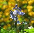
Bluebellsby mbardeenComment: Good lighting on this one. Background is suitable and the photo is very selectively clear and sharp. Nice work. |
| Photographer found comment helpful. |
| 04/23/2003 05:38:14 AM |
A California Pastureby sherryk471Comment: This is a little on the soft side in terms of focus. The horse in the background I don't feel is very suitable background. In terms of the whole pic I don't think it is as effective as it would've been with just a green or sky backdrop |
| Photographer found comment helpful. |
Home -
Challenges -
Community -
League -
Photos -
Cameras -
Lenses -
Learn -
Help -
Terms of Use -
Privacy -
Top ^
DPChallenge, and website content and design, Copyright © 2001-2025 Challenging Technologies, LLC.
All digital photo copyrights belong to the photographers and may not be used without permission.
Current Server Time: 08/15/2025 11:32:21 PM EDT.