| Image |
Comment |
| 02/25/2003 05:10:10 AM |
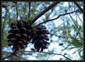
Winter Foliageby karmatComment: I don't like the pinecones that underexposed. They lack color, not that they're jumping with vivid color to begin with, but I think they should look at least like wood. Great DOF on this shot. |
 Photographer found comment helpful. Photographer found comment helpful. |
| 02/25/2003 05:08:30 AM |
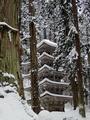
so white, so silentby kenboComment: If this pic wasn't leaning so hard to the left it would definitely be a 10. THis is really gorgeous. Well framed in by the trees and everything. awesome. Settle for 9? |
| Photographer found comment helpful. |
| 02/25/2003 05:06:56 AM |
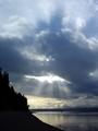
Sunraysby timj351Comment: Very nice shot. Love the silhouettes of the hill an trees. Water is very calm. Great capture of the clouds and sun. |
| Photographer found comment helpful. |
| 02/25/2003 05:04:02 AM |
Fresh Bedsheetsby tcherringComment: Baby looks a little blotchy.... sure she's not allergic to your Fabric Softener? Cute pic but it doesn't do much for me in the way of Stock Photography |
| Photographer found comment helpful. |
| 02/25/2003 04:52:42 AM |
Diceby PopeTomComment: This pic would've been much better with the right lighting. You have a lot of cool translucent dice but really could've taken advantage with something lighting them up properly, without the whole picture being so bright. Interesting idea for a shot though. Someone is a gamer looks like. |
| Photographer found comment helpful. |
| 02/25/2003 04:38:41 AM |
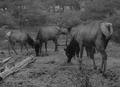
"If Ansel Saw Elk...."by tfarrell23Comment: If Ansel shot this the DOF would have been much greater. The colors are kind of dreary, even for B&W. Maybe it needs a little more contrast |
| Photographer found comment helpful. |
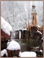
| 02/25/2003 04:36:09 AM |
Castle in the Snowby MalokataComment: The steps or whatever the border on the left would frame the picture well if they didn't come into the frame quite so far. The snow is gorgeous. Cool little tower thing as well. |
| Photographer found comment helpful. |
| 02/24/2003 11:18:16 PM |
Kids Love McDonaldsby GeneralEComment: Greetings from the Critique Club
By Inspzil
Before I get started, this is a strange photo.
Composition - I could see where you get love out of this. Its not really what I think the challenge was about, but in its own way, it does meet. That being said, Ronald looks like he's seen better days. The figure and Isaac are reasonably well framed. I'm not wild about the shot. It would be better to see Isaac's face methinks. Don't take this the wrong way GeneralE, but this is a little creepy IMO. As unbelievable as this may sound coming from me, I have no suggestions on what to change really to make it better. I'm stumped. Maybe Grimace?
Technical - A little blurry perhaps, but in spur of the moment situations, you are generale lucky to have a camera with you more or less turned on in your hands ready to shoot. Exposure is pretty good and the overall picture quality is quite clear, nothing lost by bumping the ISO up to 200. Processing looks pretty minimal. Nothing really to note.
Overall - I do not like this photo, even as a simple snapshot. I don't know any nice fluffy way to say it generale so I hope you can appreciate my directness. Maybe I have a clown-phobia that I've never addressed, but something strikes a wrong chord when I look at this. I understand the concept and I do feel it meets the challenge (a little loosely perhaps). And honestly its not a badly taken photo.
With that said, I'm moving on... My apologies if I said anything too offensive and also that this critique is basically worthless. Good Luck in the future challenges GeneralE - Bob |
| Photographer found comment helpful. |
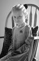
| 02/24/2003 05:31:36 AM |
Stock Photo Frame Insertby crabappl3Comment: She doesn't look to happy to be there. Neat lighting and I like the chair effect. The light looks a little bright as its washing her hair out. The crop could be better IMO including the whole chair but isn't necessary. |
| Photographer found comment helpful. |
| 02/24/2003 05:27:10 AM |
Protectorby pitsamanComment: I'm curious to know what made you cut the picture off on the left side and include this pole that seems unattached on the right. The picture isn't too bad, looks like you might've lost some picture quality in compression judging by the lines being not so fluid. Overall not too bad, but I think a better crop would've served you well |
| Photographer found comment helpful. |
Home -
Challenges -
Community -
League -
Photos -
Cameras -
Lenses -
Learn -
Help -
Terms of Use -
Privacy -
Top ^
DPChallenge, and website content and design, Copyright © 2001-2025 Challenging Technologies, LLC.
All digital photo copyrights belong to the photographers and may not be used without permission.
Current Server Time: 08/15/2025 06:24:58 PM EDT.