|
|
|
Showing 1121 - 1130 of ~1668 |
| Image |
Comment |
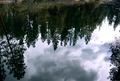
| 03/28/2003 05:20:52 AM | Above from Below from Above... er, yeah, that's right.by leko2kComment: Greetings from the Critique Club
By Inspzil
Composition - I'm not sold that this really meets the challenge, but for purposes of discussion we'll say it definitely does. The composition of this photo is this reflection. It really is a nice reflection, but leaves me wanting more. As nice as it is, I see this as a pretty background without a subject. There is no strong focal point.
**Added later - This does have a really nice feel to it like an oil painting. Ever consider turning it so it looks right side up? Just an afterthought.
Technical - This photo is pretty underexposed. Part of that is the water looks like its filtering out some of the greens in the grass and trees. I think the photo could've used a little slower shutter speed to capture a bit more of the colors. The DOF is not really an issue here. Overall not badly taken, but could use a little help making the colors stand out with exposure or processing.
Overall - I don't see this as a terribly effective shot. The reflection is neat, but not really stunning. There isn't anything about it that sets it apart. I think the score you received is fair. It isn't a bad picture, but it seems to be missing something. Hope this could be of some use to you. Good luck in future challenges. - Inspzil Message edited by author 2003-03-30 13:22:20. |  Photographer found comment helpful. Photographer found comment helpful. |
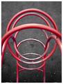
| 03/27/2003 09:02:46 AM | Playground Part from Aboveby JPRComment: Greetings from the Critique Club
By Inspzil
Composition - Interesting perspective. The bar closest to the camera is really hard for me to get past in this pic. There isn't a lot you can do about it, but I really don't like it there at all. The rest of it is fine. It doesn't have any real exceptional visual impact, but it's not completely unworthy of being a subject. And it meets the challenge :)
Technical - At least with that real close bar, the camera didn't focus solely on it. There is a great DOF that keeps all the other bars pretty focused. Its hard to tell what the Aperture was though with no EXIF data furnished. Exposure is okay. Looks like it might've been a cloudy day. The framing is as good as I think it could be. Pretty well taken photo.
Overall - Pretty average, as the score shows. Its a pretty well taken photo of something that isn't terribly exciting. I think the perspective works for this pic, but I think there are other ones to explore that might give this subject a little more visual impact. Hope this helps a little. Good luck on your future challenges - Inspzil | | Photographer found comment helpful. |
| 03/27/2003 08:48:50 AM | Candle Lightsby ozaibakComment: Greetings from the Critique Club
By Inspzil
Composition - I like the way the candles are arranged. They have pretty good color and the negative space works well. I think the candles shouldn't have been burned so much before the picture was shot. It makes them nonuniform in shape and the areas around the wicks are also of differing sizes. The flames are also not all pointing in the same direction. Not a bad composition for a photo. Not anything extraordinary either.
Technical - Focus, focus, focus. Intentional or not, the focus being this soft really killed your score. It is never taken very well, as artistic as it might be. And I think this photo has a really nice exposure and framing. A little tiny bit soft might've been okay, but this is a lot soft. I have a feeling this was a handheld shot where it should've been on a tripod for stability. If it was on a tripod, then I have to think something was bumped or something. In any case, the lack of clarity has really hurt what could've been a pretty good picture.
Overall - Focus. You have it, you do much better. You don't have it, things kind of slide. I'd set this one up again with some newer candles and try it again off a tripod. Might have to wait for the little breezes to stop so all the flames are perfectly upright or have a light even breeze blow them all to one side. Hope this helps a little. Good luck in future challenges - Inspzil
| | Photographer found comment helpful. |
| 03/27/2003 12:05:34 AM | Black & Blue Scratchby danh669Comment: Greetings Newbie from the Critique Club
By Inspzil
For reference I'll add a little "veteran's" point of view advice that you can take or leave.
Composition - Difficult to interpret what the heck I was looking at. I see now, but it took a combination of what I was seeing and the title to eventually come to the conclusion that it was pocket billiards and not just some abstract stuff. (clarity of subject is very important to the large majority of DPC voters, myself included). This is a good idea and meets the challenge. Using the approach you've taken I'd have turned it slightly to make it symmetric. The light showing thru at the bottom of the pocket is a great touch. I think it should've been the selling point of this photo. The overall color tone of the pic is good.
Technical - I think this photo would've scored substantially higher if the aperture were about F11 or so to bring the ball more in focus, if not totally focused. It would've capitalized on the light showing thru the side of the pocket. The ball is pretty blurry. (Even soft focus on DPC is generally frowned upon by most of the newer members) The exposure is great and the framing is pretty close. It doesn't look like a lot of processing was done, which generally means you did a very good job, or that you didn't do much to the photo.
Overall - I can see why this did poorly by the difficult time I had determining what I was even looking at. Voters, myself included, don't have several minutes to try to sit and determine what every subject is like I did here tonight. Abstract photos are actually acceptable if you put "abstract" somewhere in the title. If not, it's assumed that you just don't know what you're doing and your photo obviously sucks :) . There is a lot for folks like me, who start as virtual novices, to learn about photography. Hopefully this gives you a little insight into what we, the voting public, are looking for and how we are looking at it. My recipe is Clarity of Subject, Consistent with Topic, and Creativity. Anyway, there's my 2 cents. Welcome to DPC and good luck with future challenges. - Inspzil | | Photographer found comment helpful. |
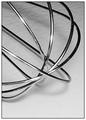
| 03/26/2003 07:56:15 AM | Whiskby lisaeComment: Greetings from the Critique Club
By Inspzil
Composition - Whisks are good photographic subjects. I think something is lost though from this extreme short distance. The properties of whisks that I personally find appealing in terms of photography are the lines of the wires and the regularity of the pattern they form on the whole. This close sort of obscures that regularity so that it sort of looks like a jumble of wires. I wish the background was flat. The little texture there isn't really hurting anything, but I don't prefer it to plain and flat. The highlights left from the flash are too intense. What I do like about this photo is the contrast between the bottom wires and the counter top and the bottom wires and the top wires. I like how the top ones are very bright (too bright in some cases) and the bottom ones are all but black. This is a great effect to show in a single utensil. Nice work there.
Technical - Well taken macro. DOF is pretty great so that most of this is in focus. I don't know what the F-number is so its hard to make any association without exif data. Whatever the case, I like the technique and the black and white works well for this photo.
Overall - Not a bad photo. Nothing extraordinary either. Well taken, but I'm not sold on the overall composition although there are some qualities that are very attractive. I think the score pretty much conveys my feelings about the photo, were I to quantify it. Hope this could be of a little help to you. Maybe natural light and a longer exposure would've done you better than the flash. Good luck with your future challenges mate - Inspzil | | Photographer found comment helpful. |
| 03/26/2003 07:42:31 AM | Spoon Starby nathaliedooComment: Greetings from the Critique Club
By Inspzil
Composition - I really like the composition of this photograph and probably why it was one of my highest rated. The framing is very good and the color is nice. The extra reflections in the spoons is a little distracting, but tolerable at worst. Great idea and well executed.
Technical - Very well taken photo. Nice and sharp with great exposure. No obvious processing flaws or compression problems.
Overall - This may be the shortest critique I've ever written. I really liked the photo and scored it well. The only thing I think that could've been better is omitting the reflections from the spoons, especially of the photographer :) I really like this photo. Great job and thanks for sharing it with us. Keep up the good work and Bon Chance! - Inspzil | | Photographer found comment helpful. |
| 03/25/2003 10:00:00 AM | Looking down on San Antonioby xertionComment: Greetings from the Critique Club
By Inspzil
Composition - The cityscape of San Antonio... This is not a bad picture, but a little, ordinary, for lack of a better word. I think that as far as these types of shots go, it is a better bet to have something as a strong focal point for the viewers. Even an ominous sky can sometimes work sometimes. There really isn't anything wrong with the picture, just lacking some interest I think. I wish the sky was all nice and blue like it is on the right side, but you can't have everyting I know. That flat looking complex at the bottom of the frame I think could've been cut out and we wouldn't miss it. Maybe if you changed the aspect a bit and made it more of a panorama type shot... but generally those shots do not do well on dpc. It just needs something to give it a little of the "wow" factor.
Technical - Not badly taken. Could be a little more sharp but it isn't really soft or anything. Looks a pinch overexposed. That might help the sky out a little too by making it a little more blue.
Overall - This is a difficult picture to critique because it really doesn't have anything WRONG with it. There isn't a whole lot you can change about it to make a substantial improvement without rethinking the composition again. Maybe it would be better to concentrate on one block of buildings as opposed to the whole cityscape. Sorry I don't have more advice to offer on this one. If you could just make it worse I could talk more and feel more important :P Good luck in the future challenges. - Inspzil | | Photographer found comment helpful. |
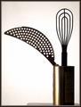
| 03/25/2003 09:33:04 AM | Bouquetby magnetic9999Comment: Greetings from the Critique Club
By Inspzil
I wrote one for this picture earlier this morning, but I'm not sure what happened to it so I guess I'm doing it again.
Composition - Great line leading into the vase with the cheese grater thing. That was the first thing I saw when I looked at this pic. The best thing about this pic that I like is the color of the receptacle. I'm not sure I like the little table there. It looks like it could be a fuzz off the horizon. This is very simple but has some very good qualities that make it compositionally strong including the geometry and the way the utensils are silhouetted.
Technical - Well taken, as always. The one thing that gets my attention is the funky diagonal lines where the whisk wires meet the handle. Doesn't look like anything wrong that you did, but maybe it was the resizing of the picture didn't agree with it. Aside from that, everything else looks pretty darn good.
Overall - Simple, but well done. Excellent picture quality. Good lines and shapes. Like the framing and exposure. Nice work. Good luck in future challenges - BoB | | Photographer found comment helpful. |
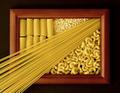
| 03/25/2003 04:43:15 AM | Pastaby FranziskaLangComment: Greetings from the Critique Club
By Inspzil
Composition - Very nice decorative variety of pastas arranged neatly on what appears to be a picture frame. This is meeting the challenge very well. The thin spaghetti does a wonderful job of providing leading lines into the picture frame. The first time I saw this during voting that spaghetti, for whatever reason, really reminded me of the sun's rays showing through the window except the sun itself is not visible. I think this quality was the appeal of this photo for me. The spaghetti acts as a sort of border between the mostaccioli noodles and the macaroni noodles. Well conceived by whomever thunk it up. Well executed by you.
Technical - Very well taken photo. Exposure could've been just a little more to give the 3 darker sides of the frame just a bit more light. This is a very nice crisp clear photo though. The kind a well trained Nikon user should take :) I don't see anything unusual about the way this was taken or the post processing. Very nicely done.
Overall - Well set up and well taken photo. The spaghetti makes this picture in my eyes. It acts as a divider and a path for the viewer to follow from the bottom corner right on up into the midst of the noodles. Despite not being your idea, I think it definitely deserves the score it got for great execution. Nice job. Keep up the good work and good luck in future challenges. - Bob
| | Photographer found comment helpful. |
| 03/20/2003 05:22:56 AM | From Scratchby karmatComment: I like the radical angle and the color approach. The background is a little busy but not too bad. Nice job | | Photographer found comment helpful. |
|
Showing 1121 - 1130 of ~1668 |
Home -
Challenges -
Community -
League -
Photos -
Cameras -
Lenses -
Learn -
Help -
Terms of Use -
Privacy -
Top ^
DPChallenge, and website content and design, Copyright © 2001-2025 Challenging Technologies, LLC.
All digital photo copyrights belong to the photographers and may not be used without permission.
Current Server Time: 08/16/2025 04:11:56 PM EDT.
|