| Image |
Comment |
| 05/09/2007 07:38:22 AM |
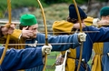
On Targetby meneleComment: Nice shot. Good cmoposition, great use of Dof to draw the eye to the main subject in an otherwise busy shot. 7 |
 Photographer found comment helpful. Photographer found comment helpful. |
| 05/09/2007 07:37:03 AM |
Swashbucklingby idnicComment: great shot. Top 10, I think. great B & W conversion, great Dof, great focus, great composition to just get the head. The only detraction, IMO, is the OOF foreground element (I can't even tell what it is -looks like it might be the top of steering wheel???). An 8 from me. |
| Photographer found comment helpful. |
| 05/09/2007 07:35:25 AM |
The Piperby cjhunter2540Comment: Nice idea, but I find the lighting to be very harsh, and from a bad angle. Having the suject turn slightly and step more into the light, and fixing your exposure would avoid the blow outs on the face and arms. |
| Photographer found comment helpful. |
| 05/09/2007 07:33:08 AM |
Boy in Mumbai carrying a babyby chetandesaiComment: Not sure how this is an event, but I'll assume it is. Nice colour tones. The guy in the left in the white shirt drawa my eye away from the subjects. Perhaps waiting a few seconds for him to leave the frame would have really improved this shot. Also, a bit dark on the smaller boys face. Getting them to turn just slightly so the light hit their eyes better would have also help. 5 from me. |
| Photographer found comment helpful. |
| 05/09/2007 07:29:59 AM |
Masqueradeby shutter22Comment: Good lighting, but I think the focus is just a bit soft. Also the large white space at the bottom distracts my eye from the actual mask. I would suggest cropping up a bit to remove some of that. 6 |
| Photographer found comment helpful. |
| 05/09/2007 07:28:29 AM |
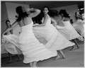
Cinco de Mayo Dancersby alexjackComment: Interesting composition selection. IMO, it seems too tight, and I wish I could see more of the costumes, which I would think should be amazing, given the headware. |
| Photographer found comment helpful. |
| 05/09/2007 07:27:07 AM |
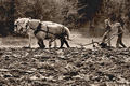
Demonstrating Cultures Of Oldby atupdateComment: Great color tone. I know the subject needs to include some foreground earth, but, IMO, the image would be improved by cropping up from the bottom just a bit, to avoid having the bold line between the plowed eartha and the background fall so exactly in the center of the image. Stepping back a few feet to get more space on both vertical sides would also help, I think, to show the amount of work that needs to be done. But those are nits, it;'s avery nice shot - Overall a 6 from me. |
| Photographer found comment helpful. |
| 05/09/2007 07:23:55 AM |
Cinco De Mayo dancersby kandykarmlComment: The tilted horizon detracts a bit, IMO, especially around the ceiling of the room. The B&W conversion could have used just a bit more contrast. Subjects and composition are good. Overall a 6 from me. |
| Photographer found comment helpful. |
| 05/07/2007 07:10:22 AM |
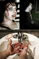
Domestic Abuseby UbersteinyComment: I promised you a more detailed comment - it is totally the subject matter that I don't like in this. I find it offensive. So, I skipped it in voting (and just left the comment) because I didn't want to vote you down just because I dislike the subject.
Technically, I think this is a great set of shots. My very few technical suggestions are - - the top right photo is a bit dark on the left side, especially contrasted against the girls photo. I might suggest that you do a vertical flip the shot of the guy digging to even out the lighting in the top two. Also, on the bottom shot, the horizontal bar above the sink detracts a bit, you could have perhaps cropped it a bit to remove that. And, I would also suggest cropping up by about the same amount from the bottom of the image, to remove a bit of the extra arms, so overall, cropping in tighter from the top and the bottom, but leaving the sides as they are, since the tightness on the sink really draws the eye into the center of the overall triptych. If I could have voted without dropping your score due to the subject matter, I'd have given this a 7 or 8. |
| Photographer found comment helpful. |
| 05/01/2007 07:48:31 PM |
|
| Photographer found comment helpful. |
Home -
Challenges -
Community -
League -
Photos -
Cameras -
Lenses -
Learn -
Help -
Terms of Use -
Privacy -
Top ^
DPChallenge, and website content and design, Copyright © 2001-2025 Challenging Technologies, LLC.
All digital photo copyrights belong to the photographers and may not be used without permission.
Current Server Time: 08/26/2025 07:20:31 AM EDT.