| Image |
Comment |
| 02/07/2008 08:14:55 PM |
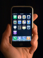
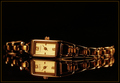
Touching is Believingby arron_christensenComment: Nice idea and concept. COmp could use a bit more negative space to place eventual text and the focus could be bit sharper but you're on the right track. |
 Photographer found comment helpful. Photographer found comment helpful. |
| 02/07/2008 08:10:25 PM |
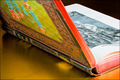
Rare Books - not your average paperbackby HeiSchComment: I wonder if the product is properly displayed or if the message "they don't make em like they used to" is what you're trying to sell. A wider crop would display your product better butthe other technicals seem fine. |
| Photographer found comment helpful. |
| 02/07/2008 02:44:10 PM |
|
| Photographer found comment helpful. |
| 02/07/2008 02:42:02 PM |
|
| Photographer found comment helpful. |
| 02/07/2008 02:39:59 PM |
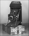
Fulgent Fossilby AbstractComment: Reflection and comp are top rate as is the lighting and focus. I'm sure what's being sold. Negative space is perfect for text. Excellent work here. |
| Photographer found comment helpful. |
| 02/07/2008 02:38:29 PM |
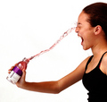
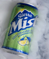
Sierra Mistby tryingtostayinfocusComment: I like the attempt at the misty effect and the droplets. Picture is clear and product is clearly displayed. Comp is nice and good focus. However the mist seems a bit too thick and actually looks more like smoke. |
| Photographer found comment helpful. |
| 02/07/2008 10:30:31 AM |
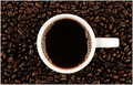
Coffee...black.by imagesbytlpComment: Ok so I;m biased, I love all things caffinated. I sure what the product is and the beautiful negative space allows for easy text placement. I might ask for a little less centered comp to add some balance when the text is supplied. Nice work overall though. |
| Photographer found comment helpful. |
| 02/07/2008 10:28:26 AM |
Peeps !by bauerfan71Comment: Nice idea and close up. I like the comp and I'm sure what the product is. Photo could be a bit sharper and some negative space would help text flow. |
| Photographer found comment helpful. |
| 02/07/2008 10:26:55 AM |
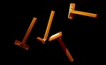
BIC Razors - One blade is all you needby treyvusComment: Comp is good and I'm sure what's being sold. Lighting is uneven and that tsetracts from the product display. Good negative space but there should be one razor that is in full view. |
| Photographer found comment helpful. |
| 02/06/2008 09:31:32 PM |
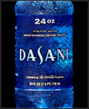
Dasani. Simply refreshing.by essayComment: Crisp and clean with tones that give this a refreshing "feel" to it. Sometimes less is more and this is a great example of it. Nice work. |
| Photographer found comment helpful. |
Home -
Challenges -
Community -
League -
Photos -
Cameras -
Lenses -
Learn -
Help -
Terms of Use -
Privacy -
Top ^
DPChallenge, and website content and design, Copyright © 2001-2025 Challenging Technologies, LLC.
All digital photo copyrights belong to the photographers and may not be used without permission.
Current Server Time: 08/24/2025 05:02:54 PM EDT.