| Image |
Comment |
| 08/10/2005 09:44:11 PM |
|
 Photographer found comment helpful. Photographer found comment helpful. |
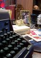
| 08/10/2005 09:43:25 PM |
1968by codauberComment: The assemblage of items is strongly evocative of the era. There is something about the white light that seems a little harsh and inappropriate for a 'vintage' feel. The white book manages to steal the show because of its light color interacts with the lighting. This is unfortunate because I am much more interested in the typewriter, the model spacecraft, the gyroscope the radio and the photo. |
| Photographer found comment helpful. |
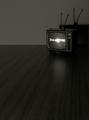
| 08/10/2005 09:29:22 PM |
1959by danderson107Comment: Nice use of negative space and rabbiit ears. This is easily the best use of rabbit ears I've seen in a very long time! |
| Photographer found comment helpful. |
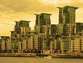
| 08/10/2005 01:31:59 PM |
Building Social Dividesby jseyerleComment: I found the golden color to be completely apropos to the theme. With the aid of the title, I was able to figure out that sometimes turning everything you touch into gold can have negative consequences. Social division is one. And I thought the photo managed to make that point better with this set of color choices - green and gold - than any other. I like the photo for the visual strength of its repeated elements, and for its unique color cast. |
| Photographer found comment helpful. |
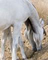
| 08/09/2005 04:55:13 PM |
Two For Oneby lynnesiteComment: I really like the composition and the textures. I find myself wondering whether that big gray patch of horse could not be treated in a more interesting manner. |
| Photographer found comment helpful. |
| 08/09/2005 04:47:44 PM |
Finger extensionby RUEDISCHMUTZComment: The white painted nails and black background proved an inspired choice. Nice texture and lighting. The illusion just about works in the thumbnail version. Nicely done. |
| Photographer found comment helpful. |
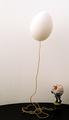
| 08/09/2005 04:43:54 PM |
Humpty Dumpty and the Floating Eggby Pug-HComment: Very funny, especially the stool. I wish the perspective were just a little lower and that mr D. figured a little more prominently in the photo. Finally, I wonder whether a nice clear blue sky with just a touch of cloud might have added to the illusion. In any case, It's clever and funny. |
| Photographer found comment helpful. |
| 08/07/2005 10:43:03 PM |
Sign at an old hardware storeby puzzledComment: I like the simple composition, especially the way the shadow echoes the sign so clearly. The bumpy stucco wall adds interest. I also like the close crop (but I tend to crop more tightly than a lot of people at this site.) |
| Photographer found comment helpful. |
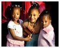
| 08/06/2005 12:33:14 AM |
Divasby whiteroomComment: What gloriously provocative expressions! Each is from a totally disparate emotional space. One might mount a heap of trivial quibbles about shadows being too strong or the background being just a tad distracting; but those three faces overbalance any hypothetical weaknesses a dozen times over. Very Very Nice. |
| Photographer found comment helpful. |
| 08/06/2005 12:29:21 AM |
360 Modena Spiderby wmprkgComment: Cathcing the reflection in the hood was a nice choice. Even if the room was that golden tone, it feels just a litte oppressive to me - a little desat might help. While this may be the right level of sharpness at which to print the photo, I think it looks a little unsharp for monitor presentation. And curiously, even though the stallion is anything but static, the framing of the horse left to right has a static effect. It feels static. Still, this is a nicely observed shot; and the treatment is solid. |
| Photographer found comment helpful. |
Home -
Challenges -
Community -
League -
Photos -
Cameras -
Lenses -
Learn -
Help -
Terms of Use -
Privacy -
Top ^
DPChallenge, and website content and design, Copyright © 2001-2025 Challenging Technologies, LLC.
All digital photo copyrights belong to the photographers and may not be used without permission.
Current Server Time: 12/21/2025 03:49:11 PM EST.