| Image |
Comment |
| 01/24/2003 02:47:45 AM |
|
 Photographer found comment helpful. Photographer found comment helpful. |
| 01/21/2003 02:19:20 AM |
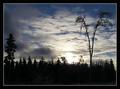
Where am I?by hardwaybetsComment: This would have been so much better if the angles were even. For example the areas of sky in the bottom corners should be the same shape and size and the top diagonals should both go to the top corners of the frame. |
| Photographer found comment helpful. |
| 01/20/2003 01:53:54 AM |
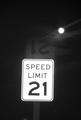
Broken Lawsby DJLubaComment: You've captured a reflection of the sign here (I assume in the car windshield). If you meant for the reflection I'm not sure that it adds anything. Also the sign is slightly off vertical, it may have been better to rotate the image a degree or two to the left and then cropping before submission. |
| Photographer found comment helpful. |
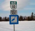
| 01/20/2003 01:42:34 AM |
The Huron Trailby margieComment: Nice shot but I think it would have better with the sign positioned more to the left. The sign is slightly off the vertical and the horizon is not quite horizontal, maybe rotating 1 or 2 degrees to the right and then cropping would fix this. |
| Photographer found comment helpful. |
| 01/17/2003 01:52:54 AM |
at sunriseby BeeGeeComment: I like the fact that you've captured the detail in the foreground rather than just concentrating on a silhouetted horizon. The horizon is slightly off horizontal though. |
| Photographer found comment helpful. |
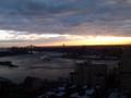
| 01/17/2003 01:37:20 AM |
Viewpointby moondoggieComment: Wow. That certainly is a good viewpoint. If I had to pick one flaw it would be that the area on the right of frame is in shadow, maybe you have tried this again at a different time of day. Congratulations on a very striking photograph. |
| Photographer found comment helpful. |
| 01/17/2003 01:34:16 AM |
Cloud-Scapeby MonaComment: Very moody shot and the border actually improves the shot rather than detracting from it. |
| Photographer found comment helpful. |
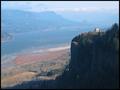
| 01/15/2003 02:16:43 AM |
Stand Tallby TurbotechComment: The foreground colours are excellent but the colours in the distance, particularly the tower and sky look a little washed out. |
| Photographer found comment helpful. |
| 01/13/2003 02:28:31 AM |
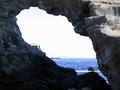
Portalby AntithesisComment: Nice photo but for the purposes of this challenge I would rather see more through the portal and less of the rock frame. Maybe you could also have tilted the camera so that the rock outline was straighter and the horizon obviously on an angle. |
| Photographer found comment helpful. |
| 12/28/2002 02:20:00 AM |
|
| Photographer found comment helpful. |
Home -
Challenges -
Community -
League -
Photos -
Cameras -
Lenses -
Learn -
Help -
Terms of Use -
Privacy -
Top ^
DPChallenge, and website content and design, Copyright © 2001-2025 Challenging Technologies, LLC.
All digital photo copyrights belong to the photographers and may not be used without permission.
Current Server Time: 08/20/2025 08:44:40 AM EDT.