|
|
|
Showing 151 - 160 of ~369 |
| Image |
Comment |
| 03/27/2006 09:02:07 AM | |  Photographer found comment helpful. Photographer found comment helpful. |
| 03/23/2006 12:10:47 PM | Eyesby banmornComment: Hi! Here’s a comment from the Critique Club.
First Impression:
Busy! Eyes dropped to the large water drop front and centre, up to the dark area near the top, around to the left, back to the front water drop.
Composition:
I feel it’s too busy, with too much out of focus. The black areas on the screen are distracting in the bifocals as well as in the water drops. I like the colours.
My eyes kept following the glasses frame around, looking for what was in focus.
Subject:
Clever use of bifocals and feathers. Meets challenge. Speed voters may have had trouble!
Technical:
Find DOF too shallow. If you could have brought the frame and some water drops in focus, your picture would have really “popped”
Thanks for your comments describing what you did pre and post. Gives me a much better idea what your intentions were.
Sorry, I don’t understand your reference to RainX
Summary:
Congratulations on your 76% placement, and getting a score above your average.
| | Photographer found comment helpful. |
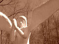
| 03/21/2006 12:40:35 PM | Follow Meby rayg544Comment: First Impression:
My eyes went to the face, to the hands, white part of left wing, down to the elbows, then over to the right wing. “What’s on the elbow?”
Composition:
Sky and wings too close in colour. Not enough contrast. May have been cropped to tight, but I don’t know what you may have been excluding on purpose. You didn’t include any notes on what you did taking the picture or post processing.
Subject:
Feel you met the challenge.
Technical:
Whites are blown and focus is soft. Nothing really sharp. Some contrast adjustment followed by some USM may have helped
Suggestions:
Don’t think the “sepia” effect works. May have been better in B/W, or original colour?
Summary:
Unfortunately, your statue doesn’t have a very high “interest” level. Post processing may not have been appropriate for this picture.
| | Photographer found comment helpful. |
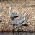
| 03/16/2006 12:46:38 PM | Sandhill Cranesby DrakeComment: Hi! Here’s a comment from the Critique Club.
First Impression:
My eyes went to the body of the top bird and then down its wing, over to the second body then down the legs. “They, (these birds) look odd.”
Composition:
Found the combination of leg position and wing position logically challenging. Took me a bit to figure out what each bird was doing. Not your typical expected pose.
Background distracted from the subjects. Tighter cropping may have been more pleasing.
Subject:
Met challenge
Technical:
With no comments to go by, I don’t know what you were trying to achieve. I found it had soft focus, with nothing sharp. File size could have been bumped up to 640 X 640. You only used 560 X 560. Colours were a little flat. Saturation on the red could have been bumped up a bit to provide more contrast.
Summary:
The cranes were an excellent subject choice. Don’t know how patient the voters would have been to figure out your picture. Typical poses require less thought and are more inclined to get more of a “wow” factor!
This bird picture lacks the crispness and feather detail of many of your other bird pictures.
| | Photographer found comment helpful. |
| 03/13/2006 12:28:04 PM | Nearness of the daughter comforts mommyby alexgarciaComment: Hi! Here’s a comment from the Critique Club.
First Impression:
My eyes went to the top left green tiles, black ears of kitten and then down to the cat. Green busy and distracting
Composition:
Location and expression of the cats is good.
Step tread and background overpower the cats.
Subject:
Good capture and well titled.
Technical:
DOF shallow, focus on kitten is soft.
Not sure why you used 800 ISO, main subjects, kitten and cat lack detail.
Picture not square. Slight drop from horizontal on left side.
Summary:
The capture is good, unfortunately the location worked against you.
| | Photographer found comment helpful. |
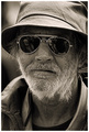
| 03/02/2006 12:52:48 PM | Invisible for everyoneby patrinusComment: Hi! Here’s a comment from the Critique Club.
First Impression:
Nice shot! Scruffy beard and detail good! What’s that in the glasses?
Composition:
May have been cropped a little tight, but not much. Reflections are a little distracting. Don’t know if you wanted them or not! With no post processing comments, I don’t know what you were trying to achieve.
Subject:
Excellent capture. His expression begs for a comment balloon.
Technical:
It all works. Focus , DOF and lighting.
Summary:
Not much to say. Very nice picture from a composition and technical point of view. With an 89% placement in a very tough challenge, I agree with the voters.
| | Photographer found comment helpful. |
| 03/02/2006 12:11:30 PM | melting frostby margiemuComment: Hi! Here’s a comment from the Critique Club.
First Impression:
My eyes went to the left leaf edge, blurry, leaf veins took me to the top right corner, blurry, then down to the water drop in focus. Nice back lighting!
Composition:
With such a narrow DOF, cropping the bottom half may have been more effective. Backlighting works well. Good job with the drop. 2nd leaf adds a dark distraction on the front leaf.
Subject:
I like your concept. Good eye to see the potential of the frost and the drop. Nice texture in the leaf.
Technical:
With no post processing comments, I can’t comment on your intentions. Lighting is effective with the leaf edge highlighted. DOF leaves most of your picture out of focus. More focus would have really brought out the edge ice as well as the leaf veins.
Summary:
Nice shot, I think the shallow DOF and cropping worked against you.
| | Photographer found comment helpful. |
| 03/01/2006 01:10:21 PM | Turn up the radio!by eliniasComment: Hi! Here’s a comment from the Critique Club.
First Impression:
Nice shot. Drawn to the eyes, smile, speaker and then down the yellow tie.
Composition:
Good choice of colours. Very vibrant. May have over done the red balance.
Framing worked, helps with the expression.
Subject:
I agree with the comments, met the challenge well.
Technical:
Find the off colour shadow to the right distracting. A second light, or post processing may have helped. Moving subject away from the back drop would have reduced the harshness of the shadow behind the hand holding the radio. Focus is a little soft.
Summary:
Nice shot! His expression and your colour choices worked really well.
p.s. Welcome to the site. Based on your first four entries, you are off to a good start!
| | Photographer found comment helpful. |
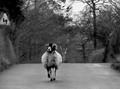
| 02/23/2006 12:54:24 PM | Leaving for the cityby PatrolComment: Hi! Here’s a comment from the Critique Club.
First Impression:
Eyes drawn directly at the animals face, then up to the sign, over to the sky , the dark tree on the right and then back to the animal. Then the more practical question, was it running at you? Good thing you were looking up!
Composition:
Found the sign, sky and trees distracting. Given your subject, tighter cropping may have helped.
Subject:
No problem meeting the challenge. Animals expression is really good! I liked your title. It went with the expression.
Technical:
With no post editing comments, I don’t know what you were trying to achieve. A little more contrast may have improved the flatness of the picture. I found the focus soft with nothing sharp. Given your comment, you may not have had time to keep your subject in focus!
Summary:
The subject and mood were stronger than the technical aspects of the picture.
| | Photographer found comment helpful. |
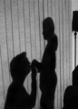
| 02/16/2006 01:07:27 PM | Be my Valentineby DigiFotoBuddyComment: Hi! Here’s a comment from the Critique Club.
First Impression:
Nice picture! Well titled.
Composition:
Positions are good, lamp on table is effective, but the round object, bottom right is distracting. Perspective is off. You look disproportionaly bigger than your wife. Background lines are distracting due to perspective. You may have cropped too tight. Seeing more of you on your knees may have helped.
Subject:
No problem meeting the challenge. Good choice of subject.
Technical:
Since you didn’t give any post processing notes, I can’t comment on your intent. I find the picture too grainy. Your 1600 ISO would not have helped. The lighting created darker shadows on the objects on the right. The sharpness is soft on the two of you, but more defined on the objects on the right. You two have more gray. The eyes keep getting drawn towards the darkside, (sorry I couldn’t resist)
Summary:
I liked your concept, unfortunately the execution created some distractions. Congratulations on this being your personal best.
| | Photographer found comment helpful. |
|
Showing 151 - 160 of ~369 |
Home -
Challenges -
Community -
League -
Photos -
Cameras -
Lenses -
Learn -
Help -
Terms of Use -
Privacy -
Top ^
DPChallenge, and website content and design, Copyright © 2001-2025 Challenging Technologies, LLC.
All digital photo copyrights belong to the photographers and may not be used without permission.
Current Server Time: 08/05/2025 04:55:42 AM EDT.
|