| Image |
Comment |
| 02/24/2005 01:28:47 PM |
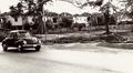
Still Cruisin' After All These Yearsby TuckersmomComment: the houses in the background are a little too distracting, I think all of the noise really adds a lot to the picture. The only thing I would do different is to make the car stand out more, all the other stuff around it (trees and houses) are a little distracting. |
 Photographer found comment helpful. Photographer found comment helpful. |
| 02/23/2005 03:00:18 PM |
|
| Photographer found comment helpful. |
| 02/10/2005 01:23:44 PM |
@#?*#%^@*!!!!!!!!!!by bruskiComment: The background seems a little blown out in the top left hand portion of this picture. A little distracting, but still a good picture. |
| Photographer found comment helpful. |
| 02/10/2005 01:04:15 PM |
Outcast by L1Comment: Wow, this is the first pic that I will rate a 9, and I am almost through all of them, great job, perfect lighting |
| Photographer found comment helpful. |
| 02/10/2005 12:50:55 PM |
|
| Photographer found comment helpful. |
| 02/10/2005 12:49:12 PM |
Credit Painby sir_bazzComment: Whoa, I hope that is not YOUR balance. Maybe would be better if the focused area was moved up more towards the center. A little too much blurry space on the top, but don't get me wrong, a very good picture (8) |
| Photographer found comment helpful. |
| 02/10/2005 12:33:37 PM |
|
| Photographer found comment helpful. |
| 02/10/2005 12:25:30 PM |
|
| Photographer found comment helpful. |
| 02/08/2005 03:25:44 PM |
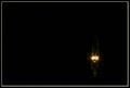
Filamentby NitinComment: Great idea, just too much white space (dead space or whatever you want to call it). Maybe if you cropped it a little more. However I do like how it is offcentered. |
| Photographer found comment helpful. |
| 02/08/2005 01:35:47 PM |
|
| Photographer found comment helpful. |
Home -
Challenges -
Community -
League -
Photos -
Cameras -
Lenses -
Learn -
Help -
Terms of Use -
Privacy -
Top ^
DPChallenge, and website content and design, Copyright © 2001-2025 Challenging Technologies, LLC.
All digital photo copyrights belong to the photographers and may not be used without permission.
Current Server Time: 08/17/2025 05:32:59 PM EDT.