| Image |
Comment |
| 02/09/2005 01:40:34 PM |
A Parent's Nightmareby ArtysteComment: Tghis image is a little dark...I would have lit it well, then toned it down in post so we get a little more detail out of it. nice actors and prtty good ont he composition. |
 Photographer found comment helpful. Photographer found comment helpful. |
| 02/09/2005 01:39:05 PM |
Mother and Daughterby JerreComment: Creative title with your picture. The combination of both is good (your specific title and image). The mother or grave by itself would not be a very strong image, but this works. Nice job. |
| Photographer found comment helpful. |
| 02/09/2005 03:41:07 AM |
WMD - Weapon of Mouse Destructionby aronya1Comment: Pretty gruesome image...I almost find it too "in your face". I'm interested to see how it scores...I'm sure some will be offended. I like the shot though. Good choice on the B&W |
| Photographer found comment helpful. |
| 02/09/2005 03:40:02 AM |
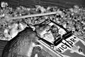
Popular Technique For Masking Painby plumber711Comment: I love the idea....you thought outside the box and its shown by your title....However....This picture has a "snapshot" feel. I bet people are hiting on it pretty hard...so lemme be one of the few people that tries to explain whats going on in my head instead of just voting.
Copositionally, not terrible. The two mirrors add a nice semetric feel to your photo. With a tighter crop job (eliminating the man on the right and the light blue strip on the far left) this would have been a little more visually solid. I know it was basic editing, so you couldnt get rid of the blue phone sign. I find that distracting too. The bucket could probably go too!
Lighting and feel- I love it. It feels like happy hour when I view this image. Sun is heading down, ready to party, or sulk at the bar. The slight light on the windows is very nice too...adds a warm tone to the image.
All that being said...I think a lot of people want to really be impacted by the pain element of the photo. Your photo is a little more out-of-the-box....which is good, but probably wont score high in the challenge. I wish you the best of luck and regardless of this challenge, I do like the image. Keep up the good work! :)) |
| Photographer found comment helpful. |
| 02/09/2005 12:22:05 AM |
You'll talk!by nicklevyComment: Nice lighting! Dark, Moody
Lighting- 9
Composition- 8
Creativeness- 7
Overall. 8!
Nice job. I think the focus is darn near perfect. Keep up the great work. |
| Photographer found comment helpful. |
| 02/08/2005 11:59:15 PM |
|
| Photographer found comment helpful. |
| 02/08/2005 11:47:31 PM |
|
| Photographer found comment helpful. |
| 02/08/2005 02:57:40 AM |
No Outletby taterbugComment: Love the effort that went into this picture! Great job :) |
| Photographer found comment helpful. |
| 02/08/2005 02:56:37 AM |
|
| Photographer found comment helpful. |
| 02/05/2005 11:13:08 PM |
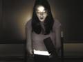
A Delightful Surpriseby RulerZigzagComment: This has great potential...but the light isn't consistent with the action. Notice the lid of the box is not fully opened. If the light on her face was really coming from the box....there would be a diagonal shodow from the lid accross her face. Also I wish the wall behind her were black. Nice shot and idea though. |
| Photographer found comment helpful. |
Home -
Challenges -
Community -
League -
Photos -
Cameras -
Lenses -
Learn -
Help -
Terms of Use -
Privacy -
Top ^
DPChallenge, and website content and design, Copyright © 2001-2025 Challenging Technologies, LLC.
All digital photo copyrights belong to the photographers and may not be used without permission.
Current Server Time: 08/25/2025 04:37:03 AM EDT.